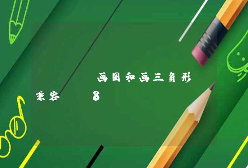


要使用CSS来制作一个圆形,我们需要一个div,被给它设置一个ID
<div id="circle"></div>
圆形在设置CSS时要设置宽度和高度相等,然后设置border-radius属性为宽度或高度的一半即可:
#circle {
width: 120px
height: 120px
background: #7fee1d
-moz-border-radius: 60px
-webkit-border-radius: 60px
border-radius: 60px
}
2
制作椭圆形:
椭圆形是正圆形的一个变体,同样使用一个带ID的div来制作
<div id="oval"></div>
设置椭圆形的CSS时,高度要设置为宽度的一半,border-radius属性也要做相应的改变:
#oval {
width: 200px
height: 100px
background: #e9337c
-webkit-border-radius: 100px / 50px
-moz-border-radius: 100px / 50px
border-radius: 100px / 50px
}
3
制作三角形:
要创建一个CSS三角形,需要使用border,通过设置不同边的透明效果,我们可以制作出三角形的现状。另外,在制作三角形时,宽度和高度要设置为0。
<div id="triangle"></div>
#triangle {
width: 0
height: 0
border-bottom: 140px solid #fcf921
border-left: 70px solid transparent
border-right: 70px solid transparent
}
4
制作倒三角形:
与正三角形不同的是,倒三角形要设置的是border-top、border-left和border-right三条边的属性:
#triangle {
width: 0
height: 0
border-top: 140px solid #20a3bf
border-left: 70px solid transparent
border-right: 70px solid transparent
}
5
制作左三角形:
左三角形操作的是border-top、border-left和border-right三条边的属性,其中上边和下边要设置透明属性。
#triangle_left {
width: 0
height: 0
border-top: 70px solid transparent
border-right: 140px solid #6bbf20
border-bottom: 70px solid transparent
}
制作菱形
制作菱形的方法有很多种。这里使用的是transform属性和rotate相结合,使两个正反三角形上下显示。
#diamond {
width: 120px
height: 120px
background: #1eff00
/* Rotate */
-webkit-transform: rotate(-45deg)
-moz-transform: rotate(-45deg)
-ms-transform: rotate(-45deg)
-o-transform: rotate(-45deg)
transform: rotate(-45deg)
/* Rotate Origin */
-webkit-transform-origin: 0 100%
-moz-transform-origin: 0 100%
-ms-transform-origin: 0 100%
-o-transform-origin: 0 100%
transform-origin: 0 100%
margin: 60px 0 10px 310px
}
制作梯形:
梯形是三角形的一个变体,设置CSS梯形时,左右两条边设置为相等,并且给它设置一个宽度。
#trapezium {
height: 0
width: 120px
border-bottom: 120px solid #ec3504
border-left: 60px solid transparent
border-right: 60px solid transparent
}
制作平行四边形:
平行四边形的制作方式是使用transform属性使长方形倾斜一个角度。
#parallelogram {
width: 160px
height: 100px
background: #8734f7
-webkit-transform: skew(30deg)
-moz-transform: skew(30deg)
-o-transform: skew(30deg)
transform: skew(30deg)
}
星形:
星形的HTML结构同样使用一个带ID的空div。星形的实现方式比较复杂,主要是使用transform属性来旋转不同的边。仔细体会下面的代码。
#star {
width: 0
height: 0
margin: 50px 0
color: #fc2e5a
position: relative
display: block
border-right: 100px solid transparent
border-bottom: 70px solid #fc2e5a
border-left: 100px solid transparent
-moz-transform: rotate(35deg)
-webkit-transform: rotate(35deg)
-ms-transform: rotate(35deg)
-o-transform: rotate(35deg)
}
#star:before {
height: 0
width: 0
position: absolute
display: block
top: -45px
left: -65px
border-bottom: 80px solid #fc2e5a
border-left: 30px solid transparent
border-right: 30px solid transparent
content: ''
-webkit-transform: rotate(-35deg)
-moz-transform: rotate(-35deg)
-ms-transform: rotate(-35deg)
-o-transform: rotate(-35deg)
}
#star:after {
content: ''
width: 0
height: 0
position: absolute
display: block
top: 3px
left: -105px
color: #fc2e5a
border-right: 100px solid transparent
border-bottom: 70px solid #fc2e5a
border-left: 100px solid transparent
-webkit-transform: rotate(-70deg)
-moz-transform: rotate(-70deg)
-ms-transform: rotate(-70deg)
-o-transform: rotate(-70deg)
}
六角星形:
和五角星的制作方法不同,六角星形状的制作方法是操纵border属性来制作两半图形,然后合并它们。
#star_six_points {
width: 0
height: 0
display: block
position: absolute
border-left: 50px solid transparent
border-right: 50px solid transparent
border-bottom: 100px solid #de34f7
margin: 10px auto
}
#star_six_points:after {
content: ""
width: 0
height: 0
position: absolute
border-left: 50px solid transparent
border-right: 50px solid transparent
border-top: 100px solid #de34f7
margin: 30px 0 0 -50px
}
六边形:
六边形的制作方法可以有很多种,可以像五边形一样,先制作一个长方形,然后在它的上面和下面各放置一个三角形。
#hexagon {
width: 100px
height: 55px
background: #fc5e5e
position: relative
margin: 10px auto
}
#hexagon:before {
content: ""
width: 0
height: 0
position: absolute
top: -25px
left: 0
border-left: 50px solid transparent
border-right: 50px solid transparent
border-bottom: 25px solid #fc5e5e
}
#hexagon:after {
content: ""
width: 0
height: 0
position: absolute
bottom: -25px
left: 0
border-left: 50px solid transparent
border-right: 50px solid transparent
border-top: 25px solid #fc5e5e
}
心形:
心形的制作是非常复杂的,可以使用伪元素来制作,分别将伪元素旋转不同的角度,并修改transform-origin属性来元素的旋转中心点。
#heart {
position: relative
}
#heart:before,#heart:after {
content: ""
width: 70px
height: 115px
position: absolute
background: red
left: 70px
top: 0
-webkit-border-radius: 50px 50px 0 0
-moz-border-radius: 50px 50px 0 0
border-radius: 50px 50px 0 0
-webkit-transform: rotate(-45deg)
-moz-transform: rotate(-45deg)
-ms-transform: rotate(-45deg)
-o-transform: rotate(-45deg)
transform: rotate(-45deg)
-webkit-transform-origin: 0 100%
-moz-transform-origin: 0 100%
-ms-transform-origin: 0 100%
-o-transform-origin: 0 100%
transform-origin: 0 100%
}
#heart:after {
left: 0
-webkit-transform: rotate(45deg)
-moz-transform: rotate(45deg)
-ms-transform: rotate(45deg)
-o-transform: rotate(45deg)
transform: rotate(45deg)
-webkit-transform-origin: 100% 100%
-moz-transform-origin: 100% 100%
-ms-transform-origin: 100% 100%
-o-transform-origin: 100% 100%
transform-origin: 100% 100%
}
蛋形:
蛋形时椭圆形的一个变体,它的高度要比宽度稍大,并且设置正确的border-radius属性即可以制作出一个蛋形。
#egg {
width: 136px
height: 190px
background: #ffc000
display: block
-webkit-border-radius: 63px 63px 63px 63px / 108px 108px 72px 72px
border-radius: 50% 50% 50% 50% / 60% 60% 40% 40%
}
无穷符号:
无穷符号可以通过border属性和设置伪元素的角度来实现。
#infinity {
width: 220px
height: 100px
position: relative
}
#infinity:before,#infinity:after {
content: ""
width: 60px
height: 60px
position: absolute
top: 0
left: 0
border: 20px solid #06c999
-moz-border-radius: 50px 50px 0
border-radius: 50px 50px 0 50px
-webkit-transform: rotate(-45deg)
-moz-transform: rotate(-45deg)
-ms-transform: rotate(-45deg)
-o-transform: rotate(-45deg)
transform: rotate(-45deg)
}
#infinity:after {
left: auto
right: 0
-moz-border-radius: 50px 50px 50px 0
border-radius: 50px 50px 50px 0
-webkit-transform: rotate(45deg)
-moz-transform: rotate(45deg)
-ms-transform: rotate(45deg)
-o-transform: rotate(45deg)
transform: rotate(45deg)
}
消息提示框:
消息提示框可以先制作一个圆角矩形,然后在需要的地方放置一个三角形。
#comment_bubble {
width: 140px
height: 100px
background: #088cb7
position: relative
-moz-border-radius: 12px
-webkit-border-radius: 12px
border-radius: 12px
}
#comment_bubble:before {
content: ""
width: 0
height: 0
right: 100%
top: 38px
position: absolute
border-top: 13px solid transparent
border-right: 26px solid #088cb7
border-bottom: 13px solid transparent
}
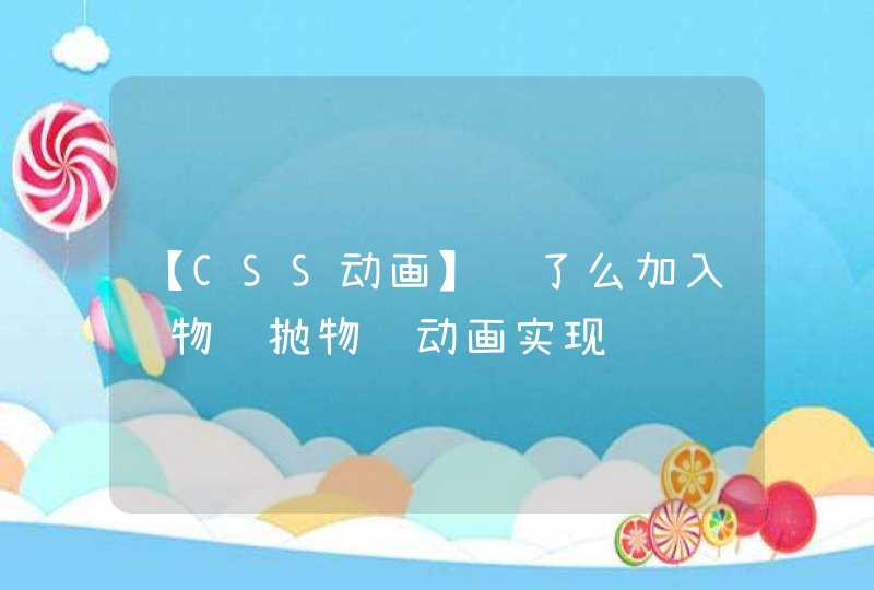
步骤阅读
给你一个例子:
<!doctype html><html>
<head>
<meta charset="utf-8">
<title>css动画</title>
<style>
*, *:before, *:after {
box-sizing: border-box
margin: 0
padding: 0
}
:root, html, body {
font-family: 'Poiret One', 'Open Sans', 'Helvetica Neue', 'Helvetica', 'Arial', sans-serif
background: #222
color: white
}
h1 {
text-align: center
margin: 1rem auto 2rem
font-weight: normal
}
p {
margin: 1rem
}
.row {
width: 80%
height: 150px
margin: 2rem auto
}
.cell {
display: inline-block
width: 49%
text-align: center
}
.circle {
display: inline-block
width: 100px
height: 100px
border-radius: 50%
background: whiteSmoke
box-shadow: 4px -40px 60px 5px rgb(26, 117, 206) inset
}
.square {
display: inline-block
width: 100px
height: 100px
border-radius: 20px
background: whiteSmoke
box-shadow: 4px -40px 60px 5px rgb(26, 117, 206) inset
}
.loader {
background: linear-gradient(to right, rgb(22, 113, 202) 50%, transparent 50%)
animation: spin 1s infinite linear
}
.loader:before {
display: block
content: ''
position: relative
top: 50%
left: 50%
transform: translate(-50%, -50%)
width: 90px
height: 90px
background: #222
border-radius: 50%
}
.gelatine {
animation: gelatine 0.5s infinite
}
@keyframes gelatine {
from, to { transform: scale(1, 1) }
25% { transform: scale(0.9, 1.1) }
50% { transform: scale(1.1, 0.9) }
75% { transform: scale(0.95, 1.05) }
}
.spin {
animation: spin 1s infinite linear
}
@keyframes spin {
from { transform: rotate(0deg) }
to { transform: rotate(360deg) }
}
.elastic-spin {
animation: elastic-spin 1s infinite ease
}
@keyframes elastic-spin {
from { transform: rotate(0deg) }
to { transform: rotate(720deg) }
}
.pulse {
animation: pulse 1s infinite ease-in-out alternate
}
@keyframes pulse {
from { transform: scale(0.8) }
to { transform: scale(1.2) }
}
.flash {
animation: flash 500ms ease infinite alternate
}
@keyframes flash {
from { opacity: 1 }
to { opacity: 0 }
}
.hithere {
animation: hithere 1s ease infinite
}
@keyframes hithere {
30% { transform: scale(1.2) }
40%, 60% { transform: rotate(-20deg) scale(1.2) }
50% { transform: rotate(20deg) scale(1.2) }
70% { transform: rotate(0deg) scale(1.2) }
100% { transform: scale(1) }
}
.grow {
animation: grow 2s ease infinite
}
@keyframes grow {
from { transform: scale(0) }
to { transform: scale(1) }
}
.fade-in {
animation: fade-in 2s linear infinite
}
@keyframes fade-in {
from { opacity: 0 }
to { opacity: 1 }
}
.fade-out {
animation: fade-out 2s linear infinite
}
@keyframes fade-out {
from { opacity: 1 }
to { opacity: 0 }
}
.bounce {
animation: bounce 2s ease infinite
}
@keyframes bounce {
70% { transform:translateY(0%) }
80% { transform:translateY(-15%) }
90% { transform:translateY(0%) }
95% { transform:translateY(-7%) }
97% { transform:translateY(0%) }
99% { transform:translateY(-3%) }
100% { transform:translateY(0) }
}
.bounce2 {
animation: bounce2 2s ease infinite
}
@keyframes bounce2 {
0%, 20%, 50%, 80%, 100% {transform: translateY(0)}
40% {transform: translateY(-30px)}
60% {transform: translateY(-15px)}
}
.shake {
animation: shake 2s ease infinite
}
@keyframes shake {
0%, 100% {transform: translateX(0)}
10%, 30%, 50%, 70%, 90% {transform: translateX(-10px)}
20%, 40%, 60%, 80% {transform: translateX(10px)}
}
.flip {
backface-visibility: visible !important
animation: flip 2s ease infinite
}
@keyframes flip {
0% {
transform: perspective(400px) rotateY(0)
animation-timing-function: ease-out
}
40% {
transform: perspective(400px) translateZ(150px) rotateY(170deg)
animation-timing-function: ease-out
}
50% {
transform: perspective(400px) translateZ(150px) rotateY(190deg) scale(1)
animation-timing-function: ease-in
}
80% {
transform: perspective(400px) rotateY(360deg) scale(.95)
animation-timing-function: ease-in
}
100% {
transform: perspective(400px) scale(1)
animation-timing-function: ease-in
}
}
.swing {
transform-origin: top center
animation: swing 2s ease infinite
}
@keyframes swing {
20% { transform: rotate(15deg) }
40% { transform: rotate(-10deg) }
60% { transform: rotate(5deg) }
80% { transform: rotate(-5deg) }
100% { transform: rotate(0deg) }
}
.wobble {
animation: wobble 2s ease infinite
}
@keyframes wobble {
0% { transform: translateX(0%) }
15% { transform: translateX(-25%) rotate(-5deg) }
30% { transform: translateX(20%) rotate(3deg) }
45% { transform: translateX(-15%) rotate(-3deg) }
60% { transform: translateX(10%) rotate(2deg) }
75% { transform: translateX(-5%) rotate(-1deg) }
100% { transform: translateX(0%) }
}
.fade-in-down {
animation: fade-in-down 2s ease infinite
}
@keyframes fade-in-down {
0% {
opacity: 0
transform: translateY(-20px)
}
100% {
opacity: 1
transform: translateY(0)
}
}
.fade-in-left {
animation: fade-in-left 2s ease infinite
}
@keyframes fade-in-left {
0% {
opacity: 0
transform: translateX(-20px)
}
100% {
opacity: 1
transform: translateX(0)
}
}
.fade-out-down {
animation: fade-out-down 2s ease infinite
}
@keyframes fade-out-down {
0% {
opacity: 1
transform: translateY(0)
}
100% {
opacity: 0
transform: translateY(20px)
}
}
.fade-out-right {
animation: fade-out-right 2s ease infinite
}
@keyframes fade-out-right {
0% {
opacity: 1
transform: translateX(0)
}
100% {
opacity: 0
transform: translateX(20px)
}
}
.bounce-in {
animation: bounce-in 2s ease infinite
}
@keyframes bounce-in {
0% {
opacity: 0
transform: scale(.3)
}
50% {
opacity: 1
transform: scale(1.05)
}
70% { transform: scale(.9) }
100% { transform: scale(1) }
}
.bounce-in-right {
animation: bounce-in-right 2s ease infinite
}
@keyframes bounce-in-right {
0% {
opacity: 0
transform: translateX(2000px)
}
60% {
opacity: 1
transform: translateX(-30px)
}
80% { transform: translateX(10px) }
100% { transform: translateX(0) }
}
.bounce-out {
animation: bounce-out 2s ease infinite
}
@keyframes bounce-out {
0% { transform: scale(1) }
25% { transform: scale(.95) }
50% {
opacity: 1
transform: scale(1.1)
}
100% {
opacity: 0
transform: scale(.3)
}
}
.bounce-out-down {
animation: bounce-out-down 2s ease infinite
}
@keyframes bounce-out-down {
0% { transform: translateY(0) }
20% {
opacity: 1
transform: translateY(-20px)
}
100% {
opacity: 0
transform: translateY(20px)
}
}
.rotate-in-down-left {
animation: rotate-in-down-left 2s ease infinite
}
@keyframes rotate-in-down-left {
0% {
transform-origin: left bottom
transform: rotate(-90deg)
opacity: 0
}
100% {
transform-origin: left bottom
transform: rotate(0)
opacity: 1
}
}
.rotate-in-up-left {
animation: rotate-in-up-left 2s ease infinite
}
@keyframes rotate-in-up-left {
0% {
transform-origin: left bottom
transform: rotate(90deg)
opacity: 0
}
100% {
transform-origin: left bottom
transform: rotate(0)
opacity: 1
}
}
.hinge {
animation: hinge 2s ease infinite
}
@keyframes hinge {
0% { transform: rotate(0) transform-origin: top left animation-timing-function: ease-in-out }
20%, 60% { transform: rotate(80deg) transform-origin: top left animation-timing-function: ease-in-out }
40% { transform: rotate(60deg) transform-origin: top left animation-timing-function: ease-in-out }
80% { transform: rotate(60deg) translateY(0) opacity: 1 transform-origin: top left animation-timing-function: ease-in-out }
100% { transform: translateY(700px) opacity: 0 }
}
.roll-in {
animation: roll-in 2s ease infinite
}
@keyframes roll-in {
0% {
opacity: 0
transform: translateX(-100%) rotate(-120deg)
}
100% {
opacity: 1
transform: translateX(0px) rotate(0deg)
}
}
.roll-out {
animation: roll-out 2s ease infinite
}
@keyframes roll-out {
0% {
opacity: 1
transform: translateX(0px) rotate(0deg)
}
100% {
opacity: 0
transform: translateX(100%) rotate(120deg)
}
}
</style>
</head>
<body>
<h1>CSS Animation</h1>
<div class="row">
<div class="cell">
<div class="circle loader"></div>
<p>loader</p>
</div>
<div class="cell">
<div class="circle gelatine"></div>
<p>gelatine</p>
</div>
</div>
<div class="row">
<div class="cell">
<div class="circle spin"></div>
<p>spin</p>
</div>
<div class="cell">
<div class="circle elastic-spin"></div>
<p>elastic spin</p>
</div>
</div>
<div class="row">
<div class="cell">
<div class="circle pulse"></div>
<p>pulse</p>
</div>
<div class="cell">
<div class="circle flash"></div>
<p>flash</p>
</div>
</div>
<div class="row">
<div class="cell">
<div class="square hithere"></div>
<p>hi there!</p>
</div>
<div class="cell">
<div class="circle grow"></div>
<p>grow</p>
</div>
</div>
<div class="row">
<div class="cell">
<div class="circle fade-in"></div>
<p>fade in</p>
</div>
<div class="cell">
<div class="circle fade-out"></div>
<p>fade out</p>
</div>
</div>
<div class="row">
<div class="cell">
<div class="circle bounce"></div>
<p>bounce</p>
</div>
<div class="cell">
<div class="circle bounce2"></div>
<p>bounce 2</p>
</div>
</div>
<div class="row">
<div class="cell">
<div class="circle shake"></div>
<p>shake</p>
</div>
<div class="cell">
<div class="circle flip"></div>
<p>flip</p>
</div>
</div>
<div class="row">
<div class="cell">
<div class="circle swing"></div>
<p>swing</p>
</div>
<div class="cell">
<div class="circle wobble"></div>
<p>wobble</p>
</div>
</div>
<div class="row">
<div class="cell">
<div class="circle fade-in-down"></div>
<p>fade in down</p>
</div>
<div class="cell">
<div class="circle fade-in-left"></div>
<p>fade in left</p>
</div>
</div>
<div class="row">
<div class="cell">
<div class="circle fade-out-down"></div>
<p>fade out down</p>
</div>
<div class="cell">
<div class="circle fade-out-right"></div>
<p>fade out right</p>
</div>
</div>
<div class="row">
<div class="cell">
<div class="circle bounce-in"></div>
<p>bounce in</p>
</div>
<div class="cell">
<div class="circle bounce-in-right"></div>
<p>bounce in right</p>
</div>
</div>
<div class="row">
<div class="cell">
<div class="circle bounce-out"></div>
<p>bounce out</p>
</div>
<div class="cell">
<div class="circle bounce-out-down"></div>
<p>bounce out down</p>
</div>
</div>
<div class="row">
<div class="cell">
<div class="circle rotate-in-down-left"></div>
<p>rotate in down left</p>
</div>
<div class="cell">
<div class="circle rotate-in-up-left"></div>
<p>rotate in up left</p>
</div>
</div>
<div class="row">
<div class="cell">
<div class="circle roll-in"></div>
<p>roll in</p>
</div>
<div class="cell">
<div class="circle roll-out"></div>
<p>roll out</p>
</div>
</div>
<div class="row">
<div class="cell">
<div class="circle hinge"></div>
<p>hinge</p>
</div>
</div>
</body>
</html>
1.文本类属性
① 字体类型
语法:font-family:字体1,字体2,字体3...
设置多个字体时,浏览器会优先识别字体1,找不到则识别字体2,都无法识别时,显示浏览器默认字体。
② 字体大小
语法:font-size:数值+单位
字体大小单位有px、em、rem、pt;浏览器默认大小为16px;字体大小一般设置为偶数值;谷歌浏览器识别最小字体为12px。
③ 字体加粗
属性值:normal常规、bold加粗、bolder更粗、100-900数值
数值100-900字体加粗程度不同,其中100-500为常规字体,600-900为加粗字体。
④字体颜色
颜色值写法有三种:直接写颜色单词,如red;十六进制写法,如color:#000;rgb写法 ,color:rgb(0,0,0)
⑤字体倾斜
⑥复合写法
font:字体大小/行高 字体类型
⑦行高
语法: line-height:数值+单位
数值不能为负值
⑧水平对齐方式
语法:text-align:left左对齐
text-align:center 居中
text-align:right 右对齐
text-align:justify 两端对齐,只对英文起作用
⑨文本修饰
text-decoration:none去掉文本修饰,可去掉超链接(对a标签使用)的下划线
text-decoration:underline下划线
text-decoration:overline上划线
text-decoration:line-through删除线
文本缩进
text-indent:数值+单位
数值为正向后缩进,负值向前缩进
强制在一行显示
white-space:nowrap
长单词换行
word-warp:break-word
2.背景类属性
语法:background-color:颜色值
属性值同字体颜色属性值相同用法
语法:background-image:url(图片路径)
语法:background-position:left;
水平方向:left、center、right
垂直方向:top、center、bottom
属性值为数值时,水平方向向右为正,向左为负,垂直方向向下为正,向上为负。水平和垂直方向都居中时可写background-position:center
background-attachment:scroll
属性值:scroll 默认值;fixed 固定
当容器出现滚动条时,背景图固定不滚动,可设置为fixed。
语法:background-repeat:repeat
属性值:repeat平铺;no-repeat;repeat-x横向平铺;repeat-y纵向平铺。
background:背景图 背景平铺 背景位置
background:url(13211.jpg) no-repeat right bottom
3.列表属性
语法:list-style-type:disc
属性值:disc实心圆;circle空心圆;square实心方块;decimal数字;none去除列表符号。
4.伪类选择器
语法: 选择符:hover{属性:属性值}
超链接a标签的四个状态:
a) a:link 超链接的初始状态,链接没有被访问过时的状态
b) a:visited 链接访问过后的状态
c) a:hover 鼠标悬停在超链接上的状态(鼠标滑过)
d) a:active 超链接被激活时的状态(鼠标按下)