


<html>
<head>
<meta charset="UTF-8">
<title></title>
<style>
body {
background-color: #eaf0f2
}
h1{text-align: center}
.box{width:500pxheight:300pxmargin:0 autoposition:relative}
.img-layer{position: absolutewidth: 500pxheight: 300pxtop: 0left: 0overflow: hidden}
.img-layer img {width: 500pxcursor: pointer}
.img-layer:before{ content: ''
position: absolute
top: 0
right: 0
width: 0
height: 0
border-style: solid
border-width: 0
border-color: rgba(0,0,0,0.2) #fff
border-radius: 0 0 0 4px
box-shadow: 0 1px 1px rgba(0,0,0,0.3), -1px 1px 1px rgba(0,0,0,0.2)
-webkit-transition: all 0.4s ease-out
transition:all 0.4s ease-out}
.img-layer:hover:before{
border-right-width:100px
border-bottom-width:100px
}
</style>
</head>
<body>
<h1>折角效果</h1>
<div class="box">
<div class="img-layer">
<img src="<a href="http://p6.qhimg.com/d/inn/3f563406/table.jpg">http://p6.qhimg.com/d/inn/3f563406/table.jpg</a>" alt="">
</div>
</div>
</body>
</html>
来源于网络
不知道LZ说的是哪一种折角矩形哦,最好贴个图上来看看,不过一般就内容变化的矩形都是用CSS写出来的,现在CSS3已经有属性支持了,LZ可以学习下,要是用CSS2.0也是可以做到的,不过麻烦点~要用PS做四个圆角图片再加上CSS样式就可以做出随内容而变的圆角矩形了~(只能是单色的哦)
在css中,让边角具有弧度只需要用border-radius这个属性。
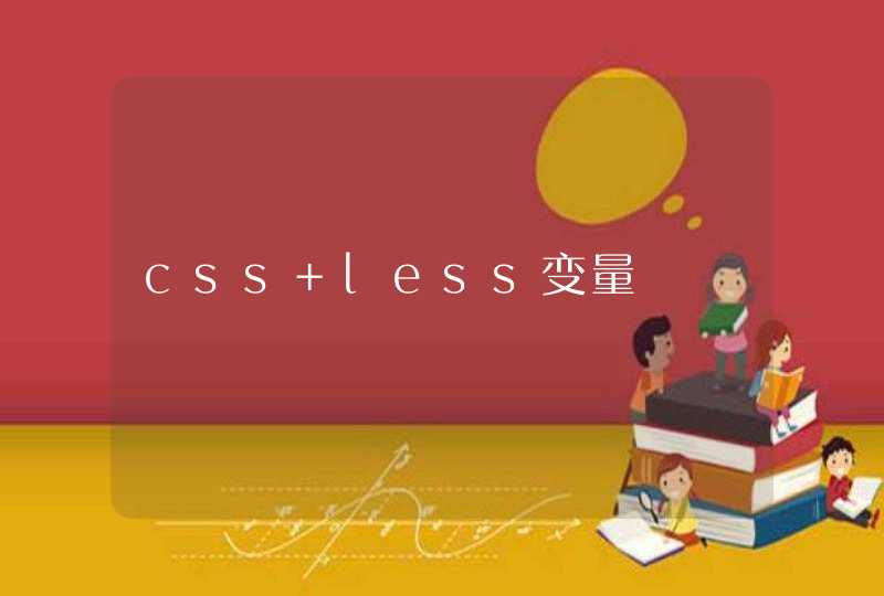
如图,这是一个测试页面,它们的边角分别为25PX和50PX半径的圆角。
写法像这样:
border-radius:25px
测试代码如下
<div style="border-radius:25px"></div>
<div style="border-radius:50px"></div>
div{
width:200px
height:130px
background-color:wheat
margin-bottom:10px
}
拓展资料-css3简介在CSS3推出前,圆角效果需要用图片实现,下面简要介绍CSS3。
CSS3是CSS(层叠样式表)技术的升级版本,于1999年开始制订,2001年5月23日W3C完成了CSS3的工作草案,主要包括盒子模型、列表模块、超链接方式、语言模块、背景和边框、文字特效、多栏布局等模块。
CSS演进的一个主要变化就是W3C决定将CSS3分成一系列模块。浏览器厂商按CSS节奏快速创新,因此通过采用模块方法,CSS3规范里的元素能以不同速度向前发展,因为不同的浏览器厂商只支持给定特性。但不同浏览器在不同时问支持不同特性,这也让跨浏览器开发变得复杂。