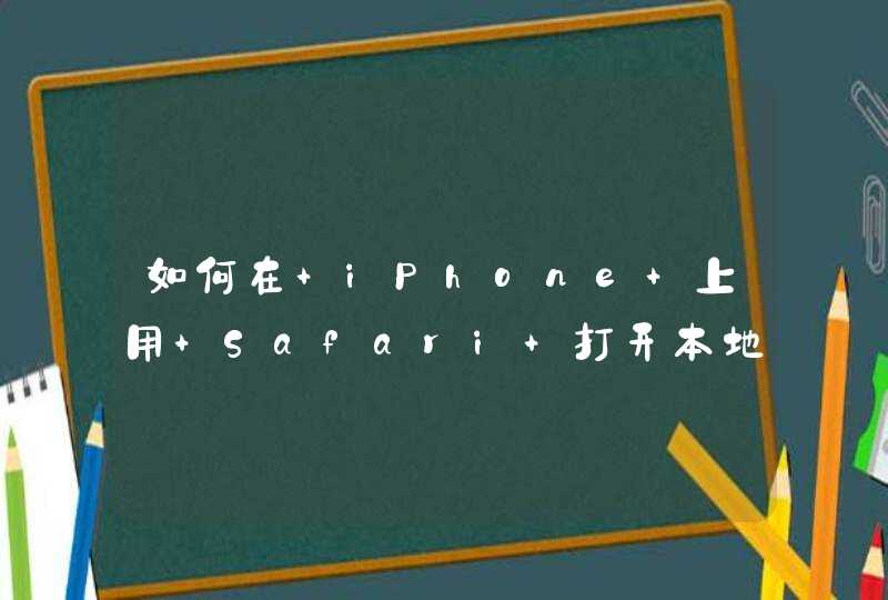


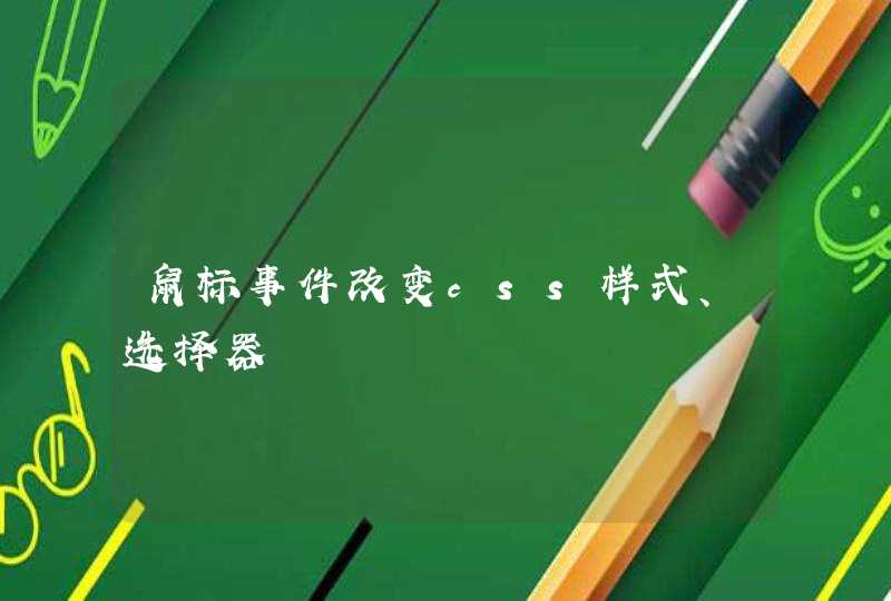


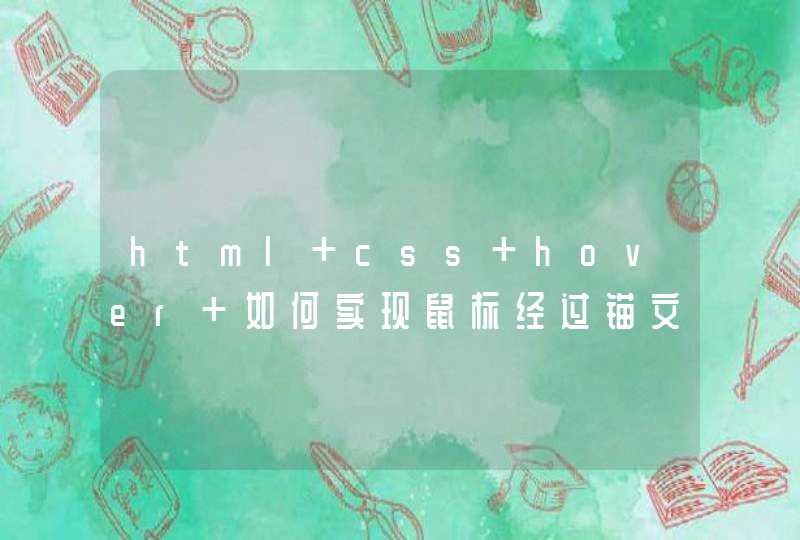


你好,我这里用CSS实现了三种带边框三角,效果分别如图:
实例代码如下,根据你个人的情况调整代码吧:
<!DOCTYPE html><html lang="en">
<head>
<meta charset="UTF-8">
<title>Arrow</title>
</head>
<body>
<style>
/* scale */
.arrow,
.arrow:after{
position: relative
display: inline-block
width: 0
height: 0
border-top: 0
border-left: 30px dotted transparent
border-right: 30px dotted transparent
border-bottom: 30px dashed #000
}
.arrow:after {
position: absolute
top: 0
content: ''
transform: translateX(-50%) scale(.8)
border-bottom: 30px dashed #fff
}
/* width & height */
.arrow1,
.arrow1:after {
position: relative
display: inline-block
width: 0
height: 0
border-top: 0
border-left: 30px dotted transparent
border-right: 30px dotted transparent
border-bottom: 30px dashed #000
}
.arrow1:after {
position: absolute
left: -26px
top: 2px
content: ''
width: 0
height: 0
border-top: 0
border-left: 26px dotted transparent
border-right: 26px dotted transparent
border-bottom: 26px dashed #fff
}
/* border & after */
.arrow2 {
position: relative
display: inline-block
width: 28px
height: 28px
border: 0
border-top: 2px solid #000
border-right: 2px solid #000
-webkit-transform: translate(7px, 14px) rotate(-45deg)
-ms-transform: translate(7px, 14px) rotate(-45deg)
-o-transform: translate(7px, 14px) rotate(-45deg)
transform: translate(7px, 14px) rotate(-45deg)
}
.arrow2:after {
position: absolute
left: 0
top: -2px
width: 42px
height: 2px
content: ''
border-radius: 2px
background-color: #000
-webkit-transform-origin: left top
-moz-transform-origin: left top
-ms-transform-origin: left top
-o-transform-origin: left top
transform-origin: left top
-webkit-transform: rotate(45deg)
-ms-transform: rotate(45deg)
-o-transform: rotate(45deg)
transform: rotate(45deg)
}
</style>
<span class="arrow"></span>
<span class="arrow1"></span>
<span class="arrow2"></span>
</body>
</html>
希望能帮到你,如有疑问请追问,望采纳~
将图标做成背景图就可以啊,比如:
<input type="text" style="background:url('arrow.png') right center no-repeat" />arrow.png指箭头图片,将图片作为输入框的背景图即可实现那种效果。
我在另一个问题里面涉及到了这个,你可以参考一下。网页链接
伪类你也可以理解为一个容器,不过为了展示顺利需要添加 content: ''和display:block;为了能够准确定位,需要结合其容器设置定位,这都是基础不需要多介绍。
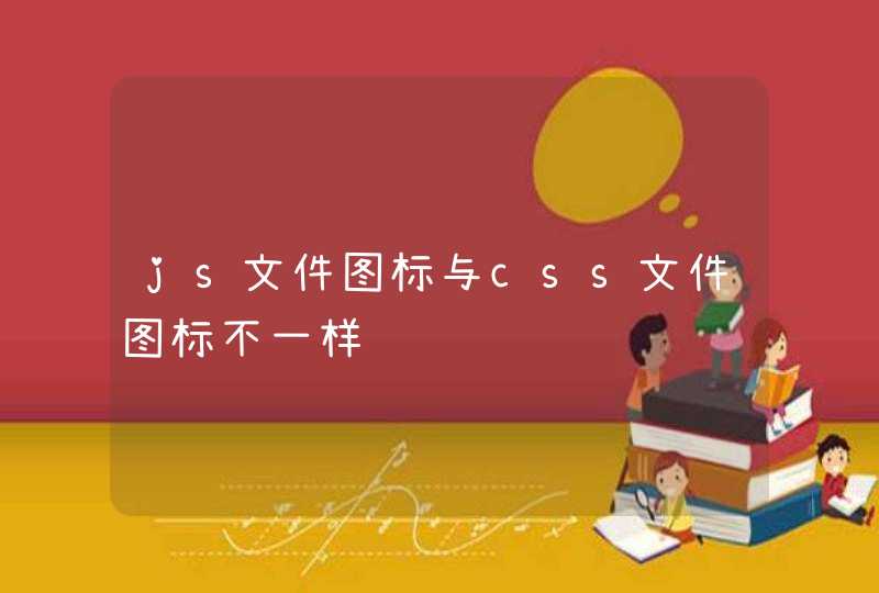
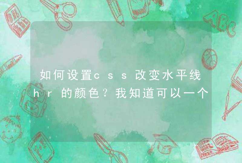
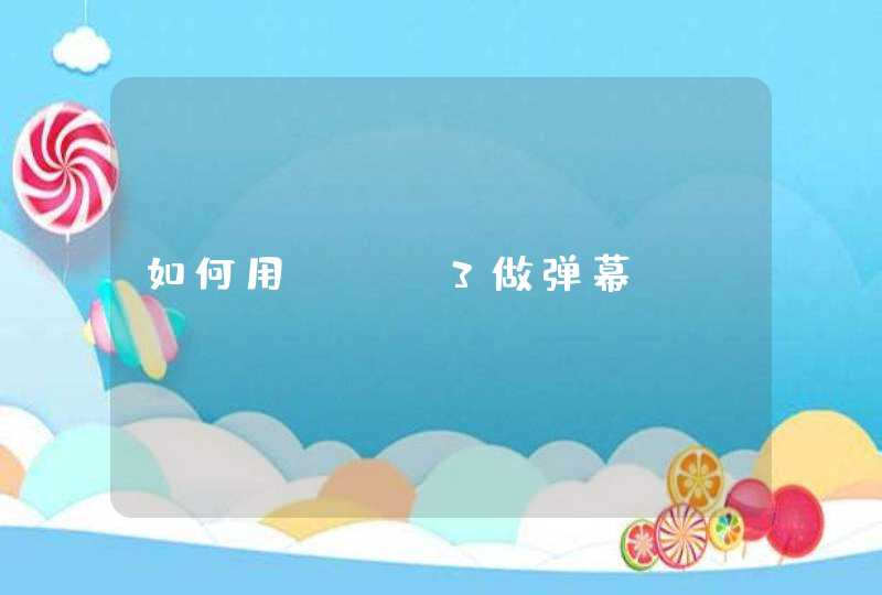
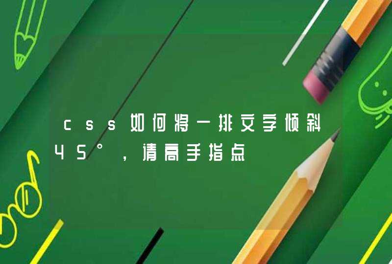
使用伪类做左右的箭头主要是需要了解 边框的构成
{border: 20px solid #333
border-top-color: #369
border-bottom-color: red
border-left-color: green
border-radius: 0
}
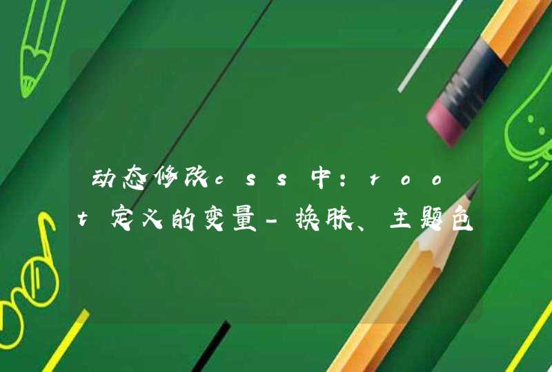
如图,我用四个颜色分别给四条边上色,可以看出来每一个边在宽度大于1的时候表现出的样子就倾向于一个梯形。
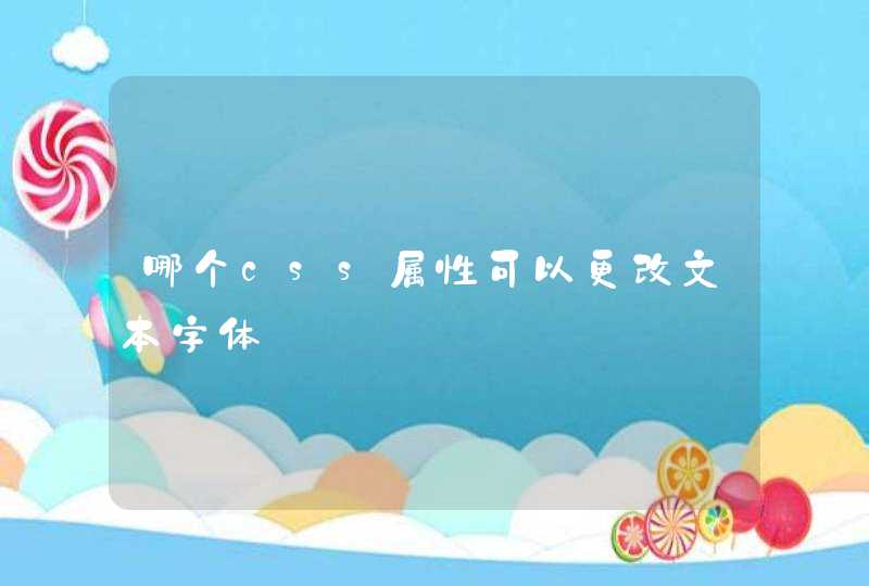
而我们可以理解为三角形其实就是梯形的一条底边长度为零。
那么为了得到一个三角形那么我们只需要容器的宽高都为零就可以了,如图:
{border: 20px solid #333
border-top-color: #369
border-bottom-color: red
border-left-color: green
border-radius: 0
font-size: 0
width: 0
height: 0
padding: 0
}
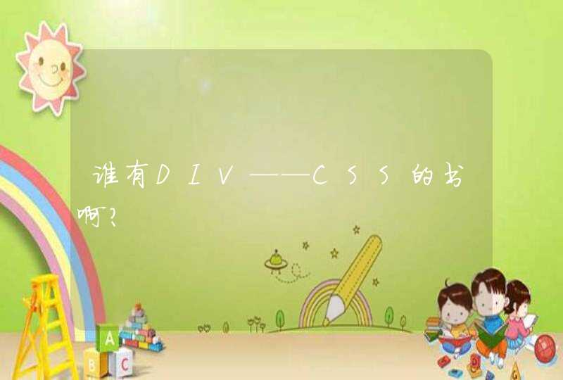
下一步我们只留下一个三角形。
只要让不需要展示的边颜色为透明就可以了
{border: 20px solid transparent
/* border-top-color: #369 */
/* border-bottom-color: red */
border-left-color: green
border-radius: 0
font-size: 0
width: 0
height: 0
padding: 0
}
这样你拿到的是上下左右四个方向的三角形,同样的 你如果需要的是斜向右上角的或者其他角度的,只要自己凑出这个方向就可以,类似于七巧板。
如果希望三角形呈现的不是直角三角形可以修改各个边的宽度。。
{border: 20px solid transparent
border-top-color: #369
/* border-bottom-color: red */
border-left-color: green
border-radius: 0
font-size: 0
width: 0
height: 0
padding: 0
}