


<div class="el-loading-spinner">
<svg viewBox="25 25 50 50" class="circular">
<circle cx="50" cy="50" r="20" fill="none" class="path"></circle>
</svg>
<p class="el-loading-text">Loading…</p>
</div>
</div>
/* ******************* 加载动画 **************************** */
.el-loading-mask.is-fullscreen { position: fixed}
.el-loading-mask { background-color: hsla(0,0%,100%,.4)!important}
.el-loading-mask { position: absolutez-index: 10000background-color: hsla(0,0%,100%,.9)margin: 0top: 0right: 0bottom: 0left: 0transition: opacity .3s}
.el-loading-mask.is-fullscreen .el-loading-spinner { margin-top: -25px}
.el-loading-spinner { top: 50%margin-top: -21pxwidth: 100%text-align: centerposition: absolute}
.el-loading-mask.is-fullscreen .el-loading-spinner .circular { width: 50pxheight: 50px}
.el-loading-spinner .circular { width: 42pxheight: 42pxanimation: loading-rotate 2s linear infinite}
svg:not(:root) { overflow: hidden}
.el-loading-spinner .el-loading-text { color: #ff495e !important}
.el-loading-spinner .el-loading-text { color: #20a0ffmargin: 3px 0font-size: 14px}
.el-loading-spinner .path { stroke: #ff495e !important}
.el-loading-spinner .path {
animation: loading-dash 1.5s ease-in-out infinite
stroke-dasharray: 90,150
stroke-dashoffset: 0
stroke-width: 2
stroke: #20a0ff
stroke-linecap: round
}
@keyframes loading-rotate {
to {
transform:rotate(1turn)
}
}@keyframes loading-dash {
0% {
stroke-dasharray:1,200
stroke-dashoffset:0
}
50% {
stroke-dasharray:90,150
stroke-dashoffset:-40px
}
to {
stroke-dasharray:90,150
stroke-dashoffset:-120px
}
/* ********************** 加载动画end ***************************************************** */
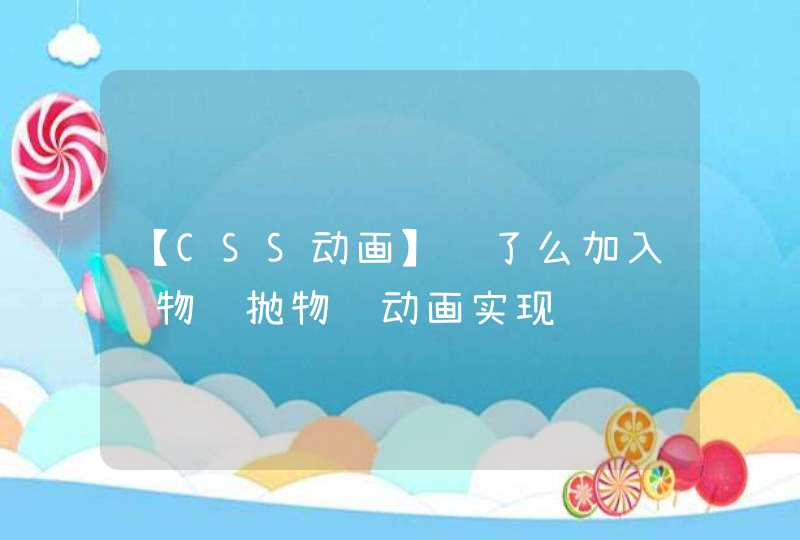
创建icons/svg文件夹将svg文件放在该文件夹下面在components文件夹中创建svgiconfont.vue文件文件内容:[removed] import '@/icons' export default {name: 'svg-icon',props: { iconClass: {type: String,required: true }, className: {type: String }},computed: { iconName() {return `#icon-${this.iconClass}` }, svgClass() {if (this.className) { console.log('svg-icon ' + this.className) return 'svg-icon ' + this.className} else { return 'svg-icon'} }},mounted: function() {} }[removed]style .svg-icon {width: 1em height: 1em vertical-align: -0.15em fill: currentColor overflow: hidden }创建index.js文件文件内容如下:import Vue from 'vue'import svgiconfont from '@/components/svgiconfont'// svg组件/*require.context有三个参数:directory:说明需要检索的目录useSubdirectories:是否检索子目录regExp: 匹配文件的正则表达式 */// 全局注册Vue.component('svg-icon', svgiconfont)const requireAll = requireContext =>requireContext.keys().map(requireContext)const req = require.context('./svg', false, /\.svg$/)requireAll(req)在main.js引入icons文件夹下即添加import ‘@/icons’修改webpack.base.conf.js添加代码:{test: /\.svg$/,loader: "svg-sprite-loader",include: [resolve("src/icons")],options: { symbolId: "icon-[name]"} }, {test: /\.(png|jpe?g|gif|svg)(\?.*)?$/,loader: 'url-loader',exclude: [resolve("src/icons")],options: { limit: 50000, name: utils.assetsPath('img/[name].[hash:7].[ext]')} }使用方法在页面中添加在制作CSS动画的时候,经常会有这样的需求,
让一个方块 沿着给定的路径 运动。
如果运动路径是不规则的,通过设置 top , left 的属性值,就显得非常困难了。
这时候可以借助svg来实现。
path 元素的形状是通过它的 d 属性 定义的,
d 属性的值,是一个“命令+参数”的序列。
其中, M 20 30 L 160 180 ,包含了2个命令序列,
M 20 30 ,表示将画笔移动到坐标 20,30 处,
L 160 180 ,表示从画笔当前位置,到 160,180 位置画直线。
path元素支持多种命令,可以参考这里, curve commands
html元素的CSS样式属性 offset-path ,表示 偏移路径 。
通过指定 offset-path 的值为path元素的 d 属性值,我们可以实现元素沿着给定的 path 路径运动。
其中, offset-distance 指定了元素偏移初始位置的百分比。
通过在 @keyframes 中逐帧更改 offset-distance ,可以实现动画效果。
我们修改path的 d 属性为 M10 80 C 40 10, 65 10, 95 80 S 150 150, 180 80 ,
相应的也修改小方块的 offset-path 属性。
就可以实现小方块沿着path运动的效果了。
MDN: paths
MDN: offset-path
MDN: offset-distance
A How-to Guide to SVG Animation
Scalable Vector Graphics (SVG) 2 - Chapter 9: Paths