


transform:skewX(30deg)
扭曲skew()函数能够让元素倾斜显示。它可以将一个对象以其中心位置围绕着X轴和Y轴按照一定的角度倾斜。这与rotate()函数的旋转不同,rotate()函数只是旋转,而不会改变
元素的形状。skew()函数不会旋转,而只会改变元素的形状。
一个参数:表示水平方向的倾斜角度;
两个参数:第一个参数表示水平方向的倾斜角度,第二个参数表示垂直方向的倾斜角度
气泡需要两个组合
<div class="send"><div class="arrow"></div>
</div>
<style type="text/css">
body {
background:#4D4948
}
.send {
position:relative
width:150px
height:35px
background:#F8C301
border-radius:5px /* 圆角 */
margin:30px auto 0
}
.send .arrow {
position:absolute
top:5px
right:-16px /* 圆角的位置需要细心调试哦 */
width:0
height:0
font-size:0
border:solid 8px
border-color:#4D4948 #4D4948 #4D4948 #F8C301
}
</style>
<html><head>
<meta http-equiv="Content-Type" content="text/html charset=UTF-8">
<title>无标题文档</title>
<style type="text/css">
body,html{
margin:0px
height:100%
}
.autoHeight{
width:100px
height:100%
background:red
}
</style>
<style type="text/css">
div{ background: #FFF
font-family: "微软雅黑"
top: 10%
position: absolute
left: 50%
display: inline-block
padding: 10px
border-radius: 10px
box-shadow: 1px 1px 3px rgba(0,0,0,0.2)}
div:before {
left: -10px
top: 50%
margin-top: -6px
position: absolute
z-index: -1
content: ""
width: 0
height: 0
border-top: 8px solid transparent
border-bottom: 8px solid transparent
border-right: 11px solid rgba(0, 0, 0, 0.1)
border-left: 0
}
div:after {
left: -11px
top: 50%
margin-top: -8px
position: absolute
content: ""
width: 0
height: 0
border-top: 8px solid transparent
border-bottom: 8px solid transparent
border-right: 11px solid #FFF
border-left: 0
}</style></head>
<body style="
background: #369
">
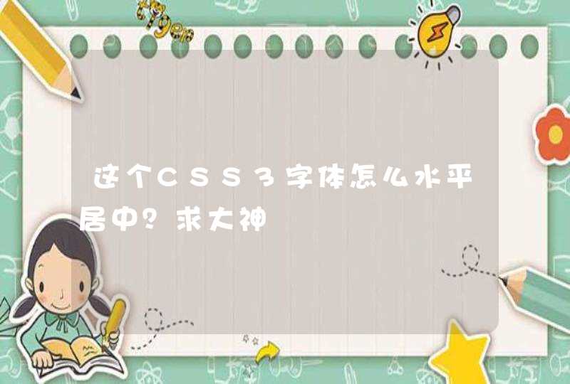
<div>你好</div>
</body>
</html>
根据你的图做的,应该合适了。