


border-radius 就是圆角样式,不过这个样式并不兼容所有浏览器,建议你用图片代替或者换其他的样式样子
html结构如下:<div class="wrap">
<div class="circle"></div>
<div class="top"></div>
<div class="bottom"></div>
</div>
实现的思路就是:
1. 首先定义外层容器大小,本例采用200x200,
.wrap{
position: relative
width: 200px
height: 200px
}
2. 通过border-radius画一个圆环,这个比较简单
.circle{
height: 100%
box-sizing: border-box
border: 20px solid red
border-radius: 50%
}
效果如下:
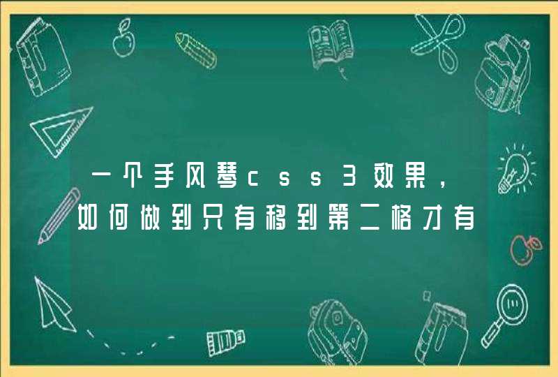
2. 然后用上下两层挡板遮住这个圆环,通过旋转挡板将圆环慢慢露出,过程如下图所示:
通过将下层挡板旋转180deg就能够实现将下半圆慢慢画出的效果,画完以后就需要将其隐藏起来,那该如何实现呢?
这里我用了opacity这个属性,当100%时将其设置为0,同时设置animation-fill-mode: forwards这样就隐藏了
0%{
transform: rotate( 0 )
}
99%{
transform: rotate( 180deg )
opacity: 1
}
100%{
transform: rotate( 180deg )
opacity: 0
}
3. 那如何显示上半圆呢?同样的思路我们对上面挡板进行旋转,通过实际效果我们可以看到,虽然上半圆露出来了,但是确把下半圆给遮挡了。
如何解决这个问题呢?
我们可以在下半圆和挡板间再放一个半圆,同时设置他们的z-index,让上面的挡板旋转时被下半圆遮住,这样就可以了。
说的有些复杂,相当于我们现在有四个元素:上挡板,下挡板,底部的大圆环,一个处在下挡板和大圆环间的半圆。
它们的z-index如下:
上挡板:1
下挡板和底部的大圆间的半圆:2
下挡板:3
为了不增加额外的元素,下挡板和底部的大圆间的半圆我们通过伪元素来实现
.circle:before{
content: ''
position: absolute
display: block
width: 100%
height: 50%
box-sizing: border-box
top: 50%
left: 0
border: 20px solid red
border-top: transparent
border-radius: 0 0 50% 50%/ 0 0 100% 100%
z-index: 2
}
4. 组后再结合css3的transform动画就可以了,需要注意的是,上挡板和下挡板动画是同时开始了,所以上挡板的动画要设置一个延时,时长就是下挡板动画的时长
本例用到的知识点如下:
1. 如何画一个圆环
2. 如何画一个半圆
3. css3动画
4. 定位
最终代码如下:
<!DOCTYPE html>
<html>
<head>
<meta http-equiv="X-UA-Compatible" content="IE=edge,chrome=1">
<meta http-equiv="content-type" content="text/htmlcharset=utf-8">
<title>动态画一个圆环</title>
<style>
*{
margin: 0padding: 0
}
.wrap{
position: relative
width: 200px
height: 200px
}
.circle{
height: 100%
box-sizing: border-box
border: 20px solid red
border-radius: 50%
}
.circle:before{
content: ''
position: absolute
display: block
width: 100%
height: 50%
box-sizing: border-box
top: 50%
left: 0
border: 20px solid red
border-top: transparent
border-radius: 0 0 50% 50%/ 0 0 100% 100%
z-index: 2
}
.top, .bottom{
position: absolute
left: 0px
width: 100%
height: 50%
box-sizing: border-box
background: white
}
.top{
top: 0
z-index: 1
transform-origin: center bottom
animation: 1s back-half linear 1s
animation-fill-mode: forwards
}
.bottom{
z-index: 3
top: 50%
transform-origin: center top
animation: 1s front-half linear
animation-fill-mode: forwards
}
@keyframes front-half{
0%{
transform: rotate( 0 )
}
99%{
transform: rotate( 180deg )
opacity: 1
}
100%{
transform: rotate( 180deg )
opacity: 0
}
}
@keyframes back-half{
0%{
transform: rotate( 0 )
}
99%{
transform: rotate( 180deg )
opacity: 1
}
100%{
transform: rotate( 180deg )
opacity: 0
}
}
</style>
</head>
<body>
<div class="wrap">
<div class="circle"></div>
<div class="top"></div>
<div class="bottom"></div>
</div>
</body>
</html>
<!DOCTYPE html><html>
<head>
<meta charset="utf-8">
<title>四色空心圆环</title>
<style>
*{ padding:0margin:0font-size:14px }
/* 第一种 */
.wai{ width: 360pxheight: 360pxposition: relativemargin: 120px autoborder-radius: 50%overflow:hidden }
.nei{ width: 160pxheight: 160pxline-height:160pxtext-align:centerbackground-color: #FFFborder-radius: 50%position: absolutemargin: autoleft:0right:0top:0bottom:0 }
.wai .fx{ width: 100%height:100%position:absolutetransform:rotate(45deg) }
.top{ background: #FF00FFwidth: 180pxheight:180pxposition: absolutetop:0left:0 }
.right{ background: #7B4DB1width: 180pxheight:180pxposition: absolutetop:0right:0 }
.bottom{ background: #1AA260width: 180pxheight:180pxposition: absolutebottom:0right:0 }
.left{ background: #20647Dwidth: 180pxheight:180pxposition: absolutebottom:0left:0 }
/* 第二种 */
.ease{
width: 360pxheight: 360pxmargin: 120px autoborder:100px solid redborder-radius:50%overflow:hidden
box-sizing:border-boxline-height:160pxtext-align:center
border-top-color: #FF00FFborder-right-color: #7B4DB1border-bottom-color: #1AA260border-left-color: #20647D
}
</style>
</head>
<body>
<!-- 第一种 -->
<div class="wai">
<div class="fx">
<div class="top"></div>
<div class="right"></div>
<div class="bottom"></div>
<div class="left"></div>
</div>
<div class="nei">Hello</div>
</div>
<!-- 第二种 -->
<div class="ease">Hello</div>
</body>
</html>