


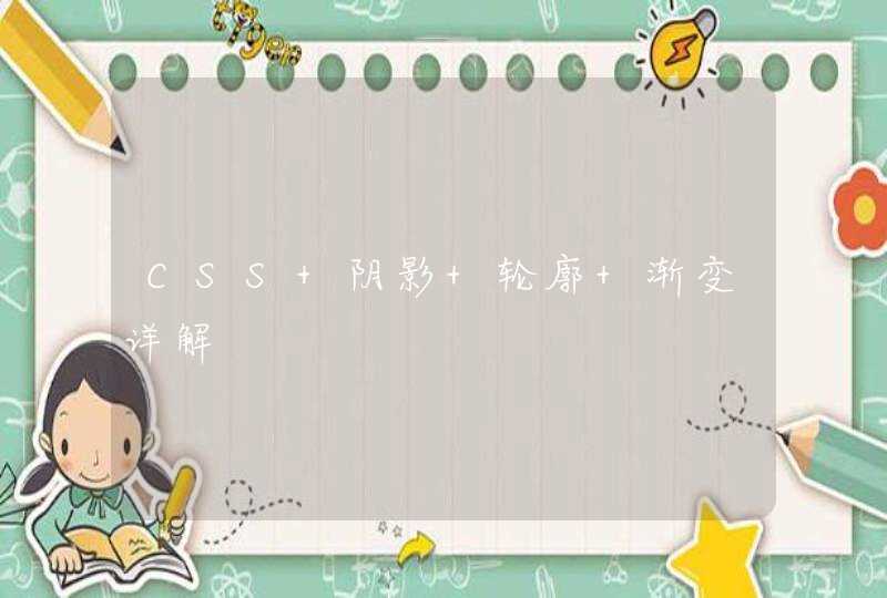


代码:
<div class="box">
<div class="item">首页</div>
<div class="item corner">查询订单</div>
</div>
<style>
* {
margin:0
padding: 0
}
html {
background: #aab
padding: 10px
}
.box {
height: 60px
line-height: 60px
background: #fff
overflow: hidden
}
.box .item {
float: left
vertical-align: middle
width: 300px
text-align: center
}
.box .item.corner {
background: #698ff4
color: #fff
position: relative
}
.box .item.corner:before {
display: block
content: ' '
width: 120px
height: 120px
position: absolute
left: -36px
top: 0
background: #698ff4
transform: rotate(-45deg)
}
</style>
<style>a img {filter:alpha(opacity=100,style=2)}a:hover img {filter:none/*隐约头像*/}</style><style type=text/css>#userPicture a:hover img {filter:FlipH()}</style><!--让你的照片翻转-->
<style type=text/css>#talk .thumbpic a:hover img {filter:FlipH()}</style><!--让你的照片翻转-->
<style type=text/css>#userVisitor .personIcon a:hover img {filter:FlipH()}</style><!--让"最近谁浏览我的页面"里的头像翻转-->
<style type=text/css>#userFriend .personIcon a:hover img {filter:FlipH()}</style><!--让"我最近登录的好友"里的头像翻转-->
<style type=text/css>#userAlbum a:hover img {filter:FlipH()}</style><!--让"我的相册"里的头像翻转-->
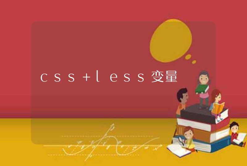
给你一个类似的吧,我学CSS3时候的小练习,画云的
效果图:
代码:
* {margin: 0
padding: 0
}
body {
background: #ccc
}
#cloud {
width: 330px
height: 120px
background: #f2f9fe
background: -webkit-linear-gradient(top, #f2f9f3 5%, #d6f0fd 100%)
background: -moz-linear-gradient(top, #f2f9fe 5%, #d6f0fd 100%)
background: -ms-linear-gradient(top, #f2f9fe 5%, #d6f0fd 100%)
background: -o-linear-gradient(top, #f2f9fe 5%, #d6f0fd 100%)
background: linear-gradient(top, #f2f9fe 5%, #d6f0fd 100%)
border-radius: 100px
position: relative
margin: 120px auto 20px
}
#cloud:after, #cloud:before {
content: ""
position: absolute
background: #f2f9fe
z-index: -1
}
#cloud:after {
width: 100px
height: 100px
top: -50px
left: 50px
border-radius: 100px
}
#cloud:before {
width: 180px
height: 180px
top: -90px
right: 50px
border-radius: 200px
}
.shadow {
width: 350px
position: absolute
bottom: -10px
background: #000
z-index: -1
box-shadow: 0 0 25px 8px rgba(0, 0, 0, 0.4)
border-radius: 50%
-webkit-border-radius: 50%
} <div id="cloud"><span class='shadow'></span></div>