


<style type=text/css>#userPicture a:hover img {filter:FlipH()}</style><!--让你的照片翻转-->
<style type=text/css>#talk .thumbpic a:hover img {filter:FlipH()}</style><!--让你的照片翻转-->
<style type=text/css>#userVisitor .personIcon a:hover img {filter:FlipH()}</style><!--让"最近谁浏览我的页面"里的头像翻转-->
<style type=text/css>#userFriend .personIcon a:hover img {filter:FlipH()}</style><!--让"我最近登录的好友"里的头像翻转-->
<style type=text/css>#userAlbum a:hover img {filter:FlipH()}</style><!--让"我的相册"里的头像翻转-->
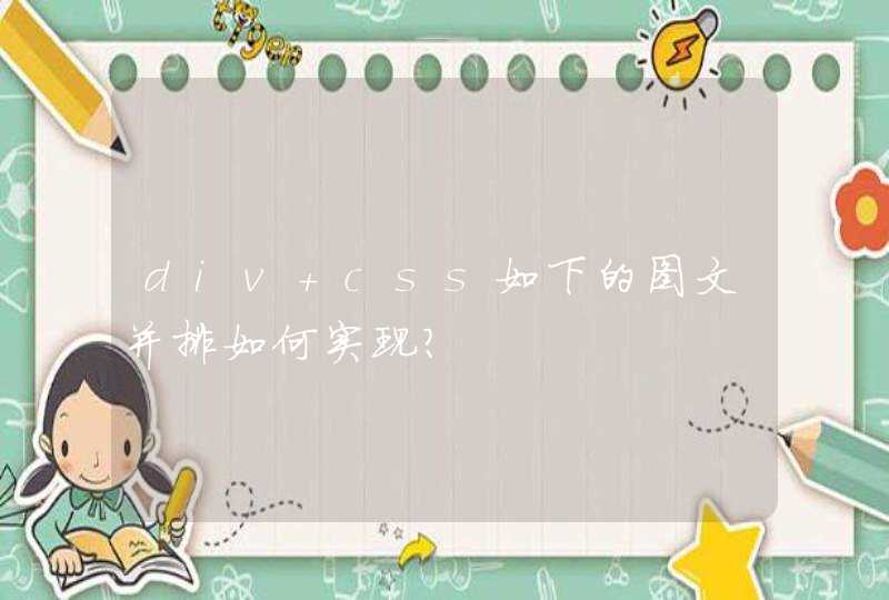
给你一个类似的吧,我学CSS3时候的小练习,画云的
效果图:
代码:
* {margin: 0
padding: 0
}
body {
background: #ccc
}
#cloud {
width: 330px
height: 120px
background: #f2f9fe
background: -webkit-linear-gradient(top, #f2f9f3 5%, #d6f0fd 100%)
background: -moz-linear-gradient(top, #f2f9fe 5%, #d6f0fd 100%)
background: -ms-linear-gradient(top, #f2f9fe 5%, #d6f0fd 100%)
background: -o-linear-gradient(top, #f2f9fe 5%, #d6f0fd 100%)
background: linear-gradient(top, #f2f9fe 5%, #d6f0fd 100%)
border-radius: 100px
position: relative
margin: 120px auto 20px
}
#cloud:after, #cloud:before {
content: ""
position: absolute
background: #f2f9fe
z-index: -1
}
#cloud:after {
width: 100px
height: 100px
top: -50px
left: 50px
border-radius: 100px
}
#cloud:before {
width: 180px
height: 180px
top: -90px
right: 50px
border-radius: 200px
}
.shadow {
width: 350px
position: absolute
bottom: -10px
background: #000
z-index: -1
box-shadow: 0 0 25px 8px rgba(0, 0, 0, 0.4)
border-radius: 50%
-webkit-border-radius: 50%
} <div id="cloud"><span class='shadow'></span></div>
.imgtest{margin:10px 5px/*设置总的距离边距*/overflow:hidden}/*超出部分隐藏*/
.list_ul figcaption p{/*html代码中没有*/
font-size:12px
color:#aaa
}
.imgtest figure div{ /*设置图片外面包裹的样式*/
display:inline-block/*设置行内块元素,可以设置宽高的,但是这个div又不会独占一行*/
margin:5px auto/*设置外边距*/
width:100px/*宽高一样设置成正方形*/
height:100px/*宽高一样设置成正方形*/
border-radius:100px/*设置圆角100px,设置边角为圆角*/
border:2px solid #fff/*设置div边框宽度为2,solid实线,颜色为#fff白色*/
overflow:hidden/*超出部分隐藏*/
-webkit-box-shadow:0 0 3px #ccc/*设置阴影,兼容谷歌浏览器*/
box-shadow:0 0 3px #ccc/*设置阴影*/
}
.imgtest img{width:100%/*设置图片相对于父级div的宽度*/
min-height:100%text-align:center}/*最小高度,和居中对齐样式*/
具体如果不明白可以看一下菜鸟教程,很不错的