


<div class="wrap">
<div class="circle"></div>
<div class="top"></div>
<div class="bottom"></div>
</div>
实现的思路就是:
1. 首先定义外层容器大小,本例采用200x200,
.wrap{
position: relative
width: 200px
height: 200px
}
2. 通过border-radius画一个圆环,这个比较简单
.circle{
height: 100%
box-sizing: border-box
border: 20px solid red
border-radius: 50%
}
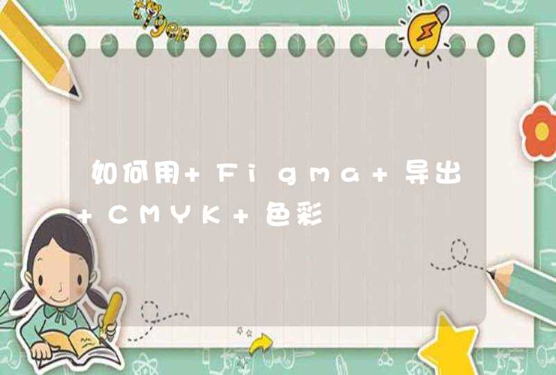
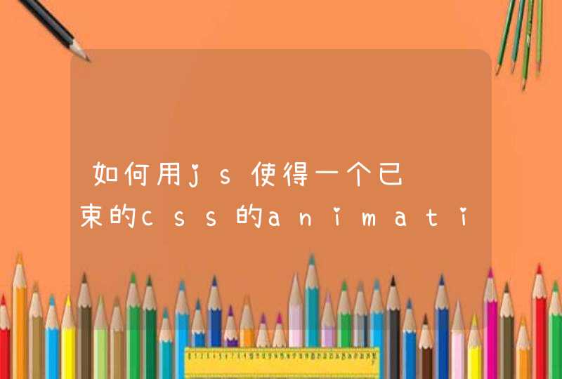
效果如下:
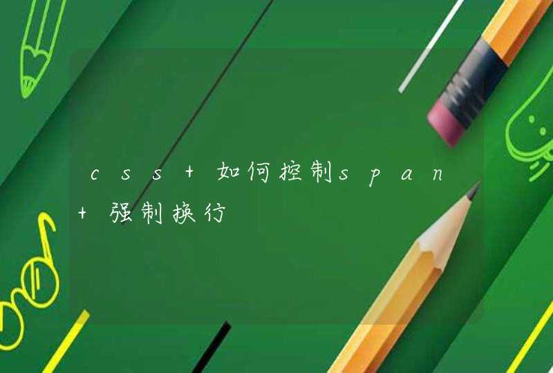
2. 然后用上下两层挡板遮住这个圆环,通过旋转挡板将圆环慢慢露出,过程如下图所示:
通过将下层挡板旋转180deg就能够实现将下半圆慢慢画出的效果,画完以后就需要将其隐藏起来,那该如何实现呢?
这里我用了opacity这个属性,当100%时将其设置为0,同时设置animation-fill-mode: forwards这样就隐藏了
0%{
transform: rotate( 0 )
}
99%{
transform: rotate( 180deg )
opacity: 1
}
100%{
transform: rotate( 180deg )
opacity: 0
}
3. 那如何显示上半圆呢?同样的思路我们对上面挡板进行旋转,通过实际效果我们可以看到,虽然上半圆露出来了,但是确把下半圆给遮挡了。
如何解决这个问题呢?
我们可以在下半圆和挡板间再放一个半圆,同时设置他们的z-index,让上面的挡板旋转时被下半圆遮住,这样就可以了。
说的有些复杂,相当于我们现在有四个元素:上挡板,下挡板,底部的大圆环,一个处在下挡板和大圆环间的半圆。
它们的z-index如下:
上挡板:1
下挡板和底部的大圆间的半圆:2
下挡板:3
为了不增加额外的元素,下挡板和底部的大圆间的半圆我们通过伪元素来实现
.circle:before{
content: ''
position: absolute
display: block
width: 100%
height: 50%
box-sizing: border-box
top: 50%
left: 0
border: 20px solid red
border-top: transparent
border-radius: 0 0 50% 50%/ 0 0 100% 100%
z-index: 2
}
4. 组后再结合css3的transform动画就可以了,需要注意的是,上挡板和下挡板动画是同时开始了,所以上挡板的动画要设置一个延时,时长就是下挡板动画的时长
本例用到的知识点如下:
1. 如何画一个圆环
2. 如何画一个半圆
3. css3动画
4. 定位
最终代码如下:
<!DOCTYPE html>
<html>
<head>
<meta http-equiv="X-UA-Compatible" content="IE=edge,chrome=1">
<meta http-equiv="content-type" content="text/htmlcharset=utf-8">
<title>动态画一个圆环</title>
<style>
*{
margin: 0padding: 0
}
.wrap{
position: relative
width: 200px
height: 200px
}
.circle{
height: 100%
box-sizing: border-box
border: 20px solid red
border-radius: 50%
}
.circle:before{
content: ''
position: absolute
display: block
width: 100%
height: 50%
box-sizing: border-box
top: 50%
left: 0
border: 20px solid red
border-top: transparent
border-radius: 0 0 50% 50%/ 0 0 100% 100%
z-index: 2
}
.top, .bottom{
position: absolute
left: 0px
width: 100%
height: 50%
box-sizing: border-box
background: white
}
.top{
top: 0
z-index: 1
transform-origin: center bottom
animation: 1s back-half linear 1s
animation-fill-mode: forwards
}
.bottom{
z-index: 3
top: 50%
transform-origin: center top
animation: 1s front-half linear
animation-fill-mode: forwards
}
@keyframes front-half{
0%{
transform: rotate( 0 )
}
99%{
transform: rotate( 180deg )
opacity: 1
}
100%{
transform: rotate( 180deg )
opacity: 0
}
}
@keyframes back-half{
0%{
transform: rotate( 0 )
}
99%{
transform: rotate( 180deg )
opacity: 1
}
100%{
transform: rotate( 180deg )
opacity: 0
}
}
</style>
</head>
<body>
<div class="wrap">
<div class="circle"></div>
<div class="top"></div>
<div class="bottom"></div>
</div>
</body>
</html>
CSS画正方形长方形很简单,本文就不说了。
一、三角形
1、CSS画等腰三角形
2、画直角三角形:
二、画圆形
注意:border-radius是width/height的一半(50%)。
画半圆:
半圆的画法是把高度设为宽度的一半,并且也只设置左上角和右上角的半径,且半径为宽度的一半。
画四分之一圆:是把高度和宽度设置为相等,只设置一个圆角,其半径等于高度或宽度。
三、画椭圆
斜杠前面的一组四个值分别表示四个角的水平半径;斜杠后面的一组四个值分别表示四个角的垂直半径。
四、平行四边形
margin-left是为了使得平行四边形可以全部在浏览器中显示出来
五、梯形
高度为0。有宽度没高度。
六、五边形、六边形