


.grup{
padding-top: 104px
position: relative
border-radius: 15px
margin-bottom: 217px
}
.grup .img{
width: 370px
height: 87px
position: absolute
top:-48px
margin-left: calc(50% - 185px)
z-index:999
background: linear-gradient(
115deg, /*背景分割倾斜角度*/
#fff 0%,
#fff 40%,
#3596EB 40%,
#3596EB 100%
)
border: 4px solid #3596EB
border-radius: 44px
}
.grup .img .coun{
display: flex
justify-content: space-around
}
.grup .img .coun div{
display: flex
line-height: 88px
}
.grup .img .coun .left{
color:#3596EB
font-size: 32px
letter-spacing: 3px
font-weight: 500
}
.grup .img .coun .right{
color:#fff
font-size: 28px
letter-spacing: 3px
font-weight: 500
}
HTML:
<div class="up grup">
<div class="img">
<div class="coun">
<div class="left">新建</div>
<div class="right">所有文集</div>
</div>
</div>
</div>
效果:
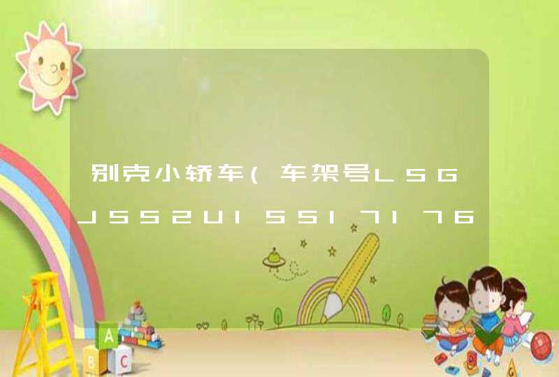
在Application标签中添加一个BorderContainer,长宽100%,为这个BorderContainer赋值属性backgroundImage = "xxxx.jpg" 写上图片所在位置。添加代码:
<s:BorderContainer width="100%" height="100%" backgroundImage="@Embed(source='assets/untitled.png')">
</s:BorderContainer>
整体示例:
<?xml version="1.0" encoding="utf-8"?>
<s:Application xmlns:fx="
xmlns:s="library://ns.adobe.com/flex/spark"
xmlns:mx="library://ns.adobe.com/flex/mx"
minWidth="955" minHeight="600">
<s:BorderContainer width="100%" height="100%" backgroundImage="@Embed(source='assets/untitled.png')">
//内容
</s:BorderContainer>
</s:Application>
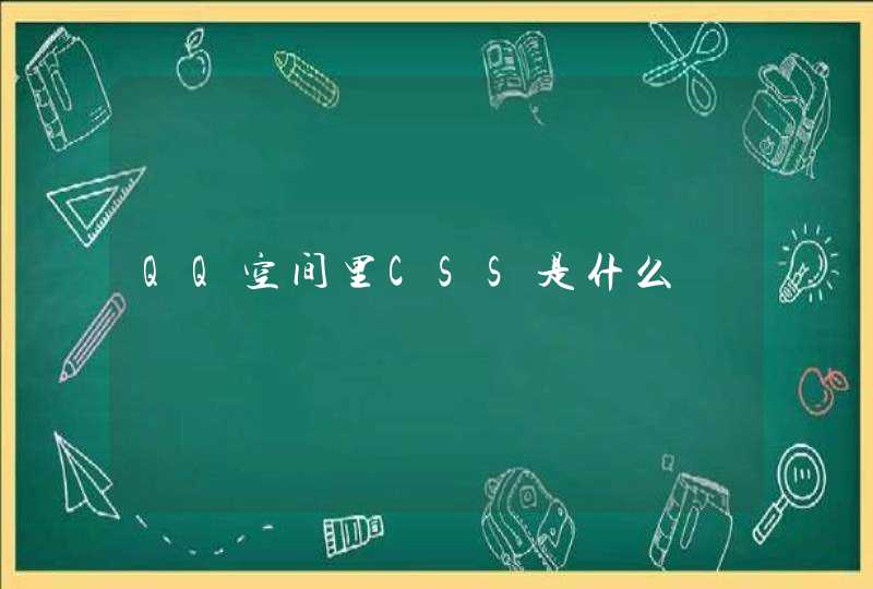
先看看等分的布局方案
1. float
兼容性较好(IE 8以上)
**2. flex **
兼容性较差(flex属于css3)
兼容性:IE8及以上
3. table
兼容性:可以兼容 IE 8
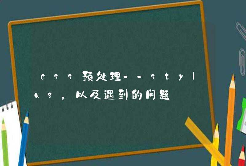
1. table
利用 table 的特性——每列等宽
2. flex
3. float
伪等高(只有背景显示高度相等),左右真实的高度其实不相等。 兼容性较好。