


#book{
width:300pxheight:20pxborder-bottom:2px solid #000000
-webkit-transform: rotate(45deg)/*Safari 4+,Google Chrome 1+ */
-moz-transform: rotate(45deg)/*Firefox 3.5+*/
filter: progid:DXImageTransform.Microsoft.BasicImage(Rotation=0.45)
}
</style>
<div id="book">
</div>
当然方法还有很多种,比如用满边框,再在上面叠加一个小一点的满边框就出来斜线了。
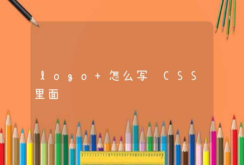
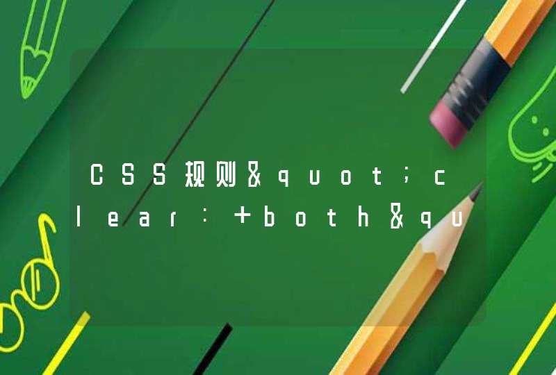
在CSS中也可以定义文字是否显示为斜体,倾斜看起来很容易理解,实际上它比通常想象的要复杂一些。正常字体与“意大利体”,及“倾斜体”的对比
一种称为italic,即意大利体。我们平常说的倾斜都是指“意大利体”,这也就是为什么在各种文字处理软件上,字体倾斜的按钮上面大都使用字母“I”来表示的原因。
另一种称为oblique,即真正的倾斜。这就是把一个字母向右边倾斜一定角度产生的效果,类似于图1右图显示的效果。这里说“类似于”,是因为Windows操作系统中并没有实现oblique方式的字体,只是找了一个接近它的字体来示意。
<!DOCTYPE html PUBLIC "-//W3C//DTD XHTML 1.0 Transitional//EN" "http://www.w3.org/TR/xhtml1/DTD/xhtml1-transitional.dtd">
<html xmlns="http://www.w3.org/1999/xhtml">
<head>
<meta http-equiv="Content-Type" content="text/htmlcharset=utf-8" />
<title>体验CSS</title>
<style type="text/css">
h1{font-family:黑体}
p{font-family: Arial, "Times New Roman"}
#p1{font-style:italic/*新增的设置*/}
</style>
</head>
<body>
<h1>互联网发展的起源</h1>
<p id="p1">A very simple ascii map of the first network link on ARPANET between UCLA and SRI taken from RFC-4 Network Timetable, by Elmer B. Shapiro, March 1969.</p>
<p id="p2">1969年,为了保障通信联络,美国国防部高级研究计划署ARPA资助建立了世界上第一个分组交换试验网ARPANET,连接美国四个大学。ARPANET的建成和不断发展标志着计算机网络发展的新纪元。</p>
</body>
</html>
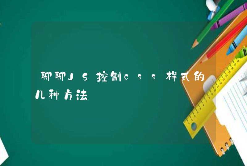
能,一种是使用css样式:先画一条横线或竖线,然后将这条线旋转一定角度得到斜线。代码如下:<style>
#book{width:300pxheight:20pxborder-bottom:1px solid #000000-webkit-transform: rotate(45deg)/*Safari 4+,Google Chrome 1+ */-moz-transform: rotate(45deg)/*Firefox 3.5+*/filter: progid:DXImageTransform.Microsoft.BasicImage(Rotation=0.45)}</style><div id="book"></div>
另外一种需要使用canvas标签,通过js实现:先画一块画板,再通过两点定位直接在画板上画线。代码如下:
<canvas id="myline" style="width:500pxheight:500px">
</canvas>
<script>
var c=document.getElementById("myline")
var ctx=c.getContext("2d")
ctx.beginPath()
ctx.moveTo(0,0)
ctx.lineTo(300,150)
ctx.stroke()
</script>