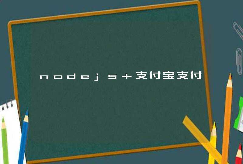


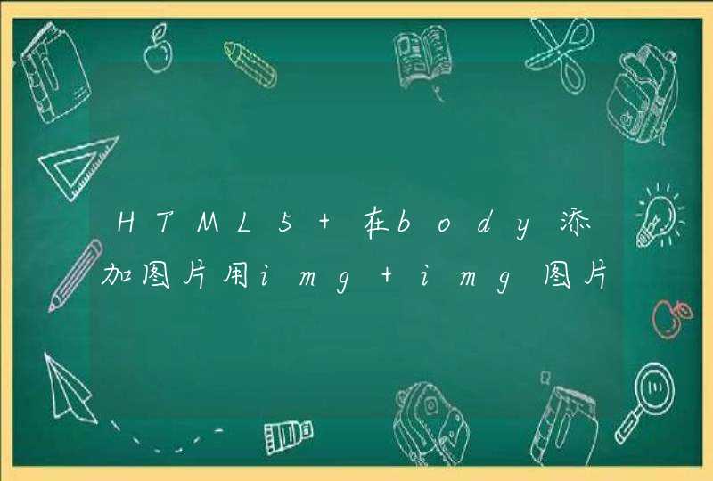


<div class="meter">
<span style="width: 25%"></span>
</div>
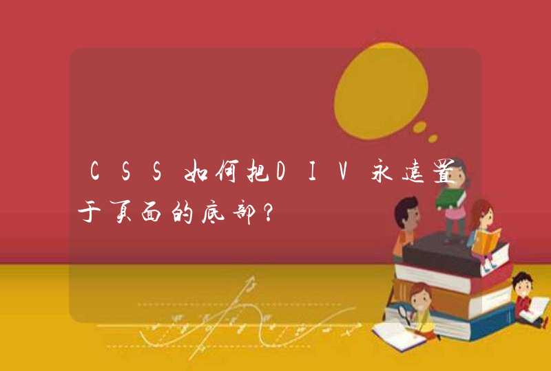
.meter {
height: 20px /* Can be anything */
position: relative
background: #555
-moz-border-radius: 25px
-webkit-border-radius: 25px
border-radius: 25px
padding: 10px
box-shadow: inset 0 -1px 1px rgba(255,255,255,0.3)
}
.meter >span {
display: block
height: 100%
border-top-right-radius: 8px
border-bottom-right-radius: 8px
border-top-left-radius: 20px
border-bottom-left-radius: 20px
background-color: rgb(43,194,83)
background-image: linear-gradient(
center bottom,
rgb(43,194,83) 37%,
rgb(84,240,84) 69%
)
box-shadow:
inset 0 2px 9px rgba(255,255,255,0.3),
inset 0 -2px 6px rgba(0,0,0,0.4)
position: relative
overflow: hidden
}
.orange >span {
background-color: #f1a165
background-image: linear-gradient(to bottom, #f1a165, #f36d0a)
}
.red >span {
background-color: #f0a3a3
background-image: linear-gradient(to bottom, #f0a3a3, #f42323)
}
.meter >span:after {
content: ""
position: absolute
top: 0left: 0bottom: 0right: 0
background-image: linear-gradient(
-45deg,
rgba(255, 255, 255, .2) 25%,
transparent 25%,
transparent 50%,
rgba(255, 255, 255, .2) 50%,
rgba(255, 255, 255, .2) 75%,
transparent 75%,
transparent
)
z-index: 1
background-size: 50px 50px
animation: move 2s linear infinite
border-top-right-radius: 8px
border-bottom-right-radius: 8px
border-top-left-radius: 20px
border-bottom-left-radius: 20px
overflow: hidden
}
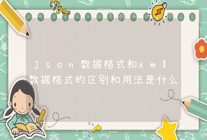
<body>
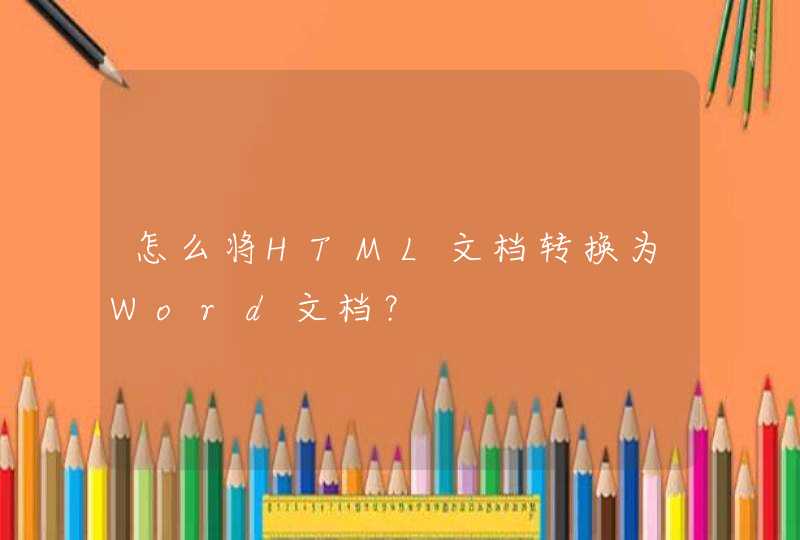
<div style=" width:50pxheight:50pxbackground-color:#F00border-radius:25px">
<span style="height:50pxline-height:50pxdisplay:blockcolor:#FFFtext-align:center">4</span>
</div>
</body>
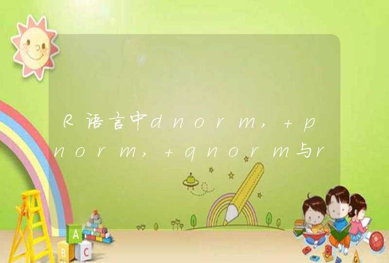
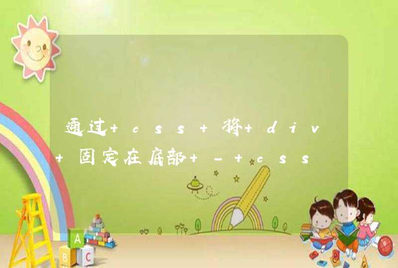
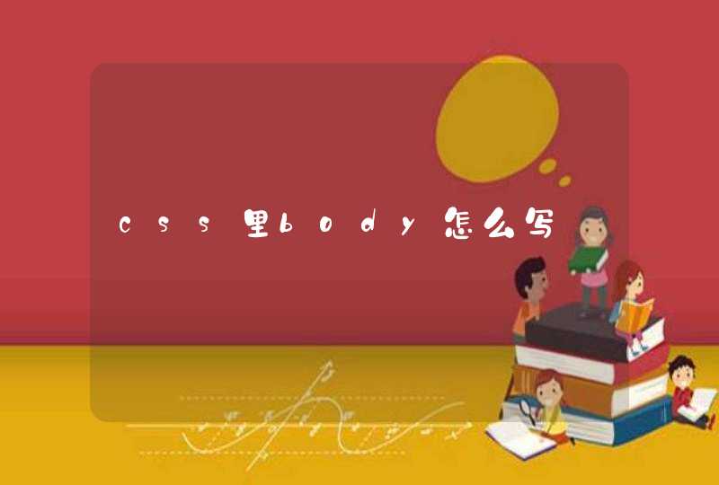
首先我们需要分析一下整个牌的构造,以普通数字牌1为例,共可分为5个部分,分别是1、外框2、颜色3、上下角标数字4、里面的白色椭圆5、中间的大数字
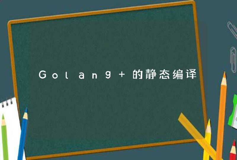
对应不同的部分,我们将其分解为5部分的html代码并为其添加class,1、卡牌背景2、卡牌颜色(由于布局相同只有颜色不同,故将颜色抽出成为单独的类)3、上下角标数字4、白色椭圆背景5、大数字
以下均采用代码和效果图对比的方式展示效果
布好局之后,为其添加样式。首先新建css样式表,并将其关联至html文件
首先写背景的样式,按牌的比例写出宽高,留白使用padding来写,css3的新特性我们使用了如图的圆角和阴影,为牌制造立体的感觉
然后来写牌的背景颜色,Uno牌一共有黑红黄绿蓝5种颜色,因此我们只需要事先定义好这五种颜色,之后将其对应的类名添加进来就可以了。
另外,因为上下角标的数字需要使用绝对定位,因此它们的父级元素就需要定义为相对定位
下面来写上下角标的数字,由于这里使用的是em行内元素标签,因此设置宽高的时候要记得display:inline-block。
绝对定位到需要的位置,然后将右下角的数字使用css3的旋转函数180度旋转,就可以制造出倒过来的数字了
中间的白色椭圆要怎么画呢,我们知道border-radius的值与宽高相等可以画出圆形,那么当它的值为宽的一半比高的一半时,则可以画出椭圆形,这时我们再将它旋转到合适的角度,就可以得到想要的椭圆
最后就是中间的数字,由于它是椭圆形的子元素,因此椭圆形旋转的时候,它也跟着一起旋转,要想让它摆在一个比较正的位置,还应将它旋转回来。并为它挑选一个合适的字体
至此,我们的普通数字牌已经写好了