


overflow:hidden}/*超出部分隐藏*/
.list_ul figcaption p{/*html代码中没有*/
font-size:12px
color:#aaa
}
.imgtest figure div{ /*设置图片外面包裹的样式*/
display:inline-block/*设置行内块元素,可以设置宽高的,但是这个div又不会独占一行*/
margin:5px auto/*设置外边距*/
width:100px/*宽高一样设置成正方形*/
height:100px/*宽高一样设置成正方形*/
border-radius:100px/*设置圆角100px,设置边角为圆角*/
border:2px solid #fff/*设置div边框宽度为2,solid实线,颜色为#fff白色*/
overflow:hidden/*超出部分隐藏*/
-webkit-box-shadow:0 0 3px #ccc/*设置阴影,兼容谷歌浏览器*/
box-shadow:0 0 3px #ccc/*设置阴影*/
}
.imgtest img{width:100%/*设置图片相对于父级div的宽度*/
min-height:100%text-align:center}/*最小高度,和居中对齐样式*/
具体如果不明白可以看一下菜鸟教程,很不错的
<html><head>
<title>圆形头像的制作</title>
<style type="text/css">
.imgtest{margin:10px 5px
overflow:hidden}
.list_ul figcaption p{
font-size:12px
color:#aaa
}
.imgtest figure div{
display:inline-block
margin:5px auto
width:100px
height:100px
border-radius:100px
border:2px solid #fff
overflow:hidden
-webkit-box-shadow:0 0 3px #ccc
box-shadow:0 0 3px #ccc
}
.imgtest img{width:100%
min-height:100% text-align:center}
</style>
</head>
<body >
<div class="imgtest">
<figure>
<div>
<img src="head.jpg" />
</div>
</figure>
</div>
</body>
</html>
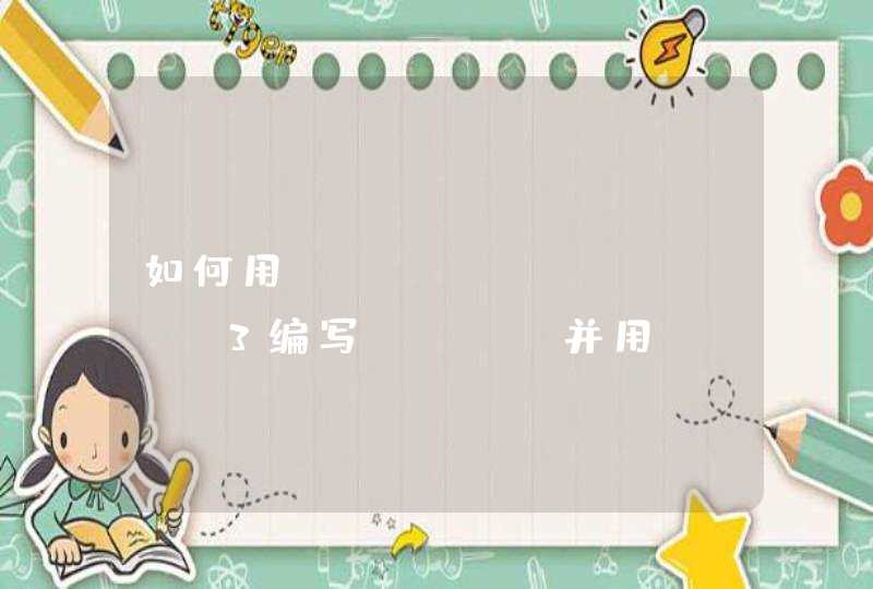
随便打开一张人物图片,然后复制图层,把背景色填充为白色(或者其他你喜欢的颜色)使用圆形选择工具,按住Shift键拉出一个正圆选中图片中你要保留的部分
在图层面板下方第三项添加蒙版
得出最终效果如下图