


ie
使用固定的渲染模式:
代码如下:
<metahttp-equiv="x-ua-compatible"content="ie=8"><!--以ie8模式渲染-->
<metahttp-equiv="x-ua-compatible"content="ie=7"><!--以ie7模式渲染-->
还
有一种情况,在ie8下只有不使用兼容模式页面才能显示正常,但是如果设定为ie8的模式,在ie9中却会导致css3失效。看来,需要针对
ie8、ie9
分别
禁用兼容模式。怎么办呢?可以在后台判断浏览器版本,如果是ie8就输出content="ie=8",如果是ie9就输出
content="ie=9"。其实还可以单纯通过html来实现的,html代码如下:
<metahttp-equiv="x-ua-compatible"content="ie=9
ie=8
ie=7
ie=edge">
IE6~8不支持CSS3 Media Query,需要借助respond.js插件。
respond.js插件下载地址:https://www.developgeek.com/plus/list.php?tid=62
demo.css 样式文件
html,body {height: 100%
}
@media only screen and (min-width: 480px){
body {
background: yellow
}
}
@media only screen and (min-width: 640px) and (max-width: 1024px) {
body {
background: green
}
}
@media screen and (min-width: 1024px){
body {
background: blue
}
}
respond.js demo实例
<!doctype html><html>
<head>
<meta charset="UTF-8">
<title>HTML5-响应式布局--respond.js-言成科技&HTML5学堂</title>
<link rel="stylesheet" type="text/css" href="demo.css" />
<script src="respond.min.js"></script>
</head>
<body>
<div class="wrap" id="con">
让IE6~8支持响应式布局——言成科技&HTML5学堂
</div>
</body>
</html>
注意:respond.min.js或者respond.src.js都可以使用,在上面给出的下载地址中下载即可。
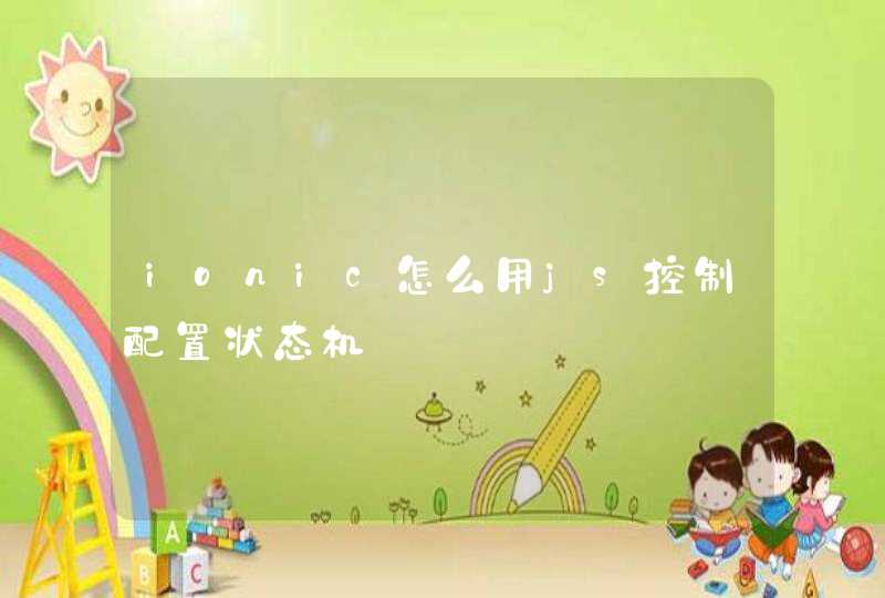
IE6的显示效果
Tips:IE7-8的显示效果也是没有问题的,在此就不贴图处理了