


第二个解释的比较详细
给你一个类似的吧,我学CSS3时候的小练习,画云的
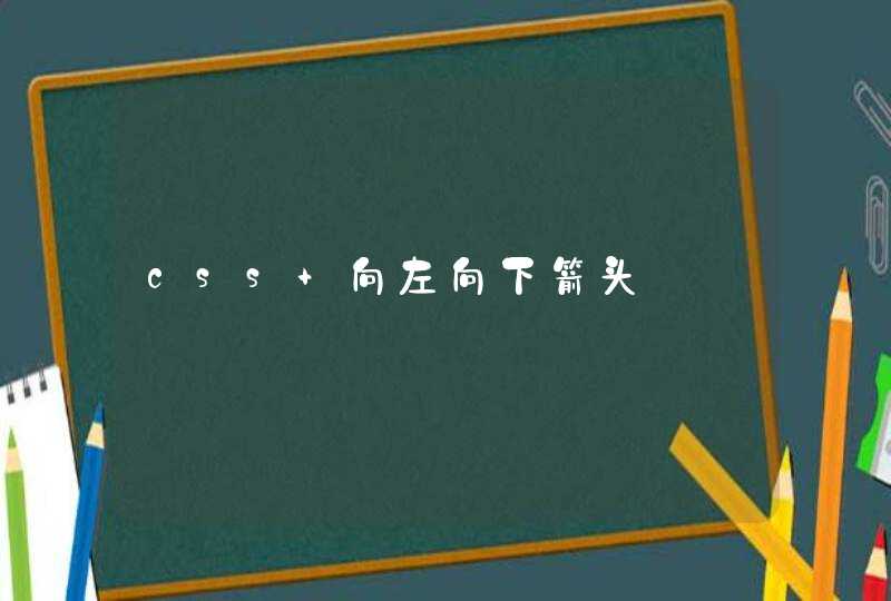
效果图:
代码:
* {margin: 0
padding: 0
}
body {
background: #ccc
}
#cloud {
width: 330px
height: 120px
background: #f2f9fe
background: -webkit-linear-gradient(top, #f2f9f3 5%, #d6f0fd 100%)
background: -moz-linear-gradient(top, #f2f9fe 5%, #d6f0fd 100%)
background: -ms-linear-gradient(top, #f2f9fe 5%, #d6f0fd 100%)
background: -o-linear-gradient(top, #f2f9fe 5%, #d6f0fd 100%)
background: linear-gradient(top, #f2f9fe 5%, #d6f0fd 100%)
border-radius: 100px
position: relative
margin: 120px auto 20px
}
#cloud:after, #cloud:before {
content: ""
position: absolute
background: #f2f9fe
z-index: -1
}
#cloud:after {
width: 100px
height: 100px
top: -50px
left: 50px
border-radius: 100px
}
#cloud:before {
width: 180px
height: 180px
top: -90px
right: 50px
border-radius: 200px
}
.shadow {
width: 350px
position: absolute
bottom: -10px
background: #000
z-index: -1
box-shadow: 0 0 25px 8px rgba(0, 0, 0, 0.4)
border-radius: 50%
-webkit-border-radius: 50%
} <div id="cloud"><span class='shadow'></span></div>