


HTML代码
<html xmlns="http://www.w3.org/1999/xhtml"><head>
<title>用CSS3动画给一个小球创建跳跃的动画效果</title>
<link rel="stylesheet" type="text/css" href="index.css" />
</head>
<body>
<section class="main">
<div id="ballWrapper">
<div id="ball"></div>
<div id="ballShadow"></div>
</div>
</section>
</body>
</html>
CSS代码(创建一个与html同目录的index.css文件)
#ballWrapper{position:fixedtop:35%left:50%z-index:100margin-left:-70pxwidth:140pxheight:300pxcursor:pointer-webkit-transition:all 5s linear 0s-moz-transition:all 5s linear 0stransition:all 5s linear 0s-webkit-transform:scale(1)-moz-transform:scale(1)-o-transform:scale(1)transform:scale(1)-ms-transform:scale(1)}#ballWrapper:active{cursor:pointer-webkit-transform:scale(0)-moz-transform:scale(0)-o-transform:scale(0)transform:scale(0)-ms-transform:scale(0)}
#ball{position:absolutetop:0z-index:11width:140pxheight:140pxborder-radius:70pxbackground:#bbbbackground:url(data:image/svg+xml background: -webkit-gradient(linear, left top, left bottom, color-stop(0%,rgba(187,187,187,1)), color-stop(99%,rgba(119,119,119,1))) background: -webkit-linear-gradient(top, rgba(187,187,187,1) 0%,rgba(119,119,119,1) 99%) background: -o-linear-gradient(top, rgba(187,187,187,1) 0%,rgba(119,119,119,1) 99%) background: -ms-linear-gradient(top, rgba(187,187,187,1) 0%,rgba(119,119,119,1) 99%) background: linear-gradient(top, rgba(187,187,187,1) 0%,rgba(119,119,119,1) 99%) box-shadow: inset 0 -5px 15px rgba(255,255,255,0.4), inset -2px -1px 40px rgba(0,0,0,0.4), 0 0 1px #000 cursor: pointer base64,PD94bWwgdmVyc2lvbj0iMS4wIiA/Pgo8c3ZnIHhtbG5zPSJodHRwOi8vd3d3LnczLm9yZy8yMDAwL3N2ZyIgd2lkdGg9IjEwMCUiIGhlaWdodD0iMTAwJSIgdmlld0JveD0iMCAwIDEgMSIgcHJlc2VydmVBc3BlY3RSYXRpbz0ibm9uZSI+CiAgPGxpbmVhckdyYWRpZW50IGlkPSJncmFkLXVjZ2ctZ2VuZXJhdGVkIiBncmFkaWVudFVuaXRzPSJ1c2VyU3BhY2VPblVzZSIgeDE9IjAlIiB5MT0iMCUiIHgyPSIwJSIgeTI9IjEwMCUiPgogICAgPHN0b3Agb2Zmc2V0PSIwJSIgc3RvcC1jb2xvcj0iI2JiYmJiYiIgc3RvcC1vcGFjaXR5PSIxIi8+CiAgICA8c3RvcCBvZmZzZXQ9Ijk5JSIgc3RvcC1jb2xvcj0iIzc3Nzc3NyIgc3RvcC1vcGFjaXR5PSIxIi8+CiAgPC9saW5lYXJHcmFkaWVudD4KICA8cmVjdCB4PSIwIiB5PSIwIiB3aWR0aD0iMSIgaGVpZ2h0PSIxIiBmaWxsPSJ1cmwoI2dyYWQtdWNnZy1nZW5lcmF0ZWQpIiAvPgo8L3N2Zz4=)background:-moz-linear-gradient(top,rgba(187,187,187,1) 0,rgba(119,119,119,1) 99%)filter:progid:DXImageTransform.Microsoft.gradient( startColorstr='#bbbbbb', endColorstr='#777777', GradientType=0 )-webkit-animation:jump 1s infinite-moz-animation:jump 1s infinite-o-animation:jump 1s infinite-ms-animation:jump 1s infiniteanimation:jump 1s infinite}
#ball::after{position:absolutetop:10pxleft:30pxz-index:10width:80pxheight:40pxborder-radius:40px/20pxbackground:url(data:image/svg+xml background: -webkit-gradient(linear, left top, left bottom, color-stop(0%,rgba(232,232,232,1)), color-stop(1%,rgba(232,232,232,1)), color-stop(100%,rgba(255,255,255,0))) background: -webkit-linear-gradient(top, rgba(232,232,232,1) 0%,rgba(232,232,232,1) 1%,rgba(255,255,255,0) 100%) background: -o-linear-gradient(top, rgba(232,232,232,1) 0%,rgba(232,232,232,1) 1%,rgba(255,255,255,0) 100%) background: -ms-linear-gradient(top, rgba(232,232,232,1) 0%,rgba(232,232,232,1) 1%,rgba(255,255,255,0) 100%) background: linear-gradient(top, rgba(232,232,232,1) 0%,rgba(232,232,232,1) 1%,rgba(255,255,255,0) 100%) content: "" base64,PD94bWwgdmVyc2lvbj0iMS4wIiA/Pgo8c3ZnIHhtbG5zPSJodHRwOi8vd3d3LnczLm9yZy8yMDAwL3N2ZyIgd2lkdGg9IjEwMCUiIGhlaWdodD0iMTAwJSIgdmlld0JveD0iMCAwIDEgMSIgcHJlc2VydmVBc3BlY3RSYXRpbz0ibm9uZSI+CiAgPGxpbmVhckdyYWRpZW50IGlkPSJncmFkLXVjZ2ctZ2VuZXJhdGVkIiBncmFkaWVudFVuaXRzPSJ1c2VyU3BhY2VPblVzZSIgeDE9IjAlIiB5MT0iMCUiIHgyPSIwJSIgeTI9IjEwMCUiPgogICAgPHN0b3Agb2Zmc2V0PSIwJSIgc3RvcC1jb2xvcj0iI2U4ZThlOCIgc3RvcC1vcGFjaXR5PSIxIi8+CiAgICA8c3RvcCBvZmZzZXQ9IjElIiBzdG9wLWNvbG9yPSIjZThlOGU4IiBzdG9wLW9wYWNpdHk9IjEiLz4KICAgIDxzdG9wIG9mZnNldD0iMTAwJSIgc3RvcC1jb2xvcj0iI2ZmZmZmZiIgc3RvcC1vcGFjaXR5PSIwIi8+CiAgPC9saW5lYXJHcmFkaWVudD4KICA8cmVjdCB4PSIwIiB5PSIwIiB3aWR0aD0iMSIgaGVpZ2h0PSIxIiBmaWxsPSJ1cmwoI2dyYWQtdWNnZy1nZW5lcmF0ZWQpIiAvPgo8L3N2Zz4=)background:-moz-linear-gradient(top,rgba(232,232,232,1) 0,rgba(232,232,232,1) 1%,rgba(255,255,255,0) 100%)filter:progid:DXImageTransform.Microsoft.gradient( startColorstr='#e8e8e8', endColorstr='#00ffffff', GradientType=0 )}
#ballShadow{position:absolutebottom:0left:50%z-index:10margin-left:-30pxwidth:60pxheight:75pxborder-radius:30px/40pxbackground:rgba(20,20,20,.1)box-shadow:0 0 20px 35px rgba(20,20,20,.1)-webkit-transform:scaleY(.3)-moz-transform:scaleY(.3)-o-transform:scaleY(.3)transform:scaleY(.3)-ms-transform:scaleY(.3)-webkit-animation:shrink 1s infinite-moz-animation:shrink 1s infinite-o-animation:shrink 1s infinite-ms-animation:shrink 1s infiniteanimation:shrink 1s infinite}
@-webkit-keyframes jump{0%{top:0-webkit-animation-timing-function:ease-in}
50%{top:140pxheight:140px-webkit-animation-timing-function:ease-out}
55%{top:160pxheight:120pxborder-radius:70px/60px-webkit-animation-timing-function:ease-in}
65%{top:120pxheight:140pxborder-radius:70px-webkit-animation-timing-function:ease-out}
95%{top:0-webkit-animation-timing-function:ease-in}
100%{top:0-webkit-animation-timing-function:ease-in}
}
@-moz-keyframes jump{0%{top:0-moz-animation-timing-function:ease-in}
50%{top:140pxheight:140px-moz-animation-timing-function:ease-out}
55%{top:160pxheight:120pxborder-radius:70px/60px-moz-animation-timing-function:ease-in}
65%{top:120pxheight:140pxborder-radius:70px-moz-animation-timing-function:ease-out}
95%{top:0-moz-animation-timing-function:ease-in}
100%{top:0-moz-animation-timing-function:ease-in}
}
@-o-keyframes jump{0%{top:0-o-animation-timing-function:ease-in}
50%{top:140pxheight:140px-o-animation-timing-function:ease-out}
55%{top:160pxheight:120pxborder-radius:70px/60px-o-animation-timing-function:ease-in}
65%{top:120pxheight:140pxborder-radius:70px-o-animation-timing-function:ease-out}
95%{top:0-o-animation-timing-function:ease-in}
100%{top:0-o-animation-timing-function:ease-in}
}
@-ms-keyframes jump{0%{top:0-ms-animation-timing-function:ease-in}
50%{top:140pxheight:140px-ms-animation-timing-function:ease-out}
55%{top:160pxheight:120pxborder-radius:70px/60px-ms-animation-timing-function:ease-in}
65%{top:120pxheight:140pxborder-radius:70px-ms-animation-timing-function:ease-out}
95%{top:0-ms-animation-timing-function:ease-in}
100%{top:0-ms-animation-timing-function:ease-in}
}
@keyframes jump{0%{top:0animation-timing-function:ease-in}
50%{top:140pxheight:140pxanimation-timing-function:ease-out}
55%{top:160pxheight:120pxborder-radius:70px/60pxanimation-timing-function:ease-in}
65%{top:120pxheight:140pxborder-radius:70pxanimation-timing-function:ease-out}
95%{top:0animation-timing-function:ease-in}
100%{top:0animation-timing-function:ease-in}
}
@-webkit-keyframes shrink{0%{bottom:0margin-left:-30pxwidth:60pxheight:75pxborder-radius:30px/40pxbackground:rgba(20,20,20,.1)box-shadow:0 0 20px 35px rgba(20,20,20,.1)-webkit-animation-timing-function:ease-in}
50%{bottom:30pxmargin-left:-10pxwidth:20pxheight:5pxborder-radius:20pxbackground:rgba(20,20,20,.3)box-shadow:0 0 20px 35px rgba(20,20,20,.3)-webkit-animation-timing-function:ease-out}
100%{bottom:0margin-left:-30pxwidth:60pxheight:75pxborder-radius:30px/40pxbackground:rgba(20,20,20,.1)box-shadow:0 0 20px 35px rgba(20,20,20,.1)-webkit-animation-timing-function:ease-in}
}
@-moz-keyframes shrink{0%{bottom:0margin-left:-30pxwidth:60pxheight:75pxborder-radius:30px/40pxbackground:rgba(20,20,20,.1)box-shadow:0 0 20px 35px rgba(20,20,20,.1)-moz-animation-timing-function:ease-in}
50%{bottom:30pxmargin-left:-10pxwidth:20pxheight:5pxborder-radius:20pxbackground:rgba(20,20,20,.3)box-shadow:0 0 20px 35px rgba(20,20,20,.3)-moz-animation-timing-function:ease-out}
100%{bottom:0margin-left:-30pxwidth:60pxheight:75pxborder-radius:30px/40pxbackground:rgba(20,20,20,.1)box-shadow:0 0 20px 35px rgba(20,20,20,.1)-moz-animation-timing-function:ease-in}
}
@-o-keyframes shrink{0%{bottom:0margin-left:-30pxwidth:60pxheight:75pxborder-radius:30px/40pxbackground:rgba(20,20,20,.1)box-shadow:0 0 20px 35px rgba(20,20,20,.1)-o-animation-timing-function:ease-in}
50%{bottom:30pxmargin-left:-10pxwidth:20pxheight:5pxborder-radius:20pxbackground:rgba(20,20,20,.3)box-shadow:0 0 20px 35px rgba(20,20,20,.3)-o-animation-timing-function:ease-out}
100%{bottom:0margin-left:-30pxwidth:60pxheight:75pxborder-radius:30px/40pxbackground:rgba(20,20,20,.1)box-shadow:0 0 20px 35px rgba(20,20,20,.1)-o-animation-timing-function:ease-in}
}
@-ms-keyframes shrink{0%{bottom:0margin-left:-30pxwidth:60pxheight:75pxborder-radius:30px/40pxbackground:rgba(20,20,20,.1)box-shadow:0 0 20px 35px rgba(20,20,20,.1)-ms-animation-timing-function:ease-in}
50%{bottom:30pxmargin-left:-10pxwidth:20pxheight:5pxborder-radius:20pxbackground:rgba(20,20,20,.3)box-shadow:0 0 20px 35px rgba(20,20,20,.3)-ms-animation-timing-function:ease-out}
100%{bottom:0margin-left:-30pxwidth:60pxheight:75pxborder-radius:30px/40pxbackground:rgba(20,20,20,.1)box-shadow:0 0 20px 35px rgba(20,20,20,.1)-ms-animation-timing-function:ease-in}
}
@keyframes shrink{0%{bottom:0margin-left:-30pxwidth:60pxheight:75pxborder-radius:30px/40pxbackground:rgba(20,20,20,.1)box-shadow:0 0 20px 35px rgba(20,20,20,.1)animation-timing-function:ease-in}
50%{bottom:30pxmargin-left:-10pxwidth:20pxheight:5pxborder-radius:20pxbackground:rgba(20,20,20,.3)box-shadow:0 0 20px 35px rgba(20,20,20,.3)animation-timing-function:ease-out}
100%{bottom:0margin-left:-30pxwidth:60pxheight:75pxborder-radius:30px/40pxbackground:rgba(20,20,20,.1)box-shadow:0 0 20px 35px rgba(20,20,20,.1)animation-timing-function:ease-in}
}
简单的动画”复选框设置HTML创建一个标准的无序列表(为了方便测试,特别复制出一份代码)
<ul>
<li>
<input type="checkbox" name="manager" id="manager" />
<label for="manager">Project Manager</label>
</li>
<li>
<input type="checkbox" name="webdesigner" id="webdesigner" />
<label for="webdesigner">Web Designer</label>
</li>
<li>
<input type="checkbox" name="webdev" id="webdev" />
<label for="webdev">Web Developer</label>
</li>
<li>
<input type="checkbox" name="seo" id="seo" />
<label for="seo">SEO</label>
</li>
<li>
<input type="checkbox" name="itstaff" id="itstaff" />
<label for="itstaff">IT Staff</label>
</li>
<li>
<input type="checkbox" name="csr" id="csr" />
<label for="csr">Customer Service Representative</label>
</li>
</ul>
首先,隐藏复选框
/* Hide the Ordinary Checkbox */
input[type="checkbox"] {
display: none
}
然后需要在我们的列表和标签标记的相对位置和填充设置一些样式。
下一步需要使用伪代码在标签之前和之后设置样式。对于这部分,我们将设置复选框Font Awesome,用一个矢量图标。
/* Checkbox Icons */
label {
position: relative
padding-left: 30px
font-size: 30px
cursor: pointer
color: #fff
padding: 16px 28px 0 0
}
label:before, label:after {
font-family: FontAwesome
font-size: 50px
/*absolutely positioned*/
position: absolutetop: 0left: -49pxright: 10px
}
现在我们需要设置图标步骤之前和之后的复选框。
label:before {
content: '\f096'/*checkbox unchecked */
}
label:after {
content: '\f00c'/*checkbox checked*/
max-width: 0
overflow: hidden
opacity: 0.5
font-size: 27px
top: 16px
left: -42px
color: #f2ca27
-webkit-transition: all 0.50s
-moz-transition: all 0.50s
-o-transition: all 0.50s
transition: all 0.50s
}
最后一步是设定一个目标,文本框和复选框后的伪代码,并给它一个最大宽度25像素之间和不透明度1。
/* Animating the Checkbox Icon */
input[type="checkbox"]:checked + label:after {
max-width: 25px
opacity: 1
margin-right: 90px
}
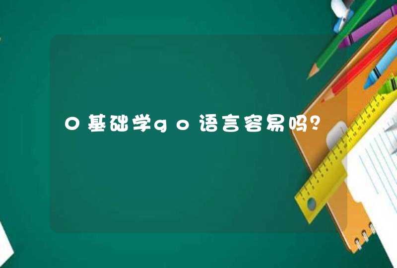
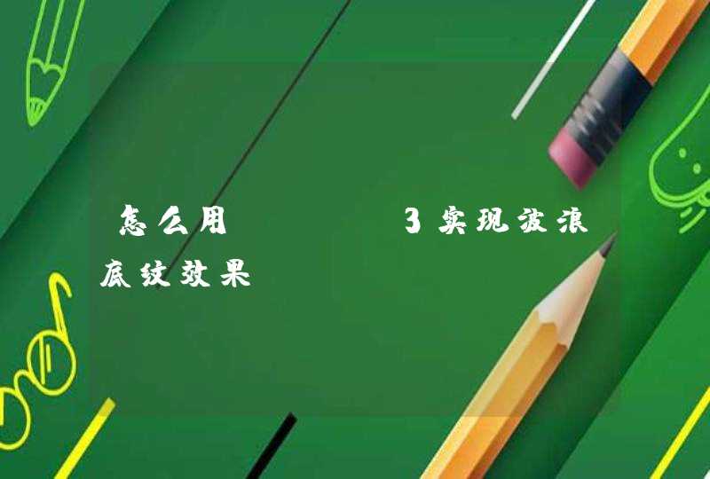
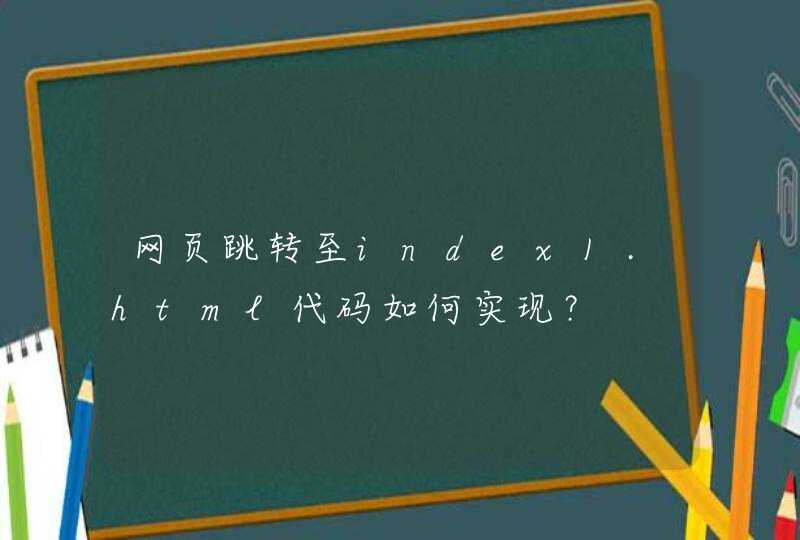
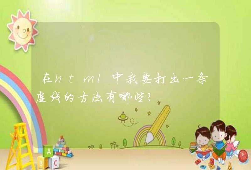
无需js css3直接能搞定材料:3张png (背景框框,两个发光的点点);布局用定位做css3里面的animation做动画hover触发动画请问用js或者css3怎么能实现元素边框动画效果,如图!