


当然需要给盒子设置宽度,不然盒子默认的宽度是父容器宽度。
也有其他方式,比如父容器设置display: flexjustify-content: center也是可以的。
方法不少能达到效果就好了。
网页设计中的css盒子内容居中,你可以先写2个div,第一个包裹着第二个,然后在设置第一个的宽高,在通过margin:0 auto;居中就行,margin的意思就是距离浏览器的外边距,如图:
这里我写段代码:
<html>
<head>
<title>网页居中</title>
</head>
<style>
#div1{
widrh:960px
height:700px
mrgin:0 auto
}
#div2{
widrh:660px
height:300px
mrgin:0 auto
}
</style>
<body>
<div id='div1'>
<div id='div2'>
<p>内容居中文字</p>
</div>
</div>
</body>
</html>
<!DOCTYPE html PUBLIC "-//W3C//DTD XHTML 1.0 Transitional//EN" "http://www.w3.org/TR/xhtml1/DTD/xhtml1-transitional.dtd"><html xmlns="http://www.w3.org/1999/xhtml">
<head>
<meta http-equiv="Content-Type" content="text/html charset=utf-8" />
<title>无标题文档</title>
<style type="text/css">
<!--
*{ margin:0 padding:0}
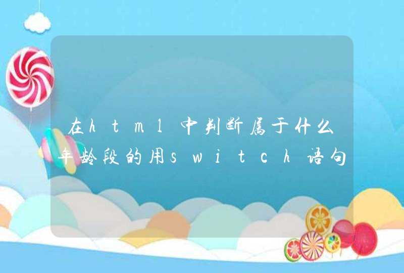
#wrap{ width:290px height:290px background-color:#CC9
padding:10px 10px}
#div1{ width:100px height:100px background-color:#C3C}
-->
</style>
</head>
<body>
<div id="wrap">
<div id="div1"></div>
</div>
</body>
</html>
大盒子设置内边距 ,代码如上,效果如下: