


实现思路
在实现上,完全通过 HTML 和 CSS 来实现,没有使用一行的 JS 逻辑代码。主要是用了一些伪类和 CSS 属性来实现。
HTML 部分
<ul class='time-line'>
<li class='timeline-stone is-completed'>
<div class='list-content'>
<div class='title'>HeloWorld</div>
<span class='time'>1993.08.03</span>
</div>
</li>
<li class='timeline-stone is-completed'>
<div class='list-content'>
<div class='title'>HeloWorld</div>
</div>
</li>
<li class='timeline-stone'>
<div class='list-content'>
<div class='title'>HeloWorld</div>
</div>
</li>
</ul>
这部分没什么讲的,主要是一些 <ul>无序列表和子项 <li>以及各自的 css 样式组成的基本结构。这里只是使用 <div>作为条目内容做结构,内部使用了 flex-box 盒子模型来做了 title 和 time 的左右布局。
CSS 部分(核心)
为了方便起见,直接将重用多次的几个值作为变量放到头部。
$purpleBText: #7d5ae7
$darkText: #666666
$lightText: #999999
$darkLine: #eaeaea.time-line { list-style: none// 不显示列表默认样式(即就是左侧的小黑点或数字) margin: 0 position: relative top: -18px
// 列表项内容
.list-content { display: flex font-size: 12px padding: 12px 10px 12px 0 margin-left: 10px position: relative bottom: -18px
.title { flex-grow: 1
} .time { font-weight: 200 font-size: 12px color: $lightText
}
} .timeline-stone { border-left: $darkLine 1px solid position: relative margin-left: -23px font-weight: 200 color: $darkText
&::before { content: '' width: 5px height: 5px background-color: $darkLine border-radius: 50% position: absolute bottom: 0 left: -3px
}
&.is-completed { border-left-color: $purpleBText z-index: 1 color: $purpleBText font-weight: 600
&:first-child { border-left: transparent 1px solid
}
&::before { width: 11px height: 11px background-color: $purpleBText opacity: 0.4 left: -6px bottom: -5px
}
&::after { content: '' width: 7px height: 7px border-radius: 50% position: absolute background-color: $purpleBText left: -4px bottom: -3px
}
}
}
}
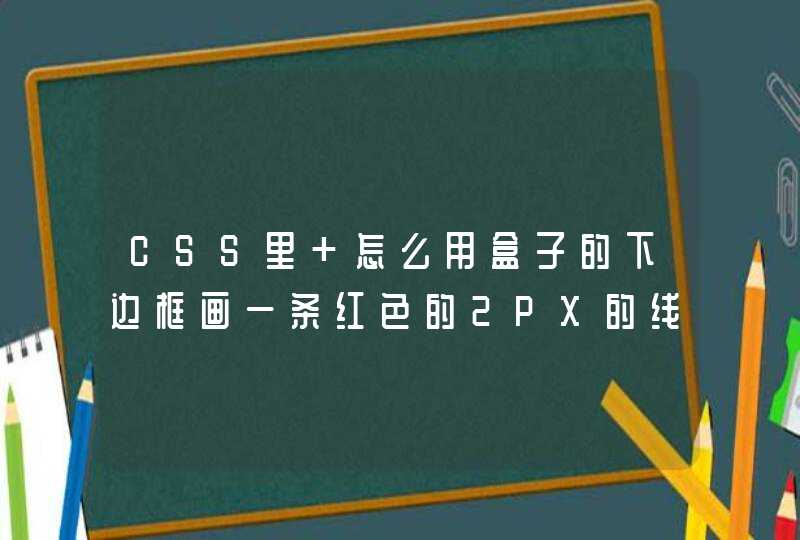
圆点居中
图中绿色的表示<li>每一个子项,而红色则表示条目内容区。可以看到,这里的实现方式是在 list-content内容区采用相对布局将自身向下移动一半列表项高度,将圆点以绝对布局的方式定位到 <li>的底部。
圆点的绘制
这里的圆点均采用 pseudo-class 伪类的方式来添加元素,只需要将 content 设置为空串即可代替常规的 HTML 结点。
共有如下两种状态:
unfinished: 就是一个小灰点,只需要在 timeline-stone 样式上给<li>加 before 伪类即可。
finished:在 is-completed 样式中,使用 before 和 after 搭配绝对布局的方式来绘制已激活状态的小圆点。
小竖线
小竖线同样和小圆点一样都具有两种状态,而它的渲染我们采取了使用小圆点所在的<li>元素的左边框作为时间线,并且通过 first-child 或者 last-child 这两个伪类来实现对第一个或者最后一个边框样式的控制。
戳我获取 完整源码