


;怎么设置旋转方向?比如向左上角旋转和以自身为中心放大,第1张")
<html lang="en">
<head>
<meta charset="UTF-8">
<title>Document</title>
<style>
/*如果使用的不是webkit浏览器 请将代码中的注释都去掉就可以看到效果*/
@-webkit-keyframes clockwiseRotate{
to {
transform:rotate(90deg)
}
}
@-webkit-keyframes anticlockwiseRotate{
to {
transform:rotate(-90deg)
}
}
@-webkit-keyframes zoomScale{
to{
transform:scale(1.5)
}
}
.stage{
width:200px
margin:200px auto auto
border-left:1px solid
border-right:1px solid
}
.box{
width:100px
height:100px
transform-origin:0 0
}
.clockwise{
background-color:purple
-webkit-animation:clockwiseRotate 2s infinite
/* 设置旋转中心为左上角 顺时针旋转90度 */
/*transform-origin:0 0
transform:rotate(90deg)*/
}
.anticlockwise{
background-color:orange
-webkit-animation:anticlockwiseRotate 2s infinite
/* 设置旋转中心为左上角 逆时针旋转90度*/
/*transform-origin:0 0
transform:rotate(-90deg)*/
}
.zoom{
background-color:green
-webkit-animation:zoomScale 2s infinite
/* 设置放大中心为元素中心 放大1.5倍*/
transform-origin:50% 50%
/*transform:scale(1.5)*/
}
</style>
</head>
<body>
<div class="stage">
<div class="box clockwise"></div>
<div class="box anticlockwise"></div>
<div class="box zoom"></div>
</div>
</body>
</html>
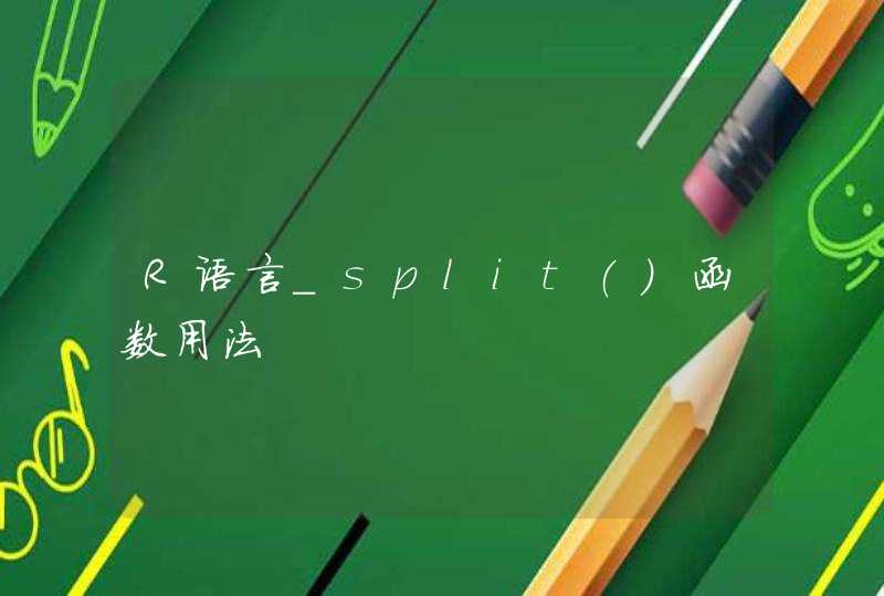
使用transform-origin设置css3旋转中心,分别有两个参数,代表x和y轴的位置。
旋转参考的零点:元素左上角的位置或者说盒子模型的左上角。
参考点的坐标线:向右的x轴和几何x轴一样取正值,向下的y轴和几何y轴相反取正值,图解如下:
CSS transform中的rotate的旋转中心设置有两种:
1.使用关键字设置位置 transform-origin: center bottom
第一个参数可选center、left、right。分别代表盒模型几何横向中间,横向左侧,横向右侧
第二个参数可选center、top、bottom。分别代表盒模型几何竖向中间,竖向头部,竖向底部
2.使用像素值设置位置 transform-origin:3px 40px两个参数为坐标值的x和y值,单位是像素。