


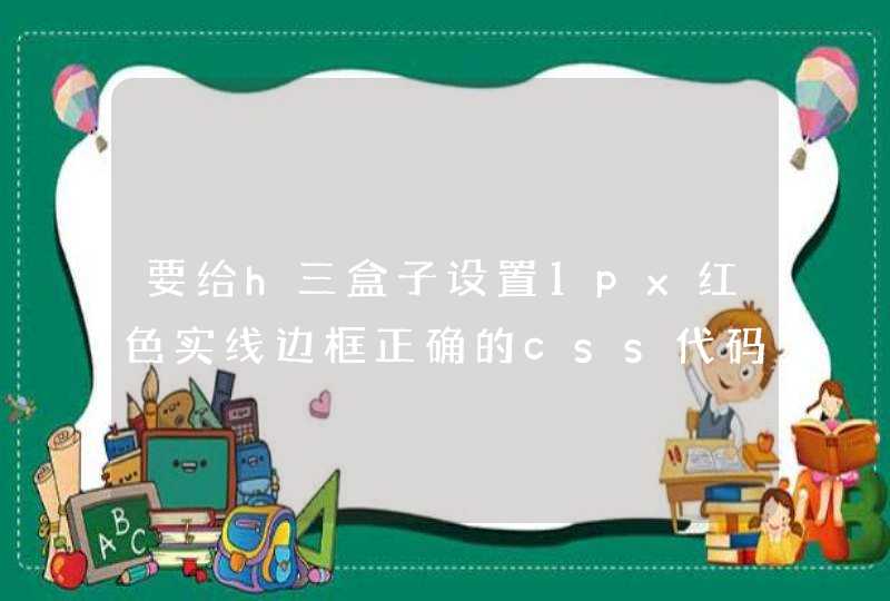


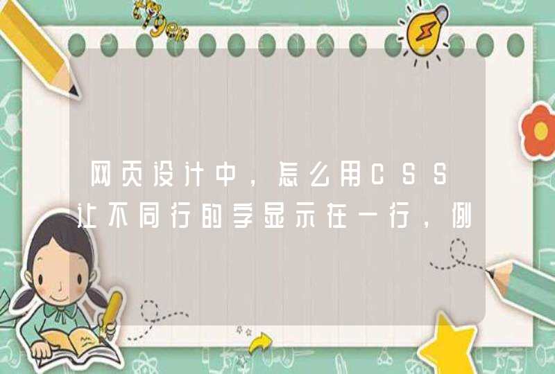


请问楼主是不是想要图片中的效果
下面是我的代码。自己先看看,有不懂再来问我
<!DOCTYPE html>
<html>
<head>
<meta charset="UTF-8">
<meta http-equiv="X-UA-Compatible" content="chrome=1" />
<title></title>
<style>
* {
transition: all .3s
}
.fontColor {
color: #333
}
.fontWhite {
color: #fff
}
.fontTheme {
color: #00a2e9
}
.relative {
position: relative
}
.absolute {
position: absolute
}
.pointer {
cursor: pointer
}
.none {
display: none
}
.hidden {
overflow: hidden
}
html,
body {
display: inline-block
width: 100%
height: 100%
margin: 0px
perspective: 500px
}
.body {
width: 100%
height: 100%
background: url('http://hitopdl.hicloud.com/dl/hitopdl//hitop/wallpaper/FHD/38968/small_38968.jpg') no-repeat center center
background-size: 100% auto
background-attachment: fixed
}
.loginBox {
position: absolute
top: 0px
bottom: 0px
left: 0px
right: 0px
margin: auto
box-sizing: border-box
width: 600px
height: 300px
border: 3px solid rgba(130, 130, 130, .3)
border-radius: 3px
overflow: hidden
animation: rotate-X 1s
animation-fill-mode: forwards
transform: rotateX(90deg) translateZ(0px)
transform-origin: bottom
animation-delay: .8s
}
.loginBox:hover {
border: 3px solid rgba(255, 255, 255, .26)
}
.loginBox:hover .loginBg {
filter: blur(0px)
}
.loginBg {
position: absolute
left: 0px
top: 0px
width: 100%
height: 100%
background: url('http://hitopdl.hicloud.com/dl/hitopdl//hitop/wallpaper/FHD/38968/small_38968.jpg') no-repeat center center
background-attachment: fixed
}
.loginName {
text-align: left
text-indent: 1em
font: normal normal normal 20px/34px "黑体", "微软雅黑"
width: 100%
background-color: rgba(0, 0, 0, .38)
border-bottom: 1px solid rgba(255, 255, 255, .42)
}
.close {
right: 4px
bottom: 4px
font: normal normal normal 14px/14px monaco, "黑体", "微软雅黑"
}
.loginInput {
width: 340px
height: auto
margin: 50px auto 0px auto
overflow: hidden
perspective-origin: bottom
transform-style: preserve-3d
}
.name,
.password {
color: #fff
text-indent: 1em
font: normal normal normal 14px/20px "黑体", "微软雅黑"
text-align: left
display: block
vertical-align:
margin: 10px auto
width: 340px
line-height: 32px
height: 32px
outline: none
background-color: rgba(0, 0, 0, .1)
border: none
border-bottom: 1px solid #fff
transition: all 1s
border-radius: 2px
}
.name:focus,
.password:focus {
background-color: rgba(0, 0, 0, .5)
border-bottom: 1px solid rgba(255, 255, 255, .4)
}
::-webkit-input-placeholder {
text-indent: 1em
text-align: left
color: rgba(255, 255, 255, .8)
font: normal normal normal 14px/20px "黑体", "微软雅黑"
}
.landing,
.returnPsd {
margin-top: 4px
background-color: #00a2e9
font: normal normal normal 16px/22px "黑体", "微软雅黑"
padding: 9px 22px
border-radius: 3px
cursor: pointer
}
.landing {
float: left
margin-left: 10px
}
.returnPsd {
float: right
margin-right: 10px
}
.blur4 {
filter: blur(4px)
-ms-filter: blur(4px)
-moz-filter: blur(4px)
-webkit-filter: blur(4px)
}
.msg {
font-family: "黑体"
z-index: 10
left: 50%
top: 20%
margin-left: -60px
border: 1px solid #fff
background-color: rgba(255, 255, 255, .1)
text-align: center
width: 120px
line-height: 80px
opacity: 0
animation: spring-X 2s linear
animation-fill-mode: forwards
}
@keyframes rotate-X {
0% {
transform: translateZ(0px) rotateX(90deg)
}
10% {
transform: translateZ(-50px) rotateX(90deg)
transform:
}
40% {
transform: translateZ(200px)
}
45% {
rotateX(90deg)
}
100% {
transform: translateZ(0px) rotateX(0deg)
}
}
@keyframes spring-X {
0% {
opacity: 0
}
5% {
opacity: 1
}
10% {
opacity: 1
transform: scale(1, 1)
}
15% {
opacity: 1
transform: scale(1.4, 1)
}
20% {
opacity: 1
transform: scale(0.9, 1)
}
25% {
opacity: 1
transform: scale(1.2, 1)
}
30% {
opacity: 1
transform: scale(0.9, 1)
}
33% {
opacity: 1
transform: scale(1, 1)
}
100% {
opacity: 1
transform: scale(1, 1)
}
}
</style>
</head>
<body>
<!--[if IE]>请使用非IE浏览器查看 <![endif]-->
<!--[if gte IE 7]>请使用非IE浏览器查看 <![endif]-->
<!--[if !IE]><!-->
<div class="msg absolute none fontWhite">
登陆成功
</div>
<div class="body">
<div class="loginBox hidden">
<div class="loginBg blur4"></div>
<div class="loginName fontWhite relative">登陆系统 <span class="close absolute pointer">Close</span></div>
<div class="loginInput relative">
<input class="name " type="text" placeholder="请输入你的用户名" />
<input class="password " type="password" placeholder="请输入你的密码" />
<div class="landing fontWhite">立即登陆</div>
<div class="returnPsd fontWhite">忘记密码</div>
</div>
</div>
</div>
<!--<![endif]-->
</body>
</html>
<script>
window.onload = function() {
document.querySelector(".landing").onclick = function() {
document.querySelector(".msg").classList.remove("none")
document.querySelector(".msg").addEventListener('animationend', function() {
document.querySelector(".msg").classList.add("none")
})
}
}
</script>
其实毛玻璃的模糊效果技术上比较简单,只是用到了 css 滤镜(filter)中的 blur 属性。1. 对元素直接使用模糊会将其内容全部模糊掉,为了保证文字不会模糊掉需要多一个层单独应用模糊效果。
2. 模糊效果并不会应用到其背后的元素上,所以需要使用 content 区域有和背景相同的背景图并进行模糊。
模糊,毛玻璃效果 (Css3 Filter):
图片自动360旋转效果:
图片,平滑的转动360度效果:
CSS3倒计时效果:
文字描边效果:
Canvas 立方体 Cube 效果:
text-fill-color 文字遮罩动画效果