


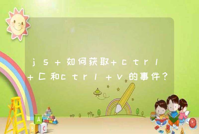


操场轨迹上下两边为直线,左右为半圆。
选择用纯css分成四段控制动画,最终效果如图:
详细分析:
创建HTML:
HTML非常简单,2个div嵌套,里面的point就是点,调整外面的layout的top,left和rotate做出动画效果。
<div class="layout"><div class="point"></div>
</div>
核心css:
去掉了浏览器兼容用的代码。
把动画分成四个部分:上方直线->右边半圆->下方直线->左边半圆。
最巧妙的地方在于,layout其实是一个长方型,把点放在长方型的一头,通过旋转layout使点旋转,去掉代码中注释的红色背景就能看到如下效果:
.layout{width:10px
height:150px
position:relative
margin-left:100px
margin-top:50px
/*background:red*/
animation-name:rotate
animation-duration:2s
animation-timing-function:linear
animation-iteration-count:infinite
animation-direction:alternate
animation-play-state:running
animation-direction:normal
}
@-webkit-keyframes rotate{
0% { left:0px top:0px
transform:rotate(0deg)
}
25% { left:150px top:0px
transform:rotate(0deg)
}
50% { left:150px top:50px
transform:rotate(180deg)
}
75% { left:0px top:50px
transform:rotate(180deg)
}
100%{ left:0px top:0px
transform:rotate(360deg)
}
}
完整代码:
<html><head>
<style>
.point{
width:10px
height:10px
background:blue
position:relative
border-radius:5px
margin:0 auto
}
.layout{
width:10px
height:150px
position:relative
margin-left:100px
margin-top:50px
/*background:red*/
animation-name:rotate
animation-duration:2s
animation-timing-function:linear
animation-iteration-count:infinite
animation-direction:alternate
animation-play-state:running
animation-direction:normal
/* Chrome: */
-webkit-animation-name:rotate
-webkit-animation-duration:2s
-webkit-animation-timing-function:linear
-webkit-animation-iteration-count:infinite
-webkit-animation-play-state:running
-webkit-animation-direction:normal
/* Firefox: */
-moz-animation-name:rotate
-moz-animation-duration:2s
-moz-animation-timing-function:linear
-moz-animation-iteration-count:infinite
-moz-animation-direction:alternate
-moz-animation-play-state:running
-moz-animation-direction:normal
/* Opera: */
-o-animation-name:rotate
-o-animation-duration:2s
-o-animation-timing-function:linear
-o-animation-iteration-count:infinite
-o-animation-direction:alternate
-o-animation-play-state:running
-o-animation-direction:normal
}
@-webkit-keyframes rotate{
0% { left:0px top:0px
transform:rotate(0deg)
-ms-transform:rotate(0deg) /* IE 9 */
-moz-transform:rotate(0deg) /* Firefox */
-webkit-transform:rotate(0deg) /* Chrome */
-o-transform:rotate(0deg) /* Opera */
}
25% { left:150px top:0px
transform:rotate(0deg)
-ms-transform:rotate(0deg) /* IE 9 */
-moz-transform:rotate(0deg) /* Firefox */
-webkit-transform:rotate(0deg) /* Chrome */
-o-transform:rotate(0deg) /* Opera */
}
50% { left:150px top:50px
transform:rotate(180deg)
-ms-transform:rotate(180deg) /* IE 9 */
-moz-transform:rotate(180deg) /* Firefox */
-webkit-transform:rotate(180deg) /* Chrome */
-o-transform:rotate(180deg) /* Opera */
}
75% { left:0px top:50px
transform:rotate(180deg)
-ms-transform:rotate(180deg) /* IE 9 */
-moz-transform:rotate(180deg) /* Firefox */
-webkit-transform:rotate(180deg) /* Chrome */
-o-transform:rotate(180deg) /* Opera */
}
100%{ left:0px top:0px
transform:rotate(360deg)
-ms-transform:rotate(360deg) /* IE 9 */
-moz-transform:rotate(360deg) /* Firefox */
-webkit-transform:rotate(360deg) /* Chrome */
-o-transform:rotate(360deg) /* Opera */
}
}
</style>
</head>
<body>
<div class="layout">
<div class="point"></div>
</div>
</body>
</html>
搞过wpf的动画,对js的不太熟悉,不过想来思路也差不多。如果轨迹是你自己定的,那么就构建条路径(path或者别的什么),将它设置为元素移动路径如果是随机的,你就在每一步移动之前用随机数取得下一步的坐标,设置为单步动画的目标点这个跟JS关系不是很大,使用CSS来做的;如果你想让DIV跟随滚动条滚动,那么div的样式应该是 relative 或者 absolute 都可以的,看外层的DIV定位如果你想让DIV在屏幕上固定位置,则用 position:fixed 就可以;具体问题还得看你代码才行;