


![[CSS] svg路径动画,第1张](/aiimages/%5BCSS%5D+svg%E8%B7%AF%E5%BE%84%E5%8A%A8%E7%94%BB.png "[CSS] svg路径动画,第1张")
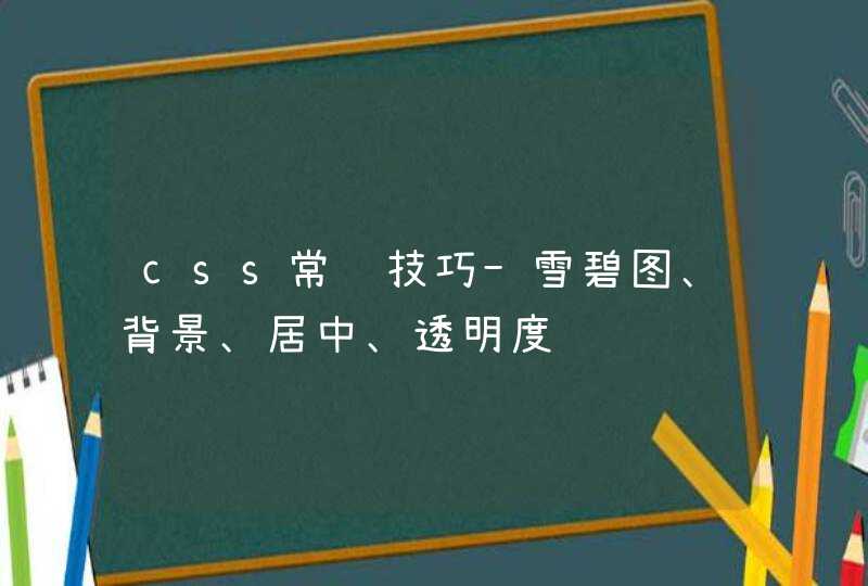
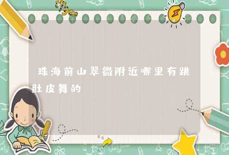
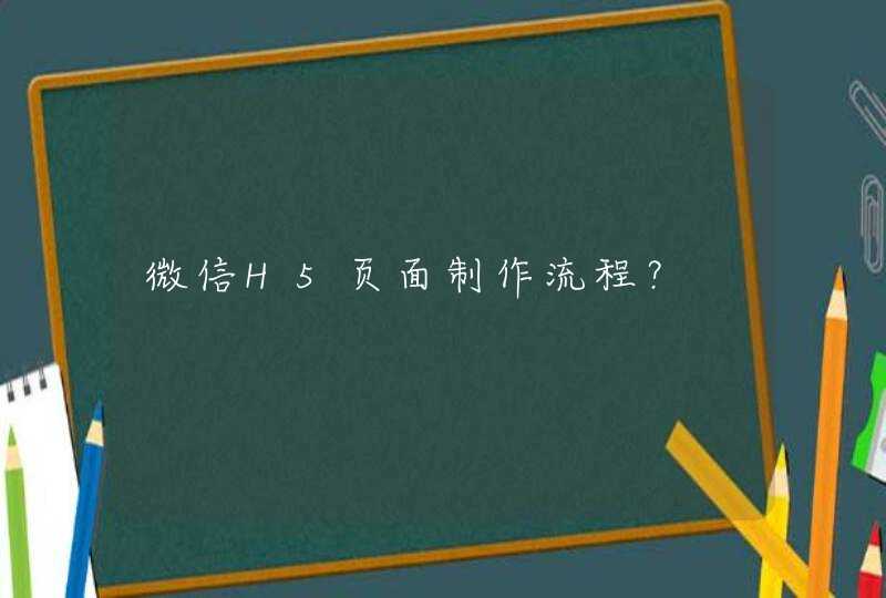
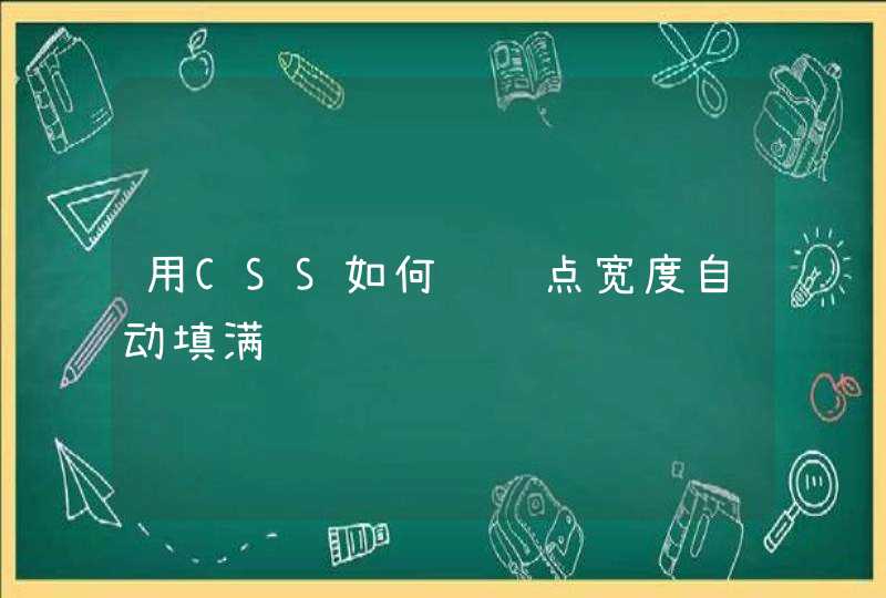
在制作CSS动画的时候,经常会有这样的需求,
让一个方块 沿着给定的路径 运动。
如果运动路径是不规则的,通过设置 top , left 的属性值,就显得非常困难了。
这时候可以借助svg来实现。
path 元素的形状是通过它的 d 属性 定义的,
d 属性的值,是一个“命令+参数”的序列。
其中, M 20 30 L 160 180 ,包含了2个命令序列,
M 20 30 ,表示将画笔移动到坐标 20,30 处,
L 160 180 ,表示从画笔当前位置,到 160,180 位置画直线。
path元素支持多种命令,可以参考这里, curve commands
html元素的CSS样式属性 offset-path ,表示 偏移路径 。
通过指定 offset-path 的值为path元素的 d 属性值,我们可以实现元素沿着给定的 path 路径运动。
其中, offset-distance 指定了元素偏移初始位置的百分比。
通过在 @keyframes 中逐帧更改 offset-distance ,可以实现动画效果。
我们修改path的 d 属性为 M10 80 C 40 10, 65 10, 95 80 S 150 150, 180 80 ,
相应的也修改小方块的 offset-path 属性。
就可以实现小方块沿着path运动的效果了。
MDN: paths
MDN: offset-path
MDN: offset-distance
A How-to Guide to SVG Animation
Scalable Vector Graphics (SVG) 2 - Chapter 9: Paths
<div class="el-loading-mask is-fullscreen">
<div class="el-loading-spinner">
<svg viewBox="25 25 50 50" class="circular">
<circle cx="50" cy="50" r="20" fill="none" class="path"></circle>
</svg>
<p class="el-loading-text">Loading…</p>
</div>
</div>
/* ******************* 加载动画 **************************** */
.el-loading-mask.is-fullscreen { position: fixed}
.el-loading-mask { background-color: hsla(0,0%,100%,.4)!important}
.el-loading-mask { position: absolutez-index: 10000background-color: hsla(0,0%,100%,.9)margin: 0top: 0right: 0bottom: 0left: 0transition: opacity .3s}
.el-loading-mask.is-fullscreen .el-loading-spinner { margin-top: -25px}
.el-loading-spinner { top: 50%margin-top: -21pxwidth: 100%text-align: centerposition: absolute}
.el-loading-mask.is-fullscreen .el-loading-spinner .circular { width: 50pxheight: 50px}
.el-loading-spinner .circular { width: 42pxheight: 42pxanimation: loading-rotate 2s linear infinite}
svg:not(:root) { overflow: hidden}
.el-loading-spinner .el-loading-text { color: #ff495e !important}
.el-loading-spinner .el-loading-text { color: #20a0ffmargin: 3px 0font-size: 14px}
.el-loading-spinner .path { stroke: #ff495e !important}
.el-loading-spinner .path {
animation: loading-dash 1.5s ease-in-out infinite
stroke-dasharray: 90,150
stroke-dashoffset: 0
stroke-width: 2
stroke: #20a0ff
stroke-linecap: round
}
@keyframes loading-rotate {
to {
transform:rotate(1turn)
}
}@keyframes loading-dash {
0% {
stroke-dasharray:1,200
stroke-dashoffset:0
}
50% {
stroke-dasharray:90,150
stroke-dashoffset:-40px
}
to {
stroke-dasharray:90,150
stroke-dashoffset:-120px
}
/* ********************** 加载动画end ***************************************************** */
如何使用CSS来修改SVG原点和制作SVG动画SVG元素可以像HTML元素一样,使用CSS keyframes和animation属性或者CSS transitions来制作各种动画效果。
SVG元素可以像HTML元素一样,使用CSS keyframes和animation属性或者CSS transitions来制作各种动画效果。
大多数情况下,一个复杂的动画效果需要组合多种变换效果:旋转、倾斜、缩放以及他们的转换和过渡效果。多数情况下,SVG元素和HTML元素在使用transform和transform-origin上是相同的。但它们之间也有不同之处,SVG元素不能使用box model来管理,因此,它没有margin、padding、border或content boxes。
默认情况下,一个HTML元素的transform原点位于该元素的(50%, 50%)的地方,这里是元素的中心点。与之不同,SVG元素的transform原点位于当前用户坐标系统的原点上,这个点是画布的左上角位置。
假设我们有一个<div>和一个SVG <rect>元素:
<!DOCTYPE html>