


<div class="wrap">
<div class="circle"></div>
<div class="top"></div>
<div class="bottom"></div>
</div>
实现的思路就是:
1. 首先定义外层容器大小,本例采用200x200,
.wrap{
position: relative
width: 200px
height: 200px
}
2. 通过border-radius画一个圆环,这个比较简单
.circle{
height: 100%
box-sizing: border-box
border: 20px solid red
border-radius: 50%
}
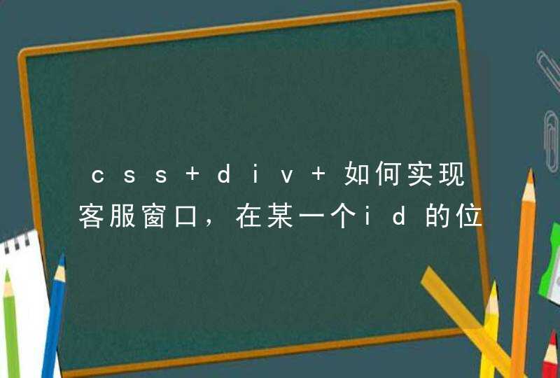
效果如下:
2. 然后用上下两层挡板遮住这个圆环,通过旋转挡板将圆环慢慢露出,过程如下图所示:
通过将下层挡板旋转180deg就能够实现将下半圆慢慢画出的效果,画完以后就需要将其隐藏起来,那该如何实现呢?
这里我用了opacity这个属性,当100%时将其设置为0,同时设置animation-fill-mode: forwards这样就隐藏了
0%{
transform: rotate( 0 )
}
99%{
transform: rotate( 180deg )
opacity: 1
}
100%{
transform: rotate( 180deg )
opacity: 0
}
3. 那如何显示上半圆呢?同样的思路我们对上面挡板进行旋转,通过实际效果我们可以看到,虽然上半圆露出来了,但是确把下半圆给遮挡了。
如何解决这个问题呢?
我们可以在下半圆和挡板间再放一个半圆,同时设置他们的z-index,让上面的挡板旋转时被下半圆遮住,这样就可以了。
说的有些复杂,相当于我们现在有四个元素:上挡板,下挡板,底部的大圆环,一个处在下挡板和大圆环间的半圆。
它们的z-index如下:
上挡板:1
下挡板和底部的大圆间的半圆:2
下挡板:3
为了不增加额外的元素,下挡板和底部的大圆间的半圆我们通过伪元素来实现
.circle:before{
content: ''
position: absolute
display: block
width: 100%
height: 50%
box-sizing: border-box
top: 50%
left: 0
border: 20px solid red
border-top: transparent
border-radius: 0 0 50% 50%/ 0 0 100% 100%
z-index: 2
}
4. 组后再结合css3的transform动画就可以了,需要注意的是,上挡板和下挡板动画是同时开始了,所以上挡板的动画要设置一个延时,时长就是下挡板动画的时长
本例用到的知识点如下:
1. 如何画一个圆环
2. 如何画一个半圆
3. css3动画
4. 定位
最终代码如下:
<!DOCTYPE html>
<html>
<head>
<meta http-equiv="X-UA-Compatible" content="IE=edge,chrome=1">
<meta http-equiv="content-type" content="text/htmlcharset=utf-8">
<title>动态画一个圆环</title>
<style>
*{
margin: 0padding: 0
}
.wrap{
position: relative
width: 200px
height: 200px
}
.circle{
height: 100%
box-sizing: border-box
border: 20px solid red
border-radius: 50%
}
.circle:before{
content: ''
position: absolute
display: block
width: 100%
height: 50%
box-sizing: border-box
top: 50%
left: 0
border: 20px solid red
border-top: transparent
border-radius: 0 0 50% 50%/ 0 0 100% 100%
z-index: 2
}
.top, .bottom{
position: absolute
left: 0px
width: 100%
height: 50%
box-sizing: border-box
background: white
}
.top{
top: 0
z-index: 1
transform-origin: center bottom
animation: 1s back-half linear 1s
animation-fill-mode: forwards
}
.bottom{
z-index: 3
top: 50%
transform-origin: center top
animation: 1s front-half linear
animation-fill-mode: forwards
}
@keyframes front-half{
0%{
transform: rotate( 0 )
}
99%{
transform: rotate( 180deg )
opacity: 1
}
100%{
transform: rotate( 180deg )
opacity: 0
}
}
@keyframes back-half{
0%{
transform: rotate( 0 )
}
99%{
transform: rotate( 180deg )
opacity: 1
}
100%{
transform: rotate( 180deg )
opacity: 0
}
}
</style>
</head>
<body>
<div class="wrap">
<div class="circle"></div>
<div class="top"></div>
<div class="bottom"></div>
</div>
</body>
</html>
1、首先新建一个html空白文档,取名字叫做css3动画,保存一下。
2、然后写html结构,只需要一个div元素即可,class名字叫做img
3、设置其边框为不同的颜色,边框宽度设置成100px。
4、因为是圆环,所以我们用到了css3的圆角效果,设置圆角为50%,也就是border-radius:50%,看一下效果。
5、接下来就是关键的步骤了,也就是添加动画效果。输入以下代码
6、来看一下最后的效果,还是不错的。
css实现圆环旋转加载
<!DOCTYPE html>
<html>
<head>
<meta charset="utf-8">
<title>css实现圆环旋转加载</title>
<style>
*{
margin:0
padding:0
}
#outbox{
position:relative/*相对定位*/
width:100px/*宽度100px*/
height:100px/*高度100px*/
background:orange/*背景色橙色*/
border-radius:50%/*圆角50%*/
margin:100px/*外侧边距100px*/
}
#outbox::before{/*前置伪元素*/
content:""/*内容空*/
display:block/*块元素*/
position:absolute/*绝对定位*/
width:80px/*宽度80px*/
height:80px/*高度80px*/
left:10px/*左边距10px*/
top:10px/*距离顶部10px*/
border-radius:50%/*圆角50%*/
background:white/*背景色白色*/
}
#outbox::after{/*后置伪元素*/
content:""/*内容为空*/
display:block/*转为块元素*/
position:absolute/*绝对定位*/
width:100px/*宽度100px*/
height:100px/*高度100px*/
top:0/*距离父容器顶部边距0*/
left:0/*距离入容器左边距0*/
border-radius:50%/*圆角50%*/
background:white/*背景色白色*/
animation:myfirst 1s both linear infinite/*绑定动画。为了看清楚效果,设置动画反复执行。使用的时候只执行一次就好了*/
-webkit-animation:myfirst 1s both linear infinite/* Safari and Chrome */
}
@keyframes myfirst/*动画开始*/
{
0%{
-webkit-clip-path: polygon(50% 50%, 100% 0, 100% 100%, 0 100%, 0 0, 100% 0)/*不裁剪的初始效果*/
clip-path: polygon(50% 50%, 100% 0, 100% 100%, 0 100%, 0 0, 100% 0)
}
40%{
-webkit-clip-path: polygon(50% 50%, 100% 0, 100% 100%, 0 100%, 0 0, 0 0)/*裁剪四分之一*/
clip-path: polygon(50% 50%, 100% 0, 100% 100%, 0 100%, 0 0, 0 0)
}
60%{
-webkit-clip-path: polygon(50% 50%, 100% 0, 100% 100%, 0 100%, 0 100%, 0 100%)/*裁剪四分之二*/
clip-path: polygon(50% 50%, 100% 0, 100% 100%, 0 100%, 0 100%, 0 100%)
}
90%{
-webkit-clip-path: polygon(50% 50%, 100% 0, 100% 100%, 100% 100%, 100% 100%, 100% 100%)/*裁剪四分之三*/
clip-path: polygon(50% 50%, 100% 0, 100% 100%, 100% 100%, 100% 100%, 100% 100%)
}
100%{
-webkit-clip-path: polygon(50% 50%, 100% 0, 100% 100%, 100% 0, 100% 0, 100% 0)/*裁剪四分之四*/
clip-path: polygon(50% 50%, 100% 0, 100% 100%, 100% 0, 100% 0, 100% 0)
}
}
</style>
</head>
<body>
<div id="outbox"></div>
</body>
</html>
<!--裁剪比较粗糙,如果要更顺滑,可以裁剪得更细腻一点,比如裁剪十分之一,十分之二,十分之三,以此类推一直到十分之十。-->