


常见兼容性问题:吸顶元素无法固定,会随着页面滚动抖动
解决方案:页面整体为弹性布局,中间加载部分自适应高度,总体结构为 顶部固定+内容+底部固定
注意整体弹性布局的时候如果要实现吸顶效果,必须将定位元素放到flex=1元素的外层,吸顶的元素需要用两个div,一个是正常显示的,一个是滚动到一定高度固定到顶部的
html:
<div class="wrap" id="wrapId">
<div class="isFixed" v-if="is_fixed">
<div class="topBar" id="fixedTopFixed" ref="topBar">
<div class="item" v-for="(item,index) in barList" >吸顶内容</div>
</div>
</div>
<div class="flexWrap" :class="is_fixed? 'wrapTop' : 'flex'">
<div class="myScroll" v-infinite-scroll="loadMore" infinite-scroll-throttle-delay="500" infinite-scroll-immediate-check="true" infinite-scroll-disabled="busy" infinite-scroll-distance="50">
<div class="flexContent">
<div class="top" ref="top">
<div class="banner"><img src="../../../assets/images/文件名/banner.jpg" alt="" srcset=""></div>
<div class="topBar" id="fixedTop" ref="topBar" v-show="!is_fixed">
<div class="item" v-for="(item,index) in barList" @click="tab(index,item)">
不吸顶时展示的内容
</div>
</div>
</div>
<div class="scrollContent" id="wrap-content" ref="contentH">
<div class="memberList" v-show="infoList.length>0" id="content">
<div class="myScroll" v-infinite-scroll="loadMore" infinite-scroll-throttle-delay="500" infinite-scroll-immediate-check="true" infinite-scroll-disabled="busy" infinite-scroll-distance="10">
<div class="memberItem" v-for="(item,index) in infoList">
加载内容
</div>
<div class="loading" v-if="loading">
<span id="load-text">{{loadText}}</span>
</div>
</div>
</div>
<div class="empty" v-show="noData">最新达成情况正在更新中...请稍后再来~</div>
</div>
</div>
</div>
</div>
<div class="footer">底部固定</div>
</div>
js:
data: {
return {
busy: false,
pageNum: 1,
pageSize: 10,
loading: false,
noData: false,
infoList: []
}
}
mounted() {
<!--监听滚动-->
that.$nextTick(() =>{
let scrollDOM = document.querySelector('.flexContent')
scrollDOM.addEventListener('scroll',that.handleScroll)
})
},
methods: {
handleScroll () {
let scrollDOM = document.querySelector('.flexContent')
let scrollTop = scrollDOM.scrollTop
<!--计算滚动高度-->
let clientHeight = document.documentElement.clientHeight
if (scrollTop >document.querySelector('.banner').offsetHeight) {
this.is_fixed = true
} else {
this.is_fixed = false
}
},
<!--//触发加载-->
loadMore() {
if(this.pageNum<this.pages) {
this.loading = true
this.pageNum+=1
this.busy = true
this.loadData(接口参数,this.pageNum)
}
},
//加载时触发的接口调用
loadData() {
api.XXX({},function(success,data,err){
if(success) {
if(data.status==200) {
//加载逻辑判断
if(data.body.list.length>0 &&pageNum>0){
that.infoList = that.infoList.concat(data.body.list)
that.loading = false
}
if(pageNum==data.body.pages || data.body.list<20) {
that.loading = true
that.loadText = '没有更多数据了'
}
if(pageNum==1 &&data.body.list.length==0) {
that.noData = true
that.infoList = []
}
}
}
})
}
}
css:
.isFixed {
width: 100%
height: 1rem
position: absolute
top: 0
left: 0
z-index: 100
}
.myScroll {
height: 100%
}
.wrap {
width: 7.5rem
margin: auto
height: 100%
overflow: hidden
display: flex
flex-direction: column
}
.flex {
flex: 1
}
.wrapTop {
padding-top:0.45rem
}
.flexWrap {
width: 100%
height: 100%
}
.flexContent {
width: 100%
height: 100%
display: flex
flex-direction: column
overflow: scroll
-webkit-overflow-scrolling: touch
}
.top {
.banner {
position: relative
img {
width: 100%
display: block
}
.month {
position: absolute
bottom: 0.33rem
left: 0.45rem
color: #fff
font-size: 0.45rem
}
}
}
.scrollContent {
width: 100%
background: #fff
flex: 1
-webkit-overflow-scrolling: touch
.memberList {
height: 100%
padding-top: 0.2rem
}
}
.footer {
position: fixed
bottom: 0
width:7.5rem
margin: auto
height:auto
background:rgba(0,0,0,.7)
}
上次使用了css实现吸顶的方法,这次使用原生js来实现这个效果做这个效果的前提:掌握offset系列 ,掌握scroll系列
offsetWidth:元素的内容宽+左右padding+左右border
offsetHeight:元素的内容高+上下padding +上下border
offsetTop :当前元素的顶部,到定位父元素的距离,如果没有定位父元素,指的就是元素到body的距离 -----用于获取当前元素在页面中的位置
offsetLeft: 当前元素的左边,到定位父元素的距离,如果没有定位父元素,指的就是元素到body的距离
onscroll:滚动条触发的事件,只要滚动条滚动就会触发,滚动条在谁身上就给谁加滚动条
这是屏幕的滚动距离
document.documentElement.scrollTop || document.body.scrollTop
给屏幕添加滚动事件
window.onscroll=function(){
//获取滚动距离,提前给body设置高度
var top=document.documentElement.scrollTop || document.body.scrollTop
}
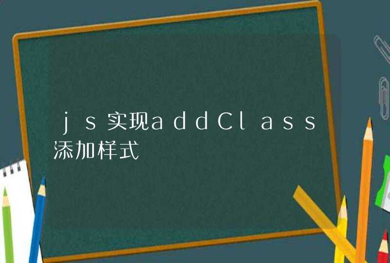
实现效果
向下滚动的时候:
到达一定高度的时候,红色的div会固定在顶部
如果是在回调里置顶DIV的话(比如点击事件),可以用scrollIntoView。 scrollIntoView如果不想吸顶 可以加个before伪类设置高度 CSS3滚动置顶目前有两种解决方案: 第一种(主流):transform: translate3d(x,y,z) 第二种(未来):position: stickytop:xxx 假设需求: 需求一:滚动过程中A ,C区域不吸顶,B区域吸顶 VUE框架推荐直接使用vantUI插件,indexbar索引栏。https://youzan.github.io/vant/#/zh-CN/index-barvantUI原理用的是transform。 以上面图片为例大致讲解: 1.transform对JS的能力要求高些,页面加载完毕后,给每个B区域对应的DIV设置translate3d的Y轴值,值为B对应div离顶部的高度。 2.当开始滚动起来后,Y轴值为原来值减去滚动条滚动距离值 3.当Y轴值小于0的时候,锁死为0,就自动吸顶了 4.当待置顶DIV的translate3d Y轴值小于DIV的高度时,已置顶DIV的Y轴值开始变为负数,这样会有一个顶出的效果 5.已置顶DIV被待置顶DIV顶出一定距离(一般两倍DIV高度),取消translate3d属性, 6.回滚反向计算即可 需求二:滚动过程中 C不吸顶,B吸顶,A一直吸顶 B在A下面 这个需求vantUI(v2.9.3)目前解决不了,采用translate太复杂,决定采用CSS3新属性position: sticky。 如果是2018年使用该属性兼容性还是个问题,但来到2020年下半年,对大部分生产环境都不是问题。博主测试的IOS11和安卓小米 华为 都支持该属性。博主的建议是:如果是公司APP内嵌H5页面或者微信打开可以使用该属性,如果纯H5页面 ,建议translate. position: sticky字面意思就是粘性定位。 可以粘顶部也可以粘底部 右侧 左侧。 所以除了position: sticky还要给一个定位值,比如top:0px或者right:0px就可以了 非常简单。 比如直接给Bdiv设置下面样式就行 实际使用要注意下面几点: 1.如果想兼容IOS12 IOS11 必须带position: -webkit-sticky而且要在样式表里写,不能写在style里。 2.容器相关。只有要移除容器范畴才起作用。比如body的height不要设置100%,height:100%表示所有元素一直在屏幕范围