


例子如下:
<!DOCTYPE html PUBLIC "-//W3C//DTD XHTML 1.0 Transitional//EN" "http://www.w3.org/TR/xhtml1/DTD/xhtml1-transitional.dtd">
<html xmlns="http://www.w3.org/1999/xhtml">
<head>
<meta http-equiv="Content-Type" content="text/htmlcharset=utf-8" />
<title>无标题文档</title>
</head>
<body>
<div style="border:3px #000 solidborder-top-right-radius:10pxborder-top-left-radius:5pxborder-bottom-left-radius:6pxborder-bottom-right-radius:20pxwidth:50pxheight:50pxbackground:#f60"></div>
<div style="border:3px #000 solidborder-radius:10pxwidth:50pxheight:50pxbackground:#fff"></div>
</body>
</html>
在css中,让边角具有弧度只需要用border-radius这个属性。
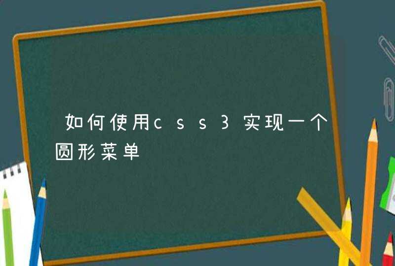
如图,这是一个测试页面,它们的边角分别为25PX和50PX半径的圆角。
写法像这样:
border-radius:25px
测试代码如下
<div style="border-radius:25px"></div>
<div style="border-radius:50px"></div>
div{
width:200px
height:130px
background-color:wheat
margin-bottom:10px
}
拓展资料-css3简介在CSS3推出前,圆角效果需要用图片实现,下面简要介绍CSS3。
CSS3是CSS(层叠样式表)技术的升级版本,于1999年开始制订,2001年5月23日W3C完成了CSS3的工作草案,主要包括盒子模型、列表模块、超链接方式、语言模块、背景和边框、文字特效、多栏布局等模块。
CSS演进的一个主要变化就是W3C决定将CSS3分成一系列模块。浏览器厂商按CSS节奏快速创新,因此通过采用模块方法,CSS3规范里的元素能以不同速度向前发展,因为不同的浏览器厂商只支持给定特性。但不同浏览器在不同时问支持不同特性,这也让跨浏览器开发变得复杂。