


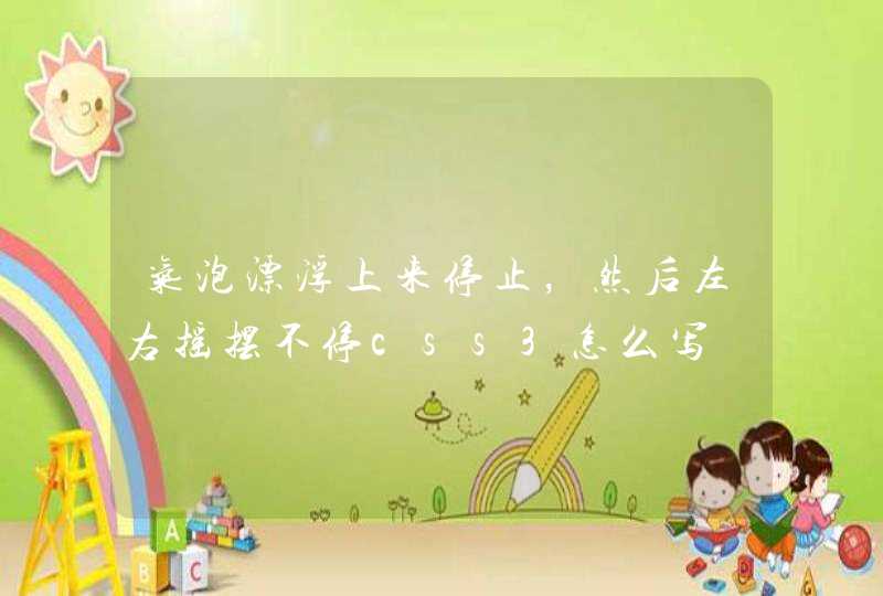


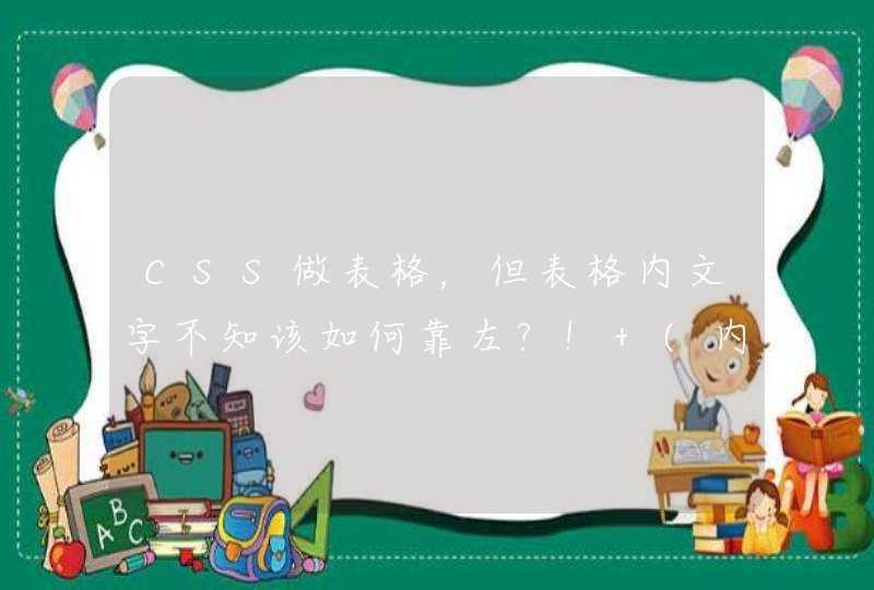


整出来的效果:
我的css代码:
.main {margin: 0 auto padding: 0 width: 60% border: 3px solid #FB3 height: 710pxposition: relative
}
.one{
height: 6em line-height: 6em
position: absolute top: 0 left: 0 width: 100%
-webkit-perspective:150px
perspective:150px
-webkit-transform-origin: center top
transform-origin: center bottom
}
.one>div, .three>div {
-webkit-transform:rotate3d(1,0,0,-90deg) scaleZ(3)
transform:rotate3d(1,0,0,-45deg) scaleZ(3)
perspective:150px
}
.two{
position: absolute top: 3.55em left: 0
height: 6em line-height: 6em width: 100%
-webkit-perspective:150px
perspective:150px
-webkit-transform-origin: center bottom
transform-origin: center top
}
.two>div, .four>div {
-webkit-transform:rotate3d(1,0,0,45deg) scaleZ(3)
transform:rotate3d(1,0,0,45deg) scaleZ(3)
perspective:150px
}
.three{
height: 6em line-height: 6em
position: absolute top: 9em left: 0 width: 100%
-webkit-perspective:150px
perspective:150px
-webkit-transform-origin: center top
transform-origin: center bottom
}
.four{
height: 6em line-height: 6em
position: absolute top: 12.5em left: 0 width: 100%
-webkit-perspective:150px
perspective:150px
-webkit-transform-origin: center top
transform-origin: center bottom
}
.red {background-color: red float: left font-size: 4em width: 25% text-align: center}
.blue {background-color: blue float: left font-size: 4em width: 25% text-align: center}
.green {background-color: green float: left font-size: 4em width: 25% text-align: center}
.yellow {background-color: yellow float: left font-size: 4em width: 25% text-align: center}
1、one,two,three,four这几个div都是舞台,容器元素,所以不在这几个上面应用3d变化。只是设置视角什么的。
他们的子元素设置变化。
2、one,two,这些元素使用了绝对定位。使用绝对定位主要是,大家变换以后中间有空隙,为了消除空隙,使用translate3d对Y进行变换消除空隙应该是不行的,因为变化以后相邻两个图形大小不一致了。当然3D空间中两个不一样大的东西在图片上看起来一样大,应该也是可以的,不过这个就很复杂了吧,只变化Y肯定是不行的。你的不对成应该主要就是因为这个。
3、one,two,这些容器元素我设置了高度,实际上也可以不设置高度,高度主要是用来计算消除空隙的,但是消除多少(也就是每个容器的top应该设置为多少)这个我现在也不会算,图里面是试出来的。不过看你的图没有空隙,你应该有自己的计算方法吧。
试了好久,想的脑袋疼 =。=!
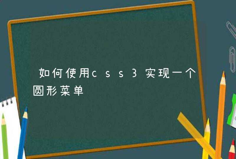
1、首先准备一个HTML文档,文档中准备好两个图片,接下来会对这两个图片进行旋转。
2、然后对HTML中的内容定义一些样式,如下图所示,主要是标题以及ul的样式。
3、接下来就给图片所在的li定义宽高,如下图所示。
4、然后给图片设置过渡效果,过渡使用transition属性,如下图所示。
5、当鼠标悬停在图片上时,通过rotate给其设置变形,如下图所示,正数代表的是顺时针,负数代表的是逆时针。
6、最后运行程序,会看到如下图所示的效果,鼠标放在图片上会顺时针或者逆时针旋转。
div{
transform:rotate(9deg)
-ms-transform:rotate(9deg) /* Internet Explorer */
-moz-transform:rotate(9deg) /* Firefox */
-webkit-transform:rotate(9deg) /* Safari 和 Chrome */
}
这是css3 的2d转换 确实能实现将背景图旋转。(9deg是选择角度 自己调整)
但是! 他会把div里面的所有内容都旋转掉(如果里面有文字或者其他也都会被影响而旋转)!