


为了防止图片被压缩,可以给图片容器设置`flex-shrink: 0`,只有不为0的元素才会被压缩。
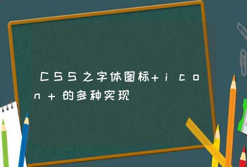
flex-box 弹性布局可以实现的效果:自适应布局,效果图如下:
代码如下:
<!DOCTYPE HTML>
<html>
<head>
<meta charset="utf-8">
<title>flex box 弹性布局 </title>
<meta name="Keywords" content="">
<meta name="Description" content="">
<style type="text/css">
html,body{height:100%margin:0}/*需要添加高度控制,否则无法撑满整个屏幕*/
body{
display:-webkit-box
-webkit-box-orient:vertical/*按照垂直方向上进行自适应处理*/
}
.content{-webkit-box-flex:1/*分配剩余的所有空间*/} .header{height:50pxmin-width:500px}/*顶部模块高度定死*/
.logo{width:100pxheight:50pxbackground:#99f}/*为区分模块,设置了背景色 logo部分固定宽高*/
.nav{height:50pxbackground:#ccc}/*nav模块不固定宽度*/
.content{min-height:100px}/*为防止之后的调整窗口大小是出现影响视觉效果的问题,特设置最小高度*/
.content,.header{display:-webkit-box/*为content,header部分也添加box的展示模式*/}
.nav{-webkit-box-flex:1}
.con2{-webkit-box-flex:1}
.con1{width:200pxbackground:#f99}/*固定宽度,高度不定*/
.con2{min-width:200pxbackground:#999}/*同上的min-height*/
.con3{width:100pxbackground:#9f9}/*固定宽度,高度不定*/
.footer{height:50pxmin-width:500pxbackground:#ccc}/*固定高度*/
</style>
<link href="" style="text/css" rel="stylesheet"/>
</head>
<body>
<div class="header">
<div class="logo">logo部分,宽高固定</div>
<div class="nav">nav部分,高度固定,宽度自适应</div>
</div>
<div class="content">
<div class="con1">内容初始化第1模块</div>
<div class="con2">内容初始化第2模块</div>
<div class="con3">内容初始化第3模块</div>
</div>
<div class="footer">底部,宽度不定,高度固定</div>
</body>
</html>