


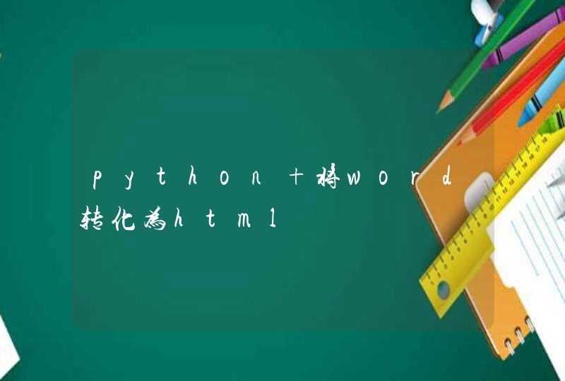


请问楼主是不是想要图片中的效果
下面是我的代码。自己先看看,有不懂再来问我
<!DOCTYPE html>
<html>
<head>
<meta charset="UTF-8">
<meta http-equiv="X-UA-Compatible" content="chrome=1" />
<title></title>
<style>
* {
transition: all .3s
}
.fontColor {
color: #333
}
.fontWhite {
color: #fff
}
.fontTheme {
color: #00a2e9
}
.relative {
position: relative
}
.absolute {
position: absolute
}
.pointer {
cursor: pointer
}
.none {
display: none
}
.hidden {
overflow: hidden
}
html,
body {
display: inline-block
width: 100%
height: 100%
margin: 0px
perspective: 500px
}
.body {
width: 100%
height: 100%
background: url('http://hitopdl.hicloud.com/dl/hitopdl//hitop/wallpaper/FHD/38968/small_38968.jpg') no-repeat center center
background-size: 100% auto
background-attachment: fixed
}
.loginBox {
position: absolute
top: 0px
bottom: 0px
left: 0px
right: 0px
margin: auto
box-sizing: border-box
width: 600px
height: 300px
border: 3px solid rgba(130, 130, 130, .3)
border-radius: 3px
overflow: hidden
animation: rotate-X 1s
animation-fill-mode: forwards
transform: rotateX(90deg) translateZ(0px)
transform-origin: bottom
animation-delay: .8s
}
.loginBox:hover {
border: 3px solid rgba(255, 255, 255, .26)
}
.loginBox:hover .loginBg {
filter: blur(0px)
}
.loginBg {
position: absolute
left: 0px
top: 0px
width: 100%
height: 100%
background: url('http://hitopdl.hicloud.com/dl/hitopdl//hitop/wallpaper/FHD/38968/small_38968.jpg') no-repeat center center
background-attachment: fixed
}
.loginName {
text-align: left
text-indent: 1em
font: normal normal normal 20px/34px "黑体", "微软雅黑"
width: 100%
background-color: rgba(0, 0, 0, .38)
border-bottom: 1px solid rgba(255, 255, 255, .42)
}
.close {
right: 4px
bottom: 4px
font: normal normal normal 14px/14px monaco, "黑体", "微软雅黑"
}
.loginInput {
width: 340px
height: auto
margin: 50px auto 0px auto
overflow: hidden
perspective-origin: bottom
transform-style: preserve-3d
}
.name,
.password {
color: #fff
text-indent: 1em
font: normal normal normal 14px/20px "黑体", "微软雅黑"
text-align: left
display: block
vertical-align:
margin: 10px auto
width: 340px
line-height: 32px
height: 32px
outline: none
background-color: rgba(0, 0, 0, .1)
border: none
border-bottom: 1px solid #fff
transition: all 1s
border-radius: 2px
}
.name:focus,
.password:focus {
background-color: rgba(0, 0, 0, .5)
border-bottom: 1px solid rgba(255, 255, 255, .4)
}
::-webkit-input-placeholder {
text-indent: 1em
text-align: left
color: rgba(255, 255, 255, .8)
font: normal normal normal 14px/20px "黑体", "微软雅黑"
}
.landing,
.returnPsd {
margin-top: 4px
background-color: #00a2e9
font: normal normal normal 16px/22px "黑体", "微软雅黑"
padding: 9px 22px
border-radius: 3px
cursor: pointer
}
.landing {
float: left
margin-left: 10px
}
.returnPsd {
float: right
margin-right: 10px
}
.blur4 {
filter: blur(4px)
-ms-filter: blur(4px)
-moz-filter: blur(4px)
-webkit-filter: blur(4px)
}
.msg {
font-family: "黑体"
z-index: 10
left: 50%
top: 20%
margin-left: -60px
border: 1px solid #fff
background-color: rgba(255, 255, 255, .1)
text-align: center
width: 120px
line-height: 80px
opacity: 0
animation: spring-X 2s linear
animation-fill-mode: forwards
}
@keyframes rotate-X {
0% {
transform: translateZ(0px) rotateX(90deg)
}
10% {
transform: translateZ(-50px) rotateX(90deg)
transform:
}
40% {
transform: translateZ(200px)
}
45% {
rotateX(90deg)
}
100% {
transform: translateZ(0px) rotateX(0deg)
}
}
@keyframes spring-X {
0% {
opacity: 0
}
5% {
opacity: 1
}
10% {
opacity: 1
transform: scale(1, 1)
}
15% {
opacity: 1
transform: scale(1.4, 1)
}
20% {
opacity: 1
transform: scale(0.9, 1)
}
25% {
opacity: 1
transform: scale(1.2, 1)
}
30% {
opacity: 1
transform: scale(0.9, 1)
}
33% {
opacity: 1
transform: scale(1, 1)
}
100% {
opacity: 1
transform: scale(1, 1)
}
}
</style>
</head>
<body>
<!--[if IE]>请使用非IE浏览器查看 <![endif]-->
<!--[if gte IE 7]>请使用非IE浏览器查看 <![endif]-->
<!--[if !IE]><!-->
<div class="msg absolute none fontWhite">
登陆成功
</div>
<div class="body">
<div class="loginBox hidden">
<div class="loginBg blur4"></div>
<div class="loginName fontWhite relative">登陆系统 <span class="close absolute pointer">Close</span></div>
<div class="loginInput relative">
<input class="name " type="text" placeholder="请输入你的用户名" />
<input class="password " type="password" placeholder="请输入你的密码" />
<div class="landing fontWhite">立即登陆</div>
<div class="returnPsd fontWhite">忘记密码</div>
</div>
</div>
</div>
<!--<![endif]-->
</body>
</html>
<script>
window.onload = function() {
document.querySelector(".landing").onclick = function() {
document.querySelector(".msg").classList.remove("none")
document.querySelector(".msg").addEventListener('animationend', function() {
document.querySelector(".msg").classList.add("none")
})
}
}
</script>
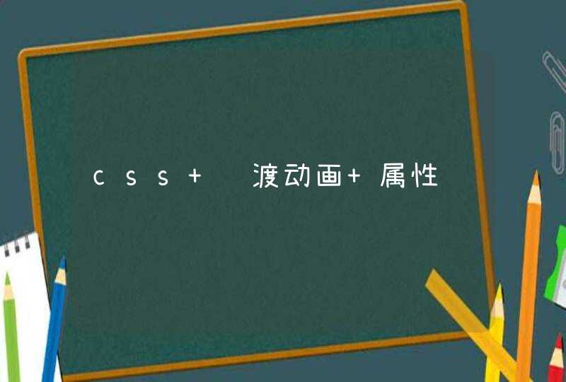
假如页面有一个背景和一个透明的盒子,我们先将盒子范围内的背景截取下来,在透明盒子之后设置一个伪元素用绝对定位格式化长宽让其跟透明盒子一样大小,在将伪元素背景设置为刚刚截取的图片设置模糊、设置z-index让伪元素在透明盒子之后,在给透明盒子设置一点阴影就好了。核心代码如下
最近在写活动页面遇到一个效果,在黑色透明蒙层后面的元素要有模糊,毛玻璃的效果,最初想到的就是 filter: blur(2px) ,直接在元素上使用,但是整个子元素都被模糊了,而且蒙层的背景并没有效果,经过百般搜索和尝试,发现还有一个属性可以实现专门针对有透明度的元素做模糊的效果,而且还不会影响到子元素的展示,它就是 backdrop-filter: blur(3px) ,完美的实现了设计稿的要求。
下面就来看看这两个属性的区别,遇到的问题以及解决方案。
filter CSS属性将模糊或颜色偏移等图形效果应用于元素。滤镜通常用于调整图像,背景和边框的渲染。
想要模糊图像或者某个不带透明度的元素,可以直接在元素上加 filter: blur(2px) ,如果这个元素下面有子元素,这样写子元素也会被模糊,解决方法是使用伪元素加定位效果实现:
backdrop-filter CSS 属性可以让你为一个元素后面区域添加图形效果(如模糊或颜色偏移)。 因为它适用于元素 背后 的所有元素,为了看到效果,必须使元素或其背景至少部分透明。
所以给蒙层的后面添加模糊的效果,可以直接在蒙层元素上使用 backdrop-filter: blur(2px)即可。
这两个属性的使用可以详细的参考 mdn上的描述:
backdrop-filter
filter