


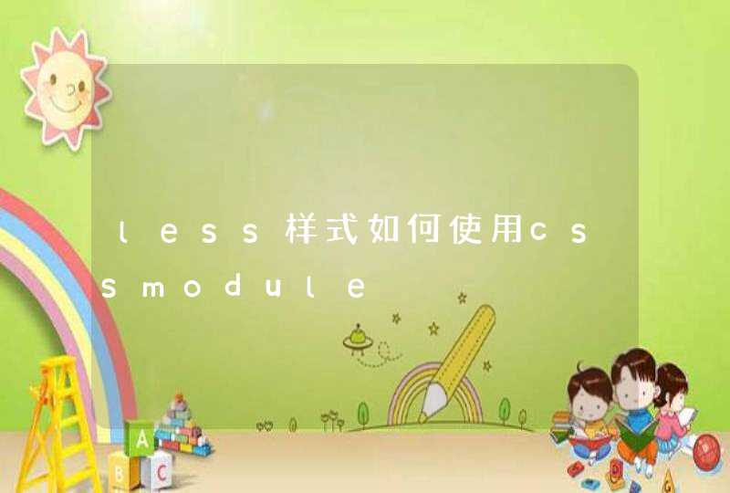


只写了里面的,外面的不太好写
<!doctype html><html lang="en">
<head>
<meta charset="UTF-8">
<title>圆形导航</title>
<link rel="stylesheet" href="css/common.css">
<style type="text/css">
.div1{
width: 405px
height: 405px
border-radius: 50%
margin-top: 40px
margin-left: 40px
background-color: #fff
position: relative
}
.div2{
width: 200px
height: 200px
background-color: #999
color:#fff
text-align: center
line-height: 200px
}
.div2:nth-child(1){border-top-left-radius: 100%}
.div2:nth-child(2){border-top-right-radius: 100%}
.div2:nth-child(3){border-bottom-left-radius: 100%}
.div2:nth-child(4){border-bottom-right-radius: 100%}
.div3{
position: absolute
width: 200px
height: 200px
border-radius: 100%
top: 100px
left: 100px
z-index: 5
background-color: red
color: #fff
border: 3px solid #fff
text-align: center
line-height: 200px
box-shadow: 0 0 15px rgba(255,255,255,.6)
}
</style>
</head>
<body>
<div class="div1 clearfix">
<div class="fl div2 mb-5">导航1</div>
<div class="fr div2 mb-5">导航1</div>
<div class="fl div2">导航1</div>
<div class="fr div2">导航1</div>
<div class="div3">综合服务</div>
</div>
</body>
</html>
一种就是把圆角图片作为背景。另一种就是用css3的border-radius:
15px
属性,要使IE支持
css3,加个文件
behavior:url(pie.htc)
比如
div{behavior:url(pie.htc)
border-radius:
15px
}
pie.htc这个文件百度下有的下的。
第一步:编辑菜单的HTML代码。
菜单包含三个列表项,分别取名为“Menu1”、“Menu2”、“Menu3”。
XML/HTML Code<div class="css3Menus">
<ul>
<li>Menu1</li>
<li>Menu2</li>
<li>Menu3</li>
</ul>
</div>
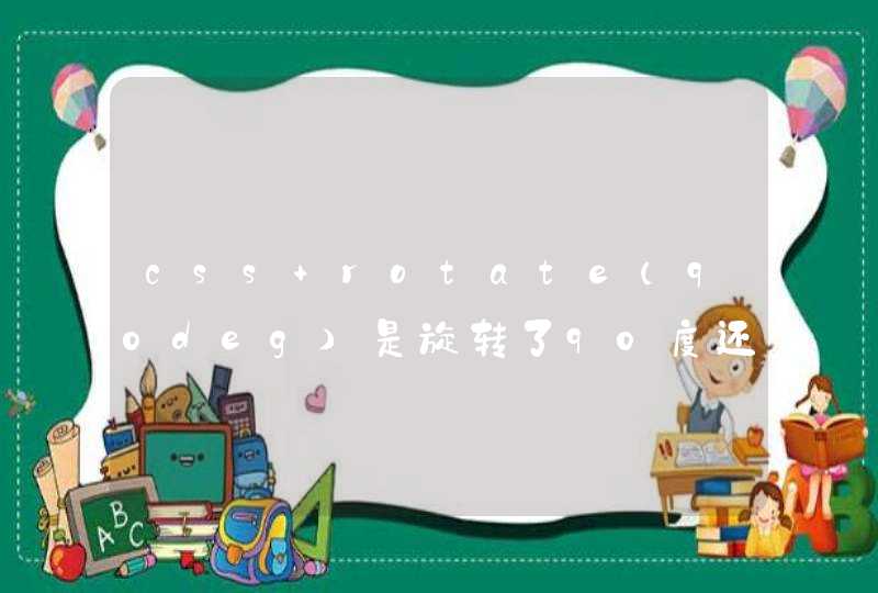
第二步:设置菜单的背景。
在该步骤中,把导航的背景设置为黑色。宽度、高度和内边距为可选项,可以不设置。
CSS Code
.<span style="width: auto height: auto float: none" id="4_nwp"><a style="text-decoration: none" mpid="4" target="_blank" href="http://cpro.baidu.com/cpro/ui/uijs.php?adclass=0&app_id=0&c=news&cf=1001&ch=0&di=128&fv=0&is_app=0&jk=e2fbae28688be8a0&k=css3&k0=css3&kdi0=0&luki=10&n=10&p=baidu&q=06011078_cpr&rb=0&rs=1&seller_id=1&sid=a0e88b6828aefbe2&ssp2=1&stid=0&t=tpclicked3_hc&tu=u1922429&u=http%3A%2F%2Fwww%2Eadmin10000%2Ecom%2Fdocument%2F2453%2Ehtml&urlid=0" id="4_nwl"><span style="color:#0000fffont-size:14pxwidth:autoheight:autofloat:none">css3</span></a></span>Menus {
background: #14080a
width:506px
height:260px
padding:20px
}
如下图:
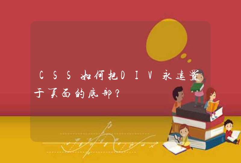
第三步:利用border-radius,制作圆形导航。
该步中,利用CSS3的一些酷的功能,尤其是border-radius ,将每个列表项的背景设置为黄色,形状为圆形。
CSS Codeul {
list-style: none
}
li {
float:left
font: 14px/10px Arial, Verdana, sans-serif
color:#FFF
background-color:#CCCC00
width: 80px
height: 80px
padding:20px
margin:0 30px 0 0
-webkit-border-radius: 60px
-moz-border-radius: 60px
border-radius: 60px
}
菜单看起来呈下面样子:
第四步:设置菜单的对齐方式。
本步骤中,将为每个列表项设置特定的背景颜色与位置:
CSS Codeli#menu1 {
background-color: #00FFCC
}
li#menu2 {
background-color: #CC9900
margin-top:100px
}
li#menu3 {
background-color: #33FF66
margin-top:50px
}
现在菜单看起来呈下面样子:
第五步:设置菜单中链接的对齐方式。
CSS Codeli a {
color:#FFF
text-decoration:none
display:<span style="width: auto height: auto float: none" id="2_nwp"><a style="text-decoration: none" mpid="2" target="_blank" href="http://cpro.baidu.com/cpro/ui/uijs.php?adclass=0&app_id=0&c=news&cf=1001&ch=0&di=128&fv=0&is_app=0&jk=e2fbae28688be8a0&k=block&k0=block&kdi0=0&luki=7&n=10&p=baidu&q=06011078_cpr&rb=0&rs=1&seller_id=1&sid=a0e88b6828aefbe2&ssp2=1&stid=0&t=tpclicked3_hc&tu=u1922429&u=http%3A%2F%2Fwww%2Eadmin10000%2Ecom%2Fdocument%2F2453%2Ehtml&urlid=0" id="2_nwl"><span style="color:#0000fffont-size:14pxwidth:autoheight:autofloat:none">block</span></a></span>
width: 80px
height: 45px text-align: center
padding:35px 0 0 0
margin:0 40px 0 0
-webkit-border-radius: 40px
-moz-border-radius: 40px
border-radius: 40px
}
li#menu1 a {
background-color: #FF0000
}
li#menu2 a {
background-color: #660033
}
li#menu3 a {
background-color: #66CCCC
}
菜单现阶段的样子:
第六步:定义另一种效果,当鼠标悬浮在链接上时进行展现。
CSS Codeli a:hover,
li a:focus,
li a:active {
width: 120px
height:65px
padding:55px 0 0 0
margin:-20px 0 0 -20px
-webkit-border-radius: 60px
-moz-border-radius: 60px
border-radius: 60px
}
菜单样式如图:
第七步:最后为导航增加动画效果。
CSS Codeli a:hover,
li a:focus,
li a:active {
-webkit-animation-name:bounce
-webkit-animation-duration:1s
-webkit-animation-iteration-count:4
-webkit-animation-direction:alternate
}
@-webkit-keyframes bounce{<span style="width: auto height: auto float: none" id="1_nwp"><a style="text-decoration: none" mpid="1" target="_blank" href="http://cpro.baidu.com/cpro/ui/uijs.php?adclass=0&app_id=0&c=news&cf=1001&ch=0&di=128&fv=0&is_app=0&jk=e2fbae28688be8a0&k=from&k0=from&kdi0=0&luki=2&n=10&p=baidu&q=06011078_cpr&rb=0&rs=1&seller_id=1&sid=a0e88b6828aefbe2&ssp2=1&stid=0&t=tpclicked3_hc&tu=u1922429&u=http%3A%2F%2Fwww%2Eadmin10000%2Ecom%2Fdocument%2F2453%2Ehtml&urlid=0" id="1_nwl"><span style="color:#0000fffont-size:14pxwidth:autoheight:autofloat:none">from</span></a></span>{margin:0 40px 0 0}
to{margin:120px 40px 0 0}
}
菜单所产生的动画效果: