


1.boder-radis圆角的制作
2.linear-gradient渐变背景的制作
3.box-shadow阴影效果的制作
4.transition转换效果的制作
5.transparent透明效果
6.CCS3中before的作用
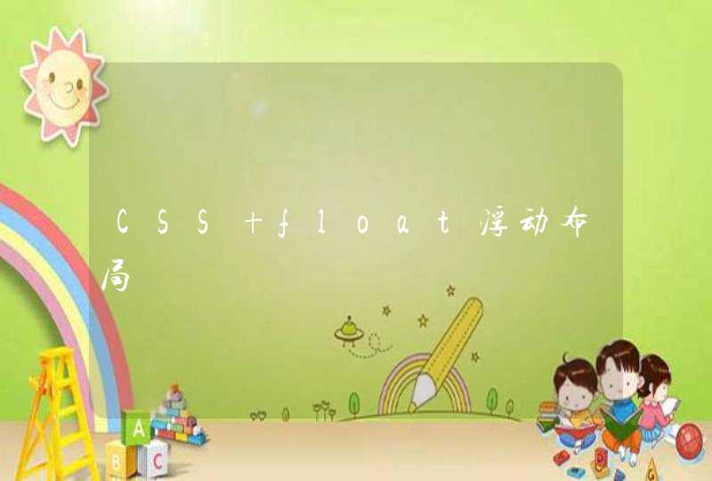
实现的效果图如下:
搭建HTML容器
一级菜单ul的样式修饰:
设置一级菜单的宽度、整体居中显示、用border设置颜色为#222的1像素宽的边框、用background-color设置背景颜色为#111、用background-image和linear-gradient设置背景图片为#444和#111的渐变效果、用border-radius设置圆角边框为6px、用before和after的方式给一级ul填充内容是清除二级浮动的一种方式保证背景能够包裹所有ul内的元素
.top-nav{width:969pxmargin:60px autoborder:1px solid #222background-color:#111 background-image:linear-gradient(#444,#111)border-radius:6pxbox-shadow:0 1px 1px #777 padding:0list-style:none} .top-nav:before,.top-nav:after{content: ""display: table} .top-nav:after{clear: both}
一级菜单内li的样式修饰:
用float将所有的li左浮动、用boder-right给每一个li制作一个左边框效果、用box-shadow制作阴影效果、position:relative是为了下面二级菜单的显示二级菜单会以absolute的方式定位
.top-nav li{float: leftborder-right:1px solid #222box-shadow:1px 0 0 #444position: relative}
一级菜单内li中a元素以及鼠标移动到a元素上之后的样式修饰
这些属性比较简单,就不作一一介绍了
.top-nav li a{float:lefttext-decoration: nonepadding:12px 30pxfont-size:12pxfont-weight:boldtext-shadow: 0 2px 0 #000color: #999} .top-nav li a:hover{color: #fafafa}
二级菜单ul的样式修饰
二级菜单默认是隐藏状态,用绝对定位的方式(相对于一级菜单)将二级菜单定位在top:38pxleft:0的位置上、同样给二级菜单设置渐变背景色和阴影的效果box-shadow中的rgba属性可以制作透明度的效果、用opacity这是透明级别为0、用transition制作一个过度显示和隐藏的效果
.top-nav li ul{visibility: hiddenposition: absolutelist-style: nonetop:38pxleft: 0z-index: 1padding: 0 background-color: #444background-image: linear-gradient(#444,#111)box-shadow: 0 -1px 0 rgba(255,255,255,.3)border-radius: 3pxopacity: 0margin: 20px 0 0 0transition: all .2s ease-in-out }
当鼠标移动到一级菜单栏的时候二级菜单栏显示
hover属性的应用
.top-nav li:hover >ul{opacity: 1visibility: visiblemargin: 0}
设置二级菜单li和a的样式
方法和一级菜单的li和a的修饰差不多,不做过多的解释
.top-nav ul li{float: nonedisplay: blockborder: 0box-shadow: 0 1px 0 #111,0 2px 0 #666} .top-nav ul a{padding: 10pxwidth: 130pxdisplay: blockfloat: none} .top-nav ul a:hover{background-color: #0186babackground-image: linear-gradient(#04acec,#0186ba)} .top-nav ul li:first-child >a{border-radius: 3px 3px 0 0} .top-nav ul li:last-child >a{border-radius: 0 0 3px 3px}
三角形的制作
用css3制作三角形的的方法就是四边设置同样宽度的border,将要保留的那一边的border设置颜色,其他三边的颜色设置为透明(transparent),则保留颜色的那一边的三角形就制作出来了
.top-nav ul li:first-child >a:before{ content: ""position: absoluteleft:40pxtop: -6px display: blockwidth: 0border-bottom: 6px solid #444border-left: 6px solid transparent border-right: 6px solid transparent } .top-nav ul li:first-child >a:hover:before{border-bottom-color:#04acec}
三级菜单位置的变换
将三级菜单定位到二级菜单的右边显示
.top-nav ul ul{top:0left: 150pxmargin: 0 0 0 20pxbox-shadow: -1px 0 0 rgba(255,255,255,.3)} .top-nav ul ul li:first-child a:before{left: -6pxtop: 50%margin-top: -6pxborder-left: 0border-bottom: 6px solid transparent border-top: 6px solid transparentborder-right: 6px solid #3b3b3b} .top-nav ul ul li:first-child a:hover:before{border-right-color:#0299d3border-bottom-color:transparent}
完整代码(其中有针对IE6的兼容性处理)
<!DOCTYPE html><html><head> <meta charset="UTF-8"> <!--<script src="http://cdn.hcharts.cn/jquery/jquery-1.8.3.min.js"></script>--> <title>用CSS3实现动画效果的制作</title> <style type="text/css"> .top-nav{width:969pxmargin:60px autoborder:1px solid #222background-color:#111 background-image:linear-gradient(#444,#111)border-radius:6pxbox-shadow:0 1px 1px #777 padding:0list-style:none} .top-nav:before,.top-nav:after{content: ""display: table} .top-nav:after{clear: both} /*针对IE6,_margin,_height是针对IE6的,其他浏览器中不需要*/ .top-nav{z-index: 1} .top-nav li{float: leftborder-right:1px solid #222box-shadow:1px 0 0 #444position: relative} .top-nav li a{float:lefttext-decoration: nonepadding:12px 30pxfont-size:12pxfont-weight:bold text-shadow: 0 2px 0 #000color: #999} .top-nav li a:hover{color: #fafafa} .top-nav li ul{visibility: hiddenposition: absolutelist-style: nonetop:38pxleft: 0z-index: 1padding: 0 background-color: #444background-image: linear-gradient(#444,#111)box-shadow: 0 -1px 0 rgba(255,255,255,.3) border-radius: 3pxopacity: 0margin: 20px 0 0 0transition: all .2s ease-in-out _margin:0 } .top-nav li:hover >ul{opacity: 1visibility: visiblemargin: 0} .top-nav ul li{float: nonedisplay: blockborder: 0box-shadow: 0 1px 0 #111,0 2px 0 #666} .top-nav ul a{padding: 10pxwidth: 130pxdisplay: blockfloat: none_height:10px} .top-nav ul a:hover{background-color: #0186babackground-image: linear-gradient(#04acec,#0186ba)} .top-nav ul li:first-child >a{border-radius: 3px 3px 0 0} .top-nav ul li:last-child >a{border-radius: 0 0 3px 3px} .top-nav ul li:first-child >a:before{ content: ""position: absoluteleft:40pxtop: -6px display: blockwidth: 0border-bottom: 6px solid #444border-left: 6px solid transparent border-right: 6px solid transparent } .top-nav ul li:first-child >a:hover:before{border-bottom-color:#04acec} .top-nav ul ul{top:0left: 150pxmargin: 0 0 0 20px_margin:0box-shadow: -1px 0 0 rgba(255,255,255,.3)} .top-nav ul ul li:first-child a:before{left: -6pxtop: 50%margin-top: -6pxborder-left: 0border-bottom: 6px solid transparent border-top: 6px solid transparentborder-right: 6px solid #3b3b3b} .top-nav ul ul li:first-child a:hover:before{border-right-color:#0299d3border-bottom-color:transparent} </style> <script type="text/javascript"> <!--针对IE6处理hover的问题-->// $(function () { // if($.browser.msie &&$.broswer.version.substr(0,1)<7){ // $("li").has("ul").mouseover(function () { // $(this).children("ul").css("visibility","visible")// }).mouseout(function () { // $(this).children("ul").css("visibility","hidden")// })// } // }) </script></head><body><ul> <li><a href="#">首页</a></li> <li><a href="#">课程大厅</a></li> <li><a href="#">学习中心 +</a> <ul> <li><a href="#">视频学习</a> <ul> <li><a href="#">css</a></li> <li><a href="#">js</a></li> <li><a href="#">jquery</a></li> </ul> </li> <li><a href="#">案例学习</a></li> <li><a href="#">交流平台</a></li> </ul> </li> <li><a href="#">关于我们</a></li></ul></body>
第一步:编辑菜单的HTML代码。
菜单包含三个列表项,分别取名为“Menu1”、“Menu2”、“Menu3”。
XML/HTML Code<div class="css3Menus">
<ul>
<li>Menu1</li>
<li>Menu2</li>
<li>Menu3</li>
</ul>
</div>
第二步:设置菜单的背景。
在该步骤中,把导航的背景设置为黑色。宽度、高度和内边距为可选项,可以不设置。
CSS Code
.<span style="width: auto height: auto float: none" id="4_nwp"><a style="text-decoration: none" mpid="4" target="_blank" href="http://cpro.baidu.com/cpro/ui/uijs.php?adclass=0&app_id=0&c=news&cf=1001&ch=0&di=128&fv=0&is_app=0&jk=e2fbae28688be8a0&k=css3&k0=css3&kdi0=0&luki=10&n=10&p=baidu&q=06011078_cpr&rb=0&rs=1&seller_id=1&sid=a0e88b6828aefbe2&ssp2=1&stid=0&t=tpclicked3_hc&tu=u1922429&u=http%3A%2F%2Fwww%2Eadmin10000%2Ecom%2Fdocument%2F2453%2Ehtml&urlid=0" id="4_nwl"><span style="color:#0000fffont-size:14pxwidth:autoheight:autofloat:none">css3</span></a></span>Menus {
background: #14080a
width:506px
height:260px
padding:20px
}
如下图:
第三步:利用border-radius,制作圆形导航。
该步中,利用CSS3的一些酷的功能,尤其是border-radius ,将每个列表项的背景设置为黄色,形状为圆形。
CSS Codeul {
list-style: none
}
li {
float:left
font: 14px/10px Arial, Verdana, sans-serif
color:#FFF
background-color:#CCCC00
width: 80px
height: 80px
padding:20px
margin:0 30px 0 0
-webkit-border-radius: 60px
-moz-border-radius: 60px
border-radius: 60px
}
菜单看起来呈下面样子:
第四步:设置菜单的对齐方式。
本步骤中,将为每个列表项设置特定的背景颜色与位置:
CSS Codeli#menu1 {
background-color: #00FFCC
}
li#menu2 {
background-color: #CC9900
margin-top:100px
}
li#menu3 {
background-color: #33FF66
margin-top:50px
}
现在菜单看起来呈下面样子:
第五步:设置菜单中链接的对齐方式。
CSS Codeli a {
color:#FFF
text-decoration:none
display:<span style="width: auto height: auto float: none" id="2_nwp"><a style="text-decoration: none" mpid="2" target="_blank" href="http://cpro.baidu.com/cpro/ui/uijs.php?adclass=0&app_id=0&c=news&cf=1001&ch=0&di=128&fv=0&is_app=0&jk=e2fbae28688be8a0&k=block&k0=block&kdi0=0&luki=7&n=10&p=baidu&q=06011078_cpr&rb=0&rs=1&seller_id=1&sid=a0e88b6828aefbe2&ssp2=1&stid=0&t=tpclicked3_hc&tu=u1922429&u=http%3A%2F%2Fwww%2Eadmin10000%2Ecom%2Fdocument%2F2453%2Ehtml&urlid=0" id="2_nwl"><span style="color:#0000fffont-size:14pxwidth:autoheight:autofloat:none">block</span></a></span>
width: 80px
height: 45px text-align: center
padding:35px 0 0 0
margin:0 40px 0 0
-webkit-border-radius: 40px
-moz-border-radius: 40px
border-radius: 40px
}
li#menu1 a {
background-color: #FF0000
}
li#menu2 a {
background-color: #660033
}
li#menu3 a {
background-color: #66CCCC
}
菜单现阶段的样子:
第六步:定义另一种效果,当鼠标悬浮在链接上时进行展现。
CSS Codeli a:hover,
li a:focus,
li a:active {
width: 120px
height:65px
padding:55px 0 0 0
margin:-20px 0 0 -20px
-webkit-border-radius: 60px
-moz-border-radius: 60px
border-radius: 60px
}
菜单样式如图:
第七步:最后为导航增加动画效果。
CSS Codeli a:hover,
li a:focus,
li a:active {
-webkit-animation-name:bounce
-webkit-animation-duration:1s
-webkit-animation-iteration-count:4
-webkit-animation-direction:alternate
}
@-webkit-keyframes bounce{<span style="width: auto height: auto float: none" id="1_nwp"><a style="text-decoration: none" mpid="1" target="_blank" href="http://cpro.baidu.com/cpro/ui/uijs.php?adclass=0&app_id=0&c=news&cf=1001&ch=0&di=128&fv=0&is_app=0&jk=e2fbae28688be8a0&k=from&k0=from&kdi0=0&luki=2&n=10&p=baidu&q=06011078_cpr&rb=0&rs=1&seller_id=1&sid=a0e88b6828aefbe2&ssp2=1&stid=0&t=tpclicked3_hc&tu=u1922429&u=http%3A%2F%2Fwww%2Eadmin10000%2Ecom%2Fdocument%2F2453%2Ehtml&urlid=0" id="1_nwl"><span style="color:#0000fffont-size:14pxwidth:autoheight:autofloat:none">from</span></a></span>{margin:0 40px 0 0}
to{margin:120px 40px 0 0}
}
菜单所产生的动画效果: