


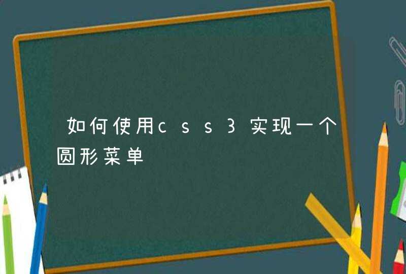


原理就是,先定义一个元素 ,然后定义动画XYZ轴偏移。
body > div > div:after {content: ""
position: absolute
top: -5px
box-shadow: 0 0 12px #fff
left: 50%
margin-left: -5px
width: 5px
height: 5px
border-radius: 50%
background-color: #fff
-webkit-animation: particle_ 2s infinite linear
animation: particle_ 2s infinite linear
} body > div:nth-of-type(4) > div, body > div:nth-of-type(4) > div:after {
-webkit-animation-delay: -1.5s
animation-delay: -1.5s
}
body > div > div {
width: 200px
height: 200px
position: relative
-webkit-transform-style: preserve-3d
-webkit-animation: trail_ 2s infinite linear
transform-style: preserve-3d
animation: trail_ 2s infinite linear
}
实施步骤:
建立一个BOX
在BOX中制作一个元素。
CSS动画定义BOX旋转按照你的轨迹。
通过。
-webkit-transform:rotateY( 0deg ) rotateZ( 0deg ) rotateX( 0deg )
-moz-transform:rotateY( 0deg ) rotateZ( 0deg ) rotateX( 0deg )
-o-transform:rotateY( 0deg ) rotateZ( 0deg ) rotateX( 0deg )
transform:rotateY( 0deg ) rotateZ( 0deg ) rotateX( 0deg )
来定义旋转方向,0是不旋转。0-360度是一圈。
-webkit-transition:transform 1s
transition:transform 1s
这是设置动画时间。
一个BOX完成后,复制box,摆在统一中心点后,设置Z轴的数字。
li:{list-style-type:circle}也可以用image代替type位置,链接你喜欢的图片
circle:是空心圆点。square:方形
disc:默认实心圆。
不知道你说的是不是这个意思