


1、横线
2、居中横线
<hr align=center width=300 color=#987cb9 size=1>
align 线条位置(可选left、right、center);width线条长度;color颜色;size厚度
二、特效(效果并不是孤立的,可相互组合)
1、两头渐变透明
<hr style="filter: alpha(opacity=100, finishopacity=0, style=3)" width="80%" color=#987cb9 SIZE=3>
2、纺锤形
<HR style="FILTER: alpha(opacity=100,finishopacity=0,style=2)" width="80%" color=#987cb9 SIZE=10>
3、右边渐变透明
<HR style="FILTER: alpha(opacity=100,finishopacity=0,style=1)" width="80%" color=#987cb9 SIZE=3>
4、左边渐变透明
<HR style="FILTER: alpha(opacity=0,finishopacity=100,style=1)" width="80%" color=#987cb9 SIZE=3>
5、虚线
<HR style="border:1 dashed #987cb9" width="80%" color=#987cb9 SIZE=1>
6、双线
<HR style="border:3 double #987cb9" width="80%" color=#987cb9 SIZE=3>
7、立体效果
<HR style="FILTER: progid:DXImageTransform.Microsoft.Shadow(color:#987cb9,direction:145,strength:15)" width="80%" color=#987cb9 SIZE=1>
8、钢针效果
<HR style="FILTER: progid:DXImageTransform.Microsoft.Glow(color=#987cb9,strength=10)" width="80%" color=#987cb9 SIZE=1>
9、垂直分割线
<table border="1px" cellpadding="0" cellspacing="0" style="height:265pxborder-left-style:solidborder-bottom-style:noneborder-right-style:noneborder-top-style:none">
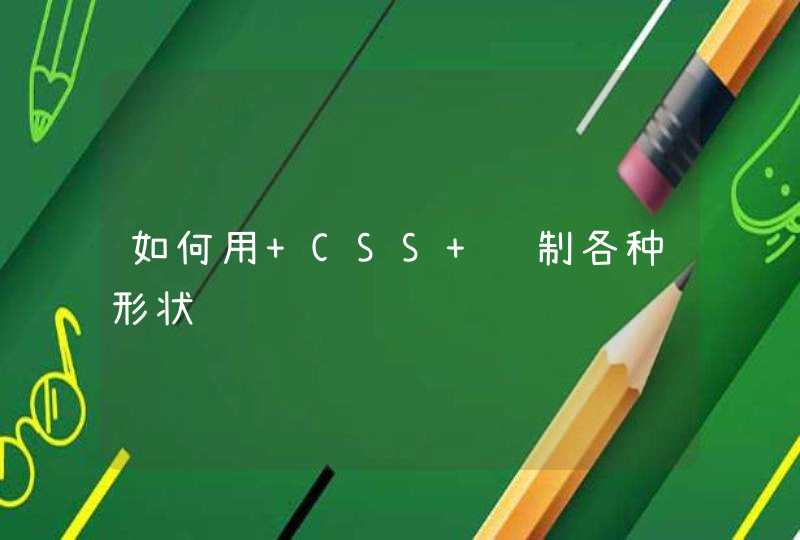
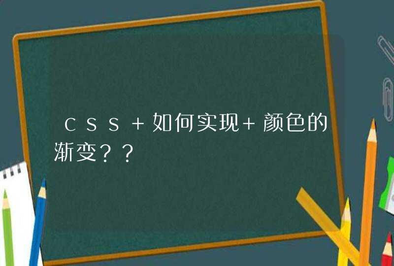
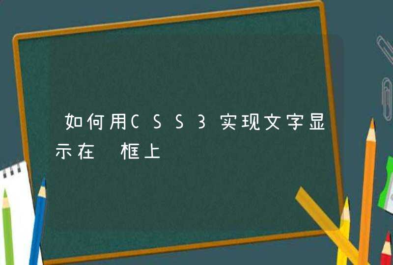
使用一个有固定宽度的div将usename和password等内容包含起来,然后设置该div的右边框为2像素粗细、实线线型、红色即可,线的粗细按需要调整就行。
<div style="border-right:2px solid redwidth:280px">usename :<input value="" name=usename id=usename />
password:<input value="" name=password id=password />
</div>
上面的例子如图:
html中貌似木有垂直分割线。但可以用div来模拟这个垂直分割线:<div style='width:49%float:leftheight:700px'>内容区域</div>
<div style='width:1pxborder:1px solid redfloat:leftheight:700px'><!--这个div模拟一条红色的垂直分割线--></div>
<div style='width:50%float:leftheight:700px'>内容区域</div>