


CSS3引入的伪元素和变换特性使得实现五角星图形非常简单,并且可以结合渐变实现更为漂亮的效果。
因此使用图片实现五角星已经毫无必要(图片占用额外的请求,且数据量大。除非要支持低版本的桌面IE浏览器)。
首先我们创建一个三角形,这通常是使用带大尺寸边线而零内容尺寸的元素来实现,代码示范:
.tri { width: 0height: 0border-left: 15px solid transparentborder-right: 15px solid transparentborder-bottom: 30px solid red}
第二步,我们使用伪元素:after和:before来克隆2个同样大小的三角形。
.tri:after,.tri:before { width: 0height: 0border-left: 15px solid transparentborder-right: 15px solid transparentborder-bottom: 30px solid red}
然后,我们在上述2个伪元素上分别应用不同的旋转变换:
.tri:before { transform: rotate(70deg)}.tri:after { transform: rotate(-70deg)}
这样我们就实现了一个五角星图形(图标)。我们可以用类似的方法实现更多的几何形状。
[html] view plain copy<div class="fancy">
<h2>
<span class="ribbon-center">50% OFF!</span>
</h2>
<p>
<img src="/uploads/160501/glass.jpg">
Check out these killer deals from Oakley!
Get an additional 50% off sale items for a limited time.
</p>
</div>
接下来给卡片和商品描述添加样式,来限定高宽和间距:
[css] view plain copy
.fancy {
width: 340px
margin: 20px auto 20px auto
background: #E7E7E7
padding: 15px
}
.fancy p {
padding-top: 10px
margin: 5px 0
line-height: 1.5
}
.fancy img {
width: 340px
}
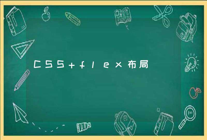
blob.png
现在页面看起来像上面这样,接下来就是要给标签(h2元素)添加样式,一个是背景色,一个是左边的3D折纸效果。
折边效果其实就是给h2的左下角拼接一个三角形的元素,我们使用伪元素来实现,代码如下:
[css] view plain copy
.fancy h2 {
font-style: italyc
line-height: 1
padding: 5px 0
color: #FFF
margin: 0
width: 205px
left: -35px// 相对卡片向左偏移35px
background-color: #e54439
position: relative
z-index: 6
}
.fancy h2:after {// 定义一个斜三角形
content: ""
width: 0
height: 0
position: absolute
font-size: 0
line-height: 0
z-index: 5
border-top: 0 solid transparent
border-bottom: 15px solid transparent
bottom: -15px
}
.fancy h2:after {
border-right: 20px solid rgb(230, 107, 97)
left: 0
}
.fancy h2 .ribbon-center {
display: block
padding: 10px 0
background-color: #e54439
}