


<div class="wrap">
<div class="circle"></div>
<div class="top"></div>
<div class="bottom"></div>
</div>
实现的思路就是:
1. 首先定义外层容器大小,本例采用200x200,
.wrap{
position: relative
width: 200px
height: 200px
}
2. 通过border-radius画一个圆环,这个比较简单
.circle{
height: 100%
box-sizing: border-box
border: 20px solid red
border-radius: 50%
}
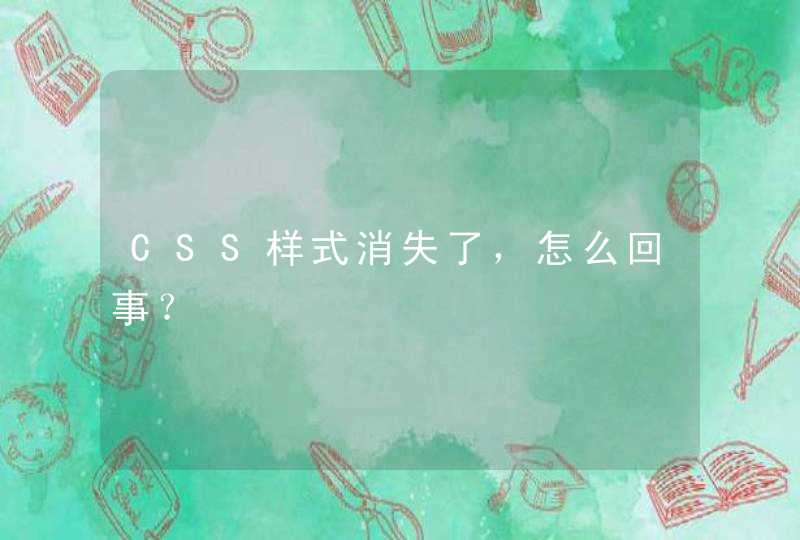
效果如下:
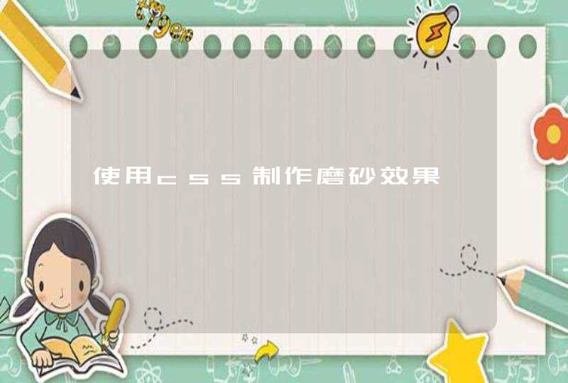
2. 然后用上下两层挡板遮住这个圆环,通过旋转挡板将圆环慢慢露出,过程如下图所示:
通过将下层挡板旋转180deg就能够实现将下半圆慢慢画出的效果,画完以后就需要将其隐藏起来,那该如何实现呢?
这里我用了opacity这个属性,当100%时将其设置为0,同时设置animation-fill-mode: forwards这样就隐藏了
0%{
transform: rotate( 0 )
}
99%{
transform: rotate( 180deg )
opacity: 1
}
100%{
transform: rotate( 180deg )
opacity: 0
}
3. 那如何显示上半圆呢?同样的思路我们对上面挡板进行旋转,通过实际效果我们可以看到,虽然上半圆露出来了,但是确把下半圆给遮挡了。
如何解决这个问题呢?
我们可以在下半圆和挡板间再放一个半圆,同时设置他们的z-index,让上面的挡板旋转时被下半圆遮住,这样就可以了。
说的有些复杂,相当于我们现在有四个元素:上挡板,下挡板,底部的大圆环,一个处在下挡板和大圆环间的半圆。
它们的z-index如下:
上挡板:1
下挡板和底部的大圆间的半圆:2
下挡板:3
为了不增加额外的元素,下挡板和底部的大圆间的半圆我们通过伪元素来实现
.circle:before{
content: ''
position: absolute
display: block
width: 100%
height: 50%
box-sizing: border-box
top: 50%
left: 0
border: 20px solid red
border-top: transparent
border-radius: 0 0 50% 50%/ 0 0 100% 100%
z-index: 2
}
4. 组后再结合css3的transform动画就可以了,需要注意的是,上挡板和下挡板动画是同时开始了,所以上挡板的动画要设置一个延时,时长就是下挡板动画的时长
本例用到的知识点如下:
1. 如何画一个圆环
2. 如何画一个半圆
3. css3动画
4. 定位
最终代码如下:
<!DOCTYPE html>
<html>
<head>
<meta http-equiv="X-UA-Compatible" content="IE=edge,chrome=1">
<meta http-equiv="content-type" content="text/htmlcharset=utf-8">
<title>动态画一个圆环</title>
<style>
*{
margin: 0padding: 0
}
.wrap{
position: relative
width: 200px
height: 200px
}
.circle{
height: 100%
box-sizing: border-box
border: 20px solid red
border-radius: 50%
}
.circle:before{
content: ''
position: absolute
display: block
width: 100%
height: 50%
box-sizing: border-box
top: 50%
left: 0
border: 20px solid red
border-top: transparent
border-radius: 0 0 50% 50%/ 0 0 100% 100%
z-index: 2
}
.top, .bottom{
position: absolute
left: 0px
width: 100%
height: 50%
box-sizing: border-box
background: white
}
.top{
top: 0
z-index: 1
transform-origin: center bottom
animation: 1s back-half linear 1s
animation-fill-mode: forwards
}
.bottom{
z-index: 3
top: 50%
transform-origin: center top
animation: 1s front-half linear
animation-fill-mode: forwards
}
@keyframes front-half{
0%{
transform: rotate( 0 )
}
99%{
transform: rotate( 180deg )
opacity: 1
}
100%{
transform: rotate( 180deg )
opacity: 0
}
}
@keyframes back-half{
0%{
transform: rotate( 0 )
}
99%{
transform: rotate( 180deg )
opacity: 1
}
100%{
transform: rotate( 180deg )
opacity: 0
}
}
</style>
</head>
<body>
<div class="wrap">
<div class="circle"></div>
<div class="top"></div>
<div class="bottom"></div>
</div>
</body>
</html>
给你一个例子:
<!doctype html><html>
<head>
<meta charset="utf-8">
<title>css动画</title>
<style>
*, *:before, *:after {
box-sizing: border-box
margin: 0
padding: 0
}
:root, html, body {
font-family: 'Poiret One', 'Open Sans', 'Helvetica Neue', 'Helvetica', 'Arial', sans-serif
background: #222
color: white
}
h1 {
text-align: center
margin: 1rem auto 2rem
font-weight: normal
}
p {
margin: 1rem
}
.row {
width: 80%
height: 150px
margin: 2rem auto
}
.cell {
display: inline-block
width: 49%
text-align: center
}
.circle {
display: inline-block
width: 100px
height: 100px
border-radius: 50%
background: whiteSmoke
box-shadow: 4px -40px 60px 5px rgb(26, 117, 206) inset
}
.square {
display: inline-block
width: 100px
height: 100px
border-radius: 20px
background: whiteSmoke
box-shadow: 4px -40px 60px 5px rgb(26, 117, 206) inset
}
.loader {
background: linear-gradient(to right, rgb(22, 113, 202) 50%, transparent 50%)
animation: spin 1s infinite linear
}
.loader:before {
display: block
content: ''
position: relative
top: 50%
left: 50%
transform: translate(-50%, -50%)
width: 90px
height: 90px
background: #222
border-radius: 50%
}
.gelatine {
animation: gelatine 0.5s infinite
}
@keyframes gelatine {
from, to { transform: scale(1, 1) }
25% { transform: scale(0.9, 1.1) }
50% { transform: scale(1.1, 0.9) }
75% { transform: scale(0.95, 1.05) }
}
.spin {
animation: spin 1s infinite linear
}
@keyframes spin {
from { transform: rotate(0deg) }
to { transform: rotate(360deg) }
}
.elastic-spin {
animation: elastic-spin 1s infinite ease
}
@keyframes elastic-spin {
from { transform: rotate(0deg) }
to { transform: rotate(720deg) }
}
.pulse {
animation: pulse 1s infinite ease-in-out alternate
}
@keyframes pulse {
from { transform: scale(0.8) }
to { transform: scale(1.2) }
}
.flash {
animation: flash 500ms ease infinite alternate
}
@keyframes flash {
from { opacity: 1 }
to { opacity: 0 }
}
.hithere {
animation: hithere 1s ease infinite
}
@keyframes hithere {
30% { transform: scale(1.2) }
40%, 60% { transform: rotate(-20deg) scale(1.2) }
50% { transform: rotate(20deg) scale(1.2) }
70% { transform: rotate(0deg) scale(1.2) }
100% { transform: scale(1) }
}
.grow {
animation: grow 2s ease infinite
}
@keyframes grow {
from { transform: scale(0) }
to { transform: scale(1) }
}
.fade-in {
animation: fade-in 2s linear infinite
}
@keyframes fade-in {
from { opacity: 0 }
to { opacity: 1 }
}
.fade-out {
animation: fade-out 2s linear infinite
}
@keyframes fade-out {
from { opacity: 1 }
to { opacity: 0 }
}
.bounce {
animation: bounce 2s ease infinite
}
@keyframes bounce {
70% { transform:translateY(0%) }
80% { transform:translateY(-15%) }
90% { transform:translateY(0%) }
95% { transform:translateY(-7%) }
97% { transform:translateY(0%) }
99% { transform:translateY(-3%) }
100% { transform:translateY(0) }
}
.bounce2 {
animation: bounce2 2s ease infinite
}
@keyframes bounce2 {
0%, 20%, 50%, 80%, 100% {transform: translateY(0)}
40% {transform: translateY(-30px)}
60% {transform: translateY(-15px)}
}
.shake {
animation: shake 2s ease infinite
}
@keyframes shake {
0%, 100% {transform: translateX(0)}
10%, 30%, 50%, 70%, 90% {transform: translateX(-10px)}
20%, 40%, 60%, 80% {transform: translateX(10px)}
}
.flip {
backface-visibility: visible !important
animation: flip 2s ease infinite
}
@keyframes flip {
0% {
transform: perspective(400px) rotateY(0)
animation-timing-function: ease-out
}
40% {
transform: perspective(400px) translateZ(150px) rotateY(170deg)
animation-timing-function: ease-out
}
50% {
transform: perspective(400px) translateZ(150px) rotateY(190deg) scale(1)
animation-timing-function: ease-in
}
80% {
transform: perspective(400px) rotateY(360deg) scale(.95)
animation-timing-function: ease-in
}
100% {
transform: perspective(400px) scale(1)
animation-timing-function: ease-in
}
}
.swing {
transform-origin: top center
animation: swing 2s ease infinite
}
@keyframes swing {
20% { transform: rotate(15deg) }
40% { transform: rotate(-10deg) }
60% { transform: rotate(5deg) }
80% { transform: rotate(-5deg) }
100% { transform: rotate(0deg) }
}
.wobble {
animation: wobble 2s ease infinite
}
@keyframes wobble {
0% { transform: translateX(0%) }
15% { transform: translateX(-25%) rotate(-5deg) }
30% { transform: translateX(20%) rotate(3deg) }
45% { transform: translateX(-15%) rotate(-3deg) }
60% { transform: translateX(10%) rotate(2deg) }
75% { transform: translateX(-5%) rotate(-1deg) }
100% { transform: translateX(0%) }
}
.fade-in-down {
animation: fade-in-down 2s ease infinite
}
@keyframes fade-in-down {
0% {
opacity: 0
transform: translateY(-20px)
}
100% {
opacity: 1
transform: translateY(0)
}
}
.fade-in-left {
animation: fade-in-left 2s ease infinite
}
@keyframes fade-in-left {
0% {
opacity: 0
transform: translateX(-20px)
}
100% {
opacity: 1
transform: translateX(0)
}
}
.fade-out-down {
animation: fade-out-down 2s ease infinite
}
@keyframes fade-out-down {
0% {
opacity: 1
transform: translateY(0)
}
100% {
opacity: 0
transform: translateY(20px)
}
}
.fade-out-right {
animation: fade-out-right 2s ease infinite
}
@keyframes fade-out-right {
0% {
opacity: 1
transform: translateX(0)
}
100% {
opacity: 0
transform: translateX(20px)
}
}
.bounce-in {
animation: bounce-in 2s ease infinite
}
@keyframes bounce-in {
0% {
opacity: 0
transform: scale(.3)
}
50% {
opacity: 1
transform: scale(1.05)
}
70% { transform: scale(.9) }
100% { transform: scale(1) }
}
.bounce-in-right {
animation: bounce-in-right 2s ease infinite
}
@keyframes bounce-in-right {
0% {
opacity: 0
transform: translateX(2000px)
}
60% {
opacity: 1
transform: translateX(-30px)
}
80% { transform: translateX(10px) }
100% { transform: translateX(0) }
}
.bounce-out {
animation: bounce-out 2s ease infinite
}
@keyframes bounce-out {
0% { transform: scale(1) }
25% { transform: scale(.95) }
50% {
opacity: 1
transform: scale(1.1)
}
100% {
opacity: 0
transform: scale(.3)
}
}
.bounce-out-down {
animation: bounce-out-down 2s ease infinite
}
@keyframes bounce-out-down {
0% { transform: translateY(0) }
20% {
opacity: 1
transform: translateY(-20px)
}
100% {
opacity: 0
transform: translateY(20px)
}
}
.rotate-in-down-left {
animation: rotate-in-down-left 2s ease infinite
}
@keyframes rotate-in-down-left {
0% {
transform-origin: left bottom
transform: rotate(-90deg)
opacity: 0
}
100% {
transform-origin: left bottom
transform: rotate(0)
opacity: 1
}
}
.rotate-in-up-left {
animation: rotate-in-up-left 2s ease infinite
}
@keyframes rotate-in-up-left {
0% {
transform-origin: left bottom
transform: rotate(90deg)
opacity: 0
}
100% {
transform-origin: left bottom
transform: rotate(0)
opacity: 1
}
}
.hinge {
animation: hinge 2s ease infinite
}
@keyframes hinge {
0% { transform: rotate(0) transform-origin: top left animation-timing-function: ease-in-out }
20%, 60% { transform: rotate(80deg) transform-origin: top left animation-timing-function: ease-in-out }
40% { transform: rotate(60deg) transform-origin: top left animation-timing-function: ease-in-out }
80% { transform: rotate(60deg) translateY(0) opacity: 1 transform-origin: top left animation-timing-function: ease-in-out }
100% { transform: translateY(700px) opacity: 0 }
}
.roll-in {
animation: roll-in 2s ease infinite
}
@keyframes roll-in {
0% {
opacity: 0
transform: translateX(-100%) rotate(-120deg)
}
100% {
opacity: 1
transform: translateX(0px) rotate(0deg)
}
}
.roll-out {
animation: roll-out 2s ease infinite
}
@keyframes roll-out {
0% {
opacity: 1
transform: translateX(0px) rotate(0deg)
}
100% {
opacity: 0
transform: translateX(100%) rotate(120deg)
}
}
</style>
</head>
<body>
<h1>CSS Animation</h1>
<div class="row">
<div class="cell">
<div class="circle loader"></div>
<p>loader</p>
</div>
<div class="cell">
<div class="circle gelatine"></div>
<p>gelatine</p>
</div>
</div>
<div class="row">
<div class="cell">
<div class="circle spin"></div>
<p>spin</p>
</div>
<div class="cell">
<div class="circle elastic-spin"></div>
<p>elastic spin</p>
</div>
</div>
<div class="row">
<div class="cell">
<div class="circle pulse"></div>
<p>pulse</p>
</div>
<div class="cell">
<div class="circle flash"></div>
<p>flash</p>
</div>
</div>
<div class="row">
<div class="cell">
<div class="square hithere"></div>
<p>hi there!</p>
</div>
<div class="cell">
<div class="circle grow"></div>
<p>grow</p>
</div>
</div>
<div class="row">
<div class="cell">
<div class="circle fade-in"></div>
<p>fade in</p>
</div>
<div class="cell">
<div class="circle fade-out"></div>
<p>fade out</p>
</div>
</div>
<div class="row">
<div class="cell">
<div class="circle bounce"></div>
<p>bounce</p>
</div>
<div class="cell">
<div class="circle bounce2"></div>
<p>bounce 2</p>
</div>
</div>
<div class="row">
<div class="cell">
<div class="circle shake"></div>
<p>shake</p>
</div>
<div class="cell">
<div class="circle flip"></div>
<p>flip</p>
</div>
</div>
<div class="row">
<div class="cell">
<div class="circle swing"></div>
<p>swing</p>
</div>
<div class="cell">
<div class="circle wobble"></div>
<p>wobble</p>
</div>
</div>
<div class="row">
<div class="cell">
<div class="circle fade-in-down"></div>
<p>fade in down</p>
</div>
<div class="cell">
<div class="circle fade-in-left"></div>
<p>fade in left</p>
</div>
</div>
<div class="row">
<div class="cell">
<div class="circle fade-out-down"></div>
<p>fade out down</p>
</div>
<div class="cell">
<div class="circle fade-out-right"></div>
<p>fade out right</p>
</div>
</div>
<div class="row">
<div class="cell">
<div class="circle bounce-in"></div>
<p>bounce in</p>
</div>
<div class="cell">
<div class="circle bounce-in-right"></div>
<p>bounce in right</p>
</div>
</div>
<div class="row">
<div class="cell">
<div class="circle bounce-out"></div>
<p>bounce out</p>
</div>
<div class="cell">
<div class="circle bounce-out-down"></div>
<p>bounce out down</p>
</div>
</div>
<div class="row">
<div class="cell">
<div class="circle rotate-in-down-left"></div>
<p>rotate in down left</p>
</div>
<div class="cell">
<div class="circle rotate-in-up-left"></div>
<p>rotate in up left</p>
</div>
</div>
<div class="row">
<div class="cell">
<div class="circle roll-in"></div>
<p>roll in</p>
</div>
<div class="cell">
<div class="circle roll-out"></div>
<p>roll out</p>
</div>
</div>
<div class="row">
<div class="cell">
<div class="circle hinge"></div>
<p>hinge</p>
</div>
</div>
</body>
</html>
1、首先新建一个html空白文档,取名字叫做css3动画,保存一下。
2、然后写html结构,只需要一个div元素即可,class名字叫做img
3、设置其边框为不同的颜色,边框宽度设置成100px。
4、因为是圆环,所以我们用到了css3的圆角效果,设置圆角为50%,也就是border-radius:50%,看一下效果。
5、接下来就是关键的步骤了,也就是添加动画效果。输入以下代码
6、来看一下最后的效果,还是不错的。